
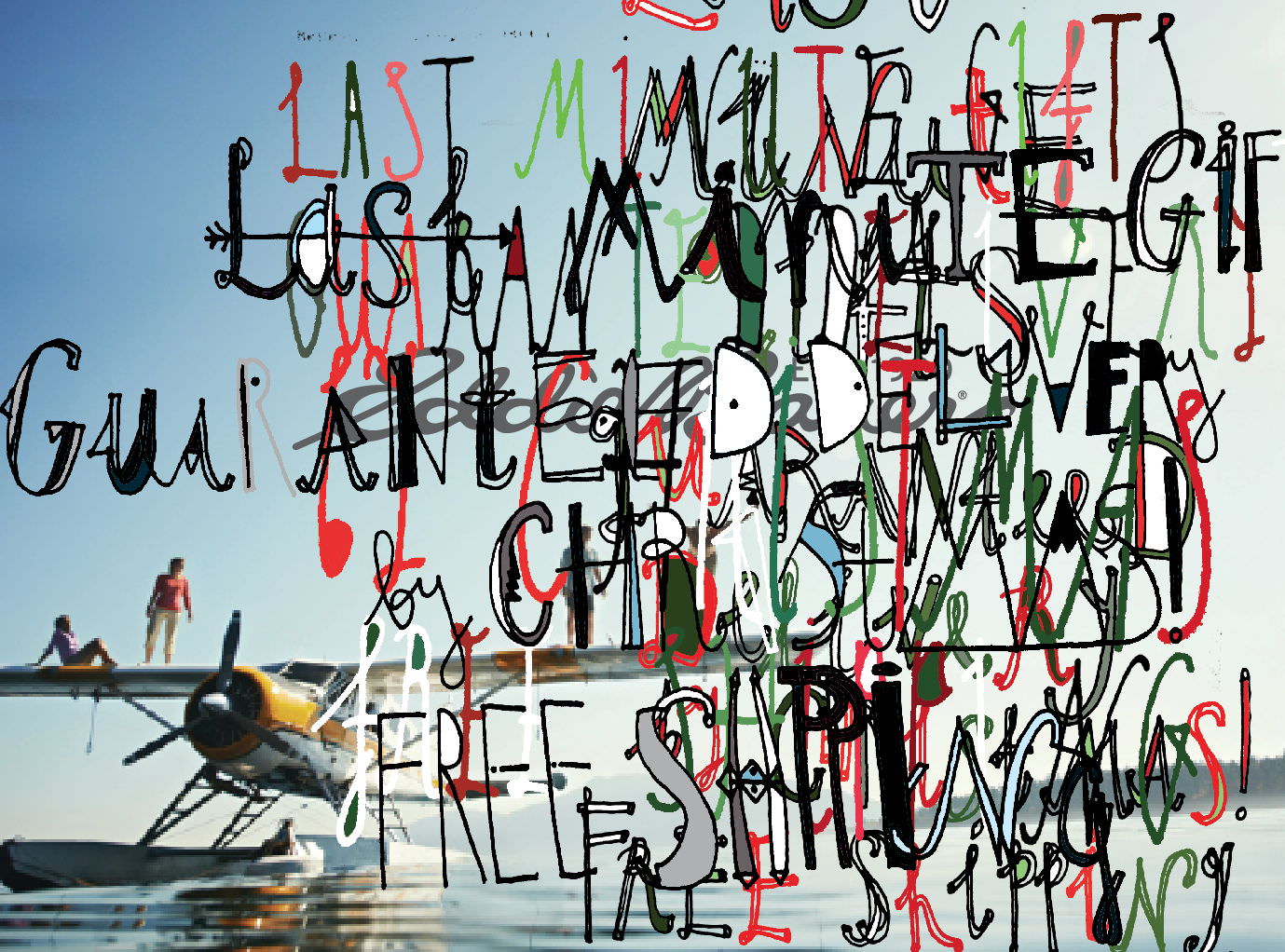
(David Carson Magazine Work, n.d.)
Post Modern designers have throughout history used factors such as deconstruction, doubt and reference to create their work. This can be exemplified by the work of David Carson in particular. I first encountered Carson’s work when studying him at A Level and my opinion of his work is satisfactory. What must have been revolutionary in its time, due to the deconstructed use of layering type over image, to me now seems dated from a contemporary eye. Carson uses lots of inspiration in his work from his passion of surfing (Anon, 2017), which makes his work personal to observe. However, his use of distorted layout, ‘mixes of vernacular typefaces and fractured imagery’ (David Carson (Research), 2014) causes the audience to beg whether Carson’s creativity is abstract genius or just damn hard to look at.
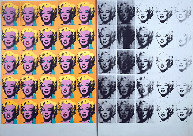
(Marilyn Diptych, 1962)
The second image I would like to discuss is Andy Warhol’s postmodern ‘Marilyn Diptych’ (Marilyn Diptych, 1962) composition. The piece has become globally famous due to its brash, bold use of colour and ‘pop art’ style. I was this use of contrasting colour that particularly stood out to me when I visited the Tate Modern in London last year. Warhol’s work combines two relatively old design techniques, collage and screen print, which particularly appeals to me. I like how the simple repetitiveness of the composition somehow creates a striking and sophisticated form.
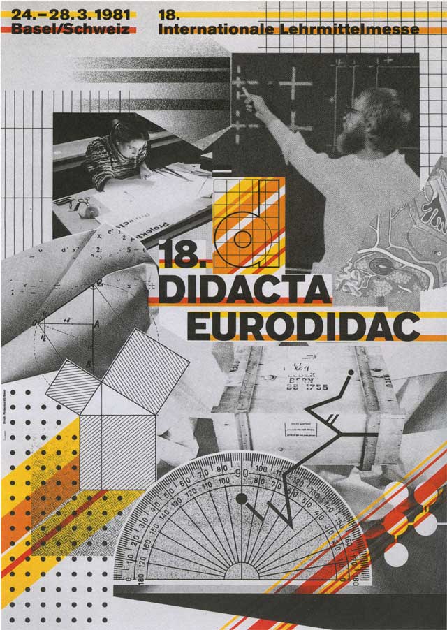
(18th Didacta/Eurodidac, 1980)
The final artist that I would like to present is Wolfgang Weingart. Weingart became famous due to his internationally known graphic design and typography. One piece in particular that I favour, is this poster (18th Didacta/Eurodidac, 1980), which I believe has really contributed to revolutionise typography as an art form. Like Weingart, I too share a passion for type and so his work is massively influential in my own practise. I especially like how Weingart’s work is constructed of many bold elements, yet if deconstructed the composition would seem incomplete and unharmonious.
I believe the work of all these post modern designers reveal aspects of modern design that are still frequently used in contemporary practise today. However of all three, I favour Weingart’s work the most, due to its complexity of design that I feel was ahead of its time.
Image 1- Anon, (2017). [online] Available at: http://www.davidcarsondesign.com/t/work/magazine/ [Accessed 27 Nov. 2017].
David Carson (Research). (2014). [Blog] Workflow. Available at: http://kjohnsonsalami1.workflow.arts.ac.uk/david-carson-research [Accessed 27 Nov. 2017].
Image 2- Marilyn Diptych. (1962). London: The Tate Modern.
The Andy Warhol Foundation for the Visual Arts, Inc. / Artists Right Society (ARS), New York and DACS, London
Image 3- 18th Didacta/Eurodidac. (1980). [Worldformat Poster] Concention on teaching aids, film layering.
AIGA | the professional association for design. (2017). Wolfgang Weingart. [online] Available at: https://www.aiga.org/medalist-wolfgang-weingart