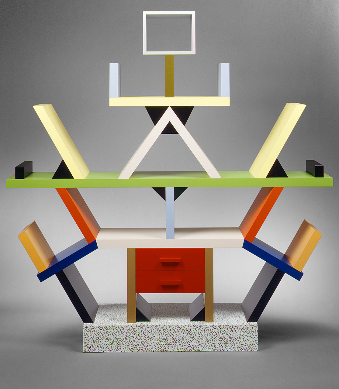
The Memphis Group is an Italian design and architecture group “known for wild colors, crazy patterns, and exaggerated shapes” (Zara, J. 2015). Memphis was about trying to break away from the minimalist designs of the 1970s and so in contrast designed bright, colourful pieces, drawing from Art Deco and Pop Art movements. One of their most iconic creations is the “Carlton” Room Divider designed by Ettore Sottsass. I find it to be a fun and playful spin on your everyday furniture design because of the illogical yet simple idea of slanted shelves. I enjoy how there doesn’t seem to be enough space on the shelves, or the spaces seem too small because they are interacting with something else. This deconstructs the idea of a shelf, to simply hold books and other objects.
My second image is ‘Retrospect’ by Keith Haring, a series of 24 cartoons made with the screen-printing technique. I enjoy the easy viewing of the images and how with such simple detail an environment is created with characters that have movement and energy, exclamation or surprise. Each image is placed one after the other and feels like a series of television screens showing different lives, different stories where you can only catch a glimpse because there is so much happening. In their simplicity, the images require no context because they are so easy to understand. Their straightforward design helps this too. Blocks of colour outlined by black come together to form clear shapes and create a series of signs that communicate the human body.
My final image is a poster created by designer Jayme Odgers, in collaboration with April Greiman. I enjoy seeing how all the different perspectives interact with each other and how the elements of the poster come together, for example the type on the bottom right hand corner and the nearby shapes. I also enjoy the way the composition is put together. The overlapping images focus the energy of the composition into the centre of the poster. Since I am not a natural graphic designer the composition of images does not come easy for me, so it is helpful to discover ways of creating images with deconstructed elements that communicate just as well as a clean, minimalist style.


- Zara, J. (2015). Neo-Memphis Design: It Came From the ‘80s. [online] WSJ. Available at: https://www.wsj.com/articles/neo-memphis-design-it-came-from-the-80s-1426885689 [Accessed 21 Nov. 2017].
- Sottsass, E. (1981). “Carlton” Room Divider. [Wood, plastic laminate] New York: The Metropolitan Museum of Art.
- Haring, K. (1989). Retrospect. [Silkscreen].
- Odgers, J. and Greiman, A. (1980). untitled. [offset lithograph on paper].
