- Explain the grid system and related golden ratio?
The grid system is how elements positioned within the layout of lines in 2D, which helps designers to determine the proportion and let compositions of elements look comfortable. The evidence of Grid system was discovered in ancient Egypt, a sculptor used eight horizontal guidelines and one vertical line to split figure through the ear, this shows an early method of Grid system.( First chapter in Grid Systems in Visual Art – EVIDENCE FOR GRIDS., OLD KINGDOM GUIDELINES., GRIDS IN THE MIDDLE KINGDOM., GRIDS IN THE NEW KINGDOM.)
.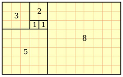 Picture from The designer’s guide to the Golden Ratio By Creative Bloq Staff August 29, 2017
Golden ratio was first called ‘Divine Proportion’, it can be defined by the mathematical method as ‘dividing a line into two parts so that longer part divided by shorter part equals the whole length divided by longer part.’ This method is shown in the picture below (History of the Golden Ratio, May 13, 2012, by Gary Meisner). The famous example of the Golden ratio is ‘The Last Supper’ by Leonardo Da Vinci: The golden ratio can be seen in between Christ and disciples (Golden Ratio in Art Composition and Design May 4, 2014, by Gary Meisner ). Similar to the Grid system, the Golden ratio is also used for positioning elements into a comfortable composition.
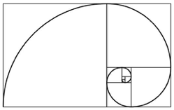 picture from The designer’s guide to grid theory By Sam Hampton-Smith
Link back to the connection between the Grid system and Golden ratio, the conclusion is that the Golden ratio is a method based on the Grid system, for example in the first picture above, it’s clearly separated into 26 units, this is a Grid system. Based on these 26 units, grid splits into three parts two squares (shown on the picture above), which forms a golden ratio graph.
References:
https://www.goldennumber.net/golden-ratio-history/
http://encyclopedia.jrank.org/articles/pages/123/Grid-Systems-in-Visual-Art.html
http://www.creativebloq.com/web-design/grid-theory-41411345
http://www.creativebloq.com/design/designers-guide-golden-ratio-12121546
- Demonstrate examples of this in use in Game UI, UX, and Design
The Grid system is an important element in Game UI, UX, and Design.
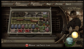
For example, Resident Evil 4 applies visual Grid system into inventory which visualizes how many objects the player can carry and also see the size of the objects rather than assign weight values
(Picture from Designing an RPG Inventory System That Fits: Preliminary Steps by Robert DellaFave).
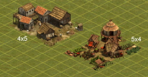
However, the Grid system can also be found in RTS games, for example, Age of Empires (Both resource and picture are from Forge of Empires Buildings and Production Statistics by HaekelHansi ). This game uses grid system as the measurement for buildings or other in-game items that can be placed in those assigned units, and this gives the player clear instructions for measuring spaces in the game.
Golden ratio largely applies to the Game design for example characters, scenes and UI. 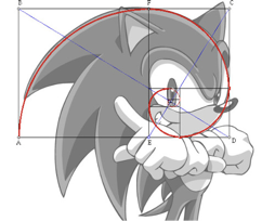
Sonic series is a good example of using the Golden ratio, this method gives the character a fluent feeling, links to the theme of the game, it supports the characteristic of Sonic: fast and nimble (picture from The Fibonacci Spiral by MoSJ).
In Rust, Golden ratio also applies into inventory UI, this is shown in the picture below:
(picture from Rust UI Design concept (Golden Ratio) by mescalineuk).
By splitting Inventory with Golden ratio method, it presents a comfortable composition for players which gives them a clear instruction of what to look at first and how it should be organized.
In conclusion, the Grid system and Golden ratio are two key elements that could be used in Game UI, UX and Design
References:
https://www.reddit.com/r/gaming/comments/1wsmce/golden_ratio/
https://steamcommunity.com/sharedfiles/filedetails/?id=176096493
http://guidescroll.com/2012/05/forge-of-empires-buildings-and-production-statistics/

