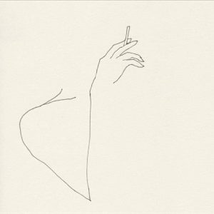
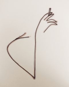
For this task I decided to take and appropriate an illustration by one of my favorite artists Frédéric Forest. I really like the minimalist approach that Frédéric Forest has to his work.
When recreating this image i decided to add some subtle colour while keeping the minimalist effect. For this I used two pro markers in ‘lavender’ and ‘pale pink’ to illustrate the females hand. I was going to leave it there but I wanted the sharp effect of the black fine liner so I went over the same line with a Graphik line maker in 0.2. This really made the illustration stand out and it is something that I have used in the past with previous illustrations. I think me adding colour to the image gives a completely different outcome to Frédéric Forest’s illustration. Especially adding the two different colours gives the final product a 3D effect.


