Counter culture was developed in the 1960/70s with underground design adapting to the style to attract a new audience. Graphic designer Paula Scher discussed design having sensibility, spirit and meaning (Abstract, 2017) which are all seen in the movement.
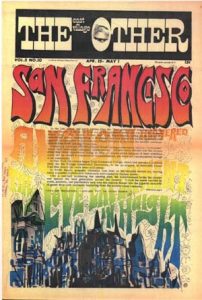
Image one is an example of underground press. As I am interested in graphic design, including magazines, I felt this piece was interesting as the bright colours, warped text and overlaid body text make it difficult to read the cover. San Francisco was the main city for this culture and is why it is so prominent. Following Scher’s words, the cover doesn’t seem overly sensible as it’s somewhat illegible but clearly expresses the spirit and meaning of the movement.

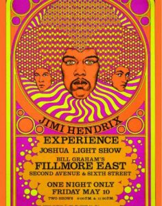
Similarly, image two shows the spirit and meaning but is more sensible as it clearly conveys information. It uses vibrant, psychedelic colours. The psychedelic nature is enhanced by using geometric shapes in the hair of Jimi Hendrix. Hendrix was a rock and roll singer/guitarist and his music was what the counter culture listened to.
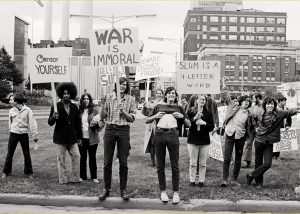
Image three is a photograph, as photography is another interest of mine. The image was taken at the Detr oit riots by A.S. Turner. The riot was one of the main race riots. The counter culture is also represented through the style of each of the individuals. The movement was looked down upon, creating an underground culture and being segregated as races were. The signs also fit the hippy culture with the ideas of peace and love. In terms of Scher, the photo holds the meaning and spirit of the movement.
Paula Scher (2013) also said ‘Identities are the beginning of everything. They are how something is recognized and understood’. Within all three of the images there are clear identities present whether in the individuals or the culture. It’s also true that through this you are able to recognise and understand the movement more. Author Sebastyne Young said ‘a picture can tell a thousand words but a few words can change its story’. This quote is relevant to these images as they each have a strong message but a caption on the photograph, for example, could say so much more.
References
- Abstract: The Art of Design – Season 1, Episode 6 – Paula Scher: Graphic Design (2017) TV series. USA: Netflix.
- East Village Other Image – EVOv2n1 (uploaded 2005) JPEG digital image. wikipedia.org. [Online] Available from: https://en.wikipedia.org/wiki/East_Village_Other#/media/File:EVOv2n1.jpg [Accessed 4 November 2017]
- David-Edward-Byrd-Hendrix-800×500.jpg (uploaded 2015/created 1960s) JPEG digital image. lamag.com. [Online] Available from: http://www.lamag.com/culturefiles/the-godfather-of-rock-n-roll-poster-art-discusses-his-art/ [Accessed 4 November 2017]
- Hippy Protest in Detroit image (uploaded 2013) JPEG digital image. sensiseeds.com. [Online] Available from: https://sensiseeds.com/en/blog/counterculture-detroit-declared-bankrupt/ [Accessed 4 November 2017]
- SCHER, P. (2013) Design Quotes: Paula Scher [Online] Eye on Design. Available from: https://eyeondesign.aiga.org/paula-scher/ [Accessed 4 November 2017]
- YOUNG, S. (n/a) Sebastyne Young Quotes [Online] Good Reads. Available from: https://www.goodreads.com/author/quotes/4489284.Sebastyne_Young [Accessed 4 November 2017]
