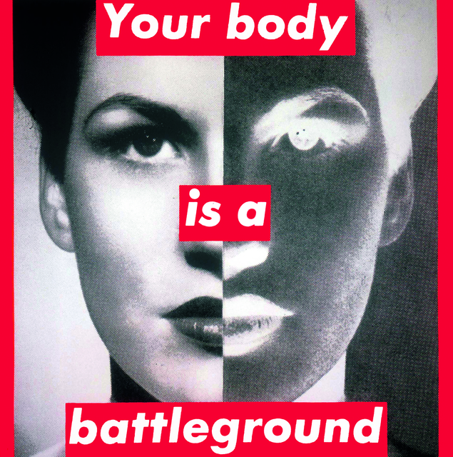
The first image by Barbara Kruger I consider striking through the use of layout, text, colour and imagery. The artwork addresses media and politics through critical character and cultural hierarches. From my research, this poster was formed in 1989 for the women’s march on Washington supporting reproductive freedom. The type “Your body is a battleground.” In my opinion, suggests the Feminist theory as the text relates to the portrait of the female. The divide down the middle of the artwork is a positive and negative exposure. The negative/dark divide indicates hardship “battleground” and may illustrate that some women are pressured to be perfect. In comparison, to the second piece that is a photograph by Luigi Scuderi. The photograph is captured in a natural method and represents current societies and the juxtaposition of rich and poor people. The deprived women struggling to stand all dresses in black while a wealth woman dressed in white walks past ignoring the reality of her current society. The black and white filter also contributes to the divide of the wealth and poverty. The overall photograph relates to the Marxist theory demonstrating social inequality as current societies are based on pursuit of wealth and it doesn’t benefit all. Comparing both sources, they reflect similar elements such as, the technique used to construct the images in a de-saturated style. They both have foundations of critical and political views through the use of imagery or text, which I will find beneficial to my future upcoming projects.
Barbara Kruger (1989) Your body is a battleground, Designishistory.com Available from: http://www.designishistory.com/images/kruger/battleground.jpg [Accessed 16th October 2017]
Luigi Scuderi (2010) The rich and the poor, DeviantArt. Available from: https://minotauro9.deviantart.com/art/The-rich-and-the-poor-151873239 [Accessed 16th October 2017]


