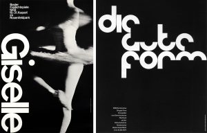
Armin Hofmann: Poster for the Ballet Giselle – 1959 (left) and Die Gute Form – 1964 (Right) , International Typographic Style
As Theo Van Doesberg states ‘The new artist does not imitate, he creates’ (Wilk, C 2008). However, in order for artists to create upcoming and contemporary pieces, they must expand on what previous artists have explored. To me, this does not affect the authenticity of the work, but recycling old success’ into something more exciting and modern.
The ‘Die Neue Typographie’ by Jan Tschichold, explores the graphic form in a ‘new’ aesthetic for the time. It focused on ‘clarity not simply beauty’ (Phillip B, M, 2011) and explored contemporary features, such as negative space and grids. It could be argued that although this was considered ‘authentic’, styles in the future, such as the ‘International Typographic Style’ (1940s/50s) imitated these features in order to create a newer graphic form e.g. Swiss Typography. Does imitating a style make it lose its authenticity? I feel that influence from designs does not enable a design to lose it’s originality but helps adapt originality of a new style. If Graphic designers in the 21st century were to ignore the triumphs already established by design, graphics would not move forward, be exciting and not enable communication to modernise and develop culture.
However, ‘once art loses the aura and ritual value, it is forced to find meaning through its exhibition’ (Benjamin, W 2008) e.g. galleries and merchandise (such as Starry Night by Vincent Van Gough). It’s so familiarised that it questions whether it is authentic or over popularised. I believe that popularised artwork may not be unauthentic, but provokes losing the impact which made the design so original.
Bibliography:
Benjamin, W (2008). The Work of Art in the Age of Mechanical Reproduction (1935). England: Penguin. 1.
Phillip B, M (2011). Meggs’ History of Graphic Design. 5th ed. England: John Wiley & Sons. 355.
Wilk, C (2008). Modernism: Designing a New World : 1914-1939. England: V&A Publishing.

