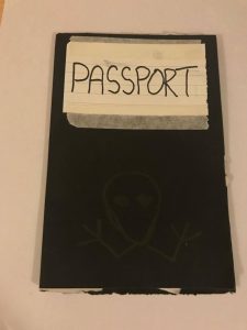
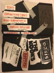
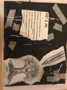
The task in which these works are based on was to create passport of yourself which could be presented in any way you feel. I stuck to the traditional form of a passport which is a booklet form and my first design had an overall darker theme. Each page is decorated by ripped up paper to give a rough scrappy look to it. The dark colour scheme is meant to fit in with my interest of German expressionist printmaking which is stated on the third page. The Biro drawing of the tree is to show my interest in decaying environments.
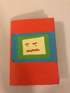
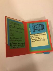
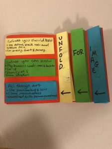
After near completion of my first passport I decided to explore with bright colour. I then started to create ideas for another passport that primarily had the colours red, yellow, blue and green. I created different patterns for each page using layers of neatly cut out paper as opposed to ripped sheets. This passport is intentionally much smaller to reflect on my lesser inclination to used bright colours and results in a fun way of showing my basic identity.
To Develop my passports further, I would try to make it make it more personal in a way that it encompasses a wider aspect of my life rather than just myself. To do this I would have included sketches of my family in each page and perhaps use an A3 page to completely expose my life in front of people rather than being a closed book in which you have to make the effort of opening it up to know about me.

