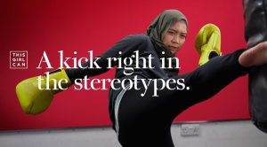
In 2015, Sport England decided to tackle the issue of women in the UK being majorly less involved with sport than men. In association with advertising agency FCB Inferno, they created the ‘This Girl Can’ campaign.
A bold white type face has been chosen for the logo. The use of the colour white steers clear from gender-associated colour. The bold font signifies the aim of the campaign, to show women they are powerful. The red background is not only visually striking, but forshadows the anger of the woman in the photo who is fighting against stereotypes. The quote ‘A kick right in the stereotypes’, supports Judith Butlers gender performativity theory. Butler said ‘There is no gender identity behind the expressions of gender’ explaining that the way we perform our gender is taught. I believe this links to ‘This Girl Can’ as the reason many women aren’t playing sport could be a social construction.
Maroon 5’s ‘Overexposed’ album cover art work is a colourful, image-filled collage of illustrations, created by illustrator Young & Sick. I like how the album is crowded full of different images, giving the audience a range of pieces to look at. In addition, the different elements make up a face for the main composition.
In comparison to the previous photograph, colour is extremely important. I believe colour is more important for the album cover as it is created for commercial purpose and must catch the eyes of audiences and potential customers. Whereas the “This Girl Can’ photograph uses words and body language of the models to inform audiences of an issue.
–IMAGE 1 – FCB Inferno 2017, This Girl Can; A Kick Right in the Stereotypes. Available at https://www.sportengland.org/news-and-features/news/2017/february/24/this-girl-can-returns-to-our-screens/ (Accessed on19th October 2017)
-IMAGE 2 – Young & Sick 2012, Overexposed Album Cover. Available at https://en.wikipedia.org/wiki/Overexposed_(album)#Artwork (Accessed on 19th October 2017)


