Firstly, I looked at a piece of Stefan Sagmeister’s typographic work – “Obsessions Make My Life Worse but My Work Better”. Initially you read the phrase, and agree that it has aided his work due to the delicate floral embellishments and the use of 250,000 Eurocents that must have taken much rigorous (obsessive) layout planning.
I think that equality and accessibility of design is being represented in this work. Once it was completed, the piece was left open in Waagdragerhof Square in Amsterdam to encourage interaction from the public. Alternatively, I think it reflects the thoughts of designers being apprehensive to share their work with people that don’t have the same vision for design. In this instance, it’s shown through the fact that the cents started to be taken by the public, before being swept up completely to “preserve” it by the Police.
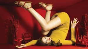
In contrast, I looked at some fashion photography directed by Jessica Walsh titled “By The Sea” which aimed to look at the crossover of fashion and art. Using bold, primary colours and angular shapes provided by the model’s body position, it feels almost like a painting with the monotone background. The intense eye contact she has with the camera gives power to her despite being in such a cramped room.
Space is a strong theme in both these pieces of work due to the small, filled room that the model takes up in the By The Sea shoot, making you feel overwhelmed and nauseous, compared to the 300m2 open space that the Obsession piece covers which allows room for the viewer to breathe.
Bibliography
Sagmeister&Walsh (2008). Obsessions Make My Life Worse But My Work Better. [image] Available at: https://sagmeisterwalsh.com/work/environmental/obsessions-make-my-life-worse-but-my-work-better/ [Accessed 18 Oct. 2017].
Sagmeister&Walsh (n.d.). By The Sea Campaign. [image] Available at: https://sagmeisterwalsh.com/work/advertising/by-the-sea-campaigns/ [Accessed 18 Oct. 2017].


