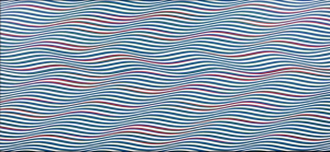
Monsoonartcollection.com. (2017). BRIDGET RILEY: STREAK 2, 1979 | MONSOON ART COLLECTION. [online] Available at: http://monsoonartcollection.com/bridget-riley/streak-2/ [Accessed 25 Nov. 2017].
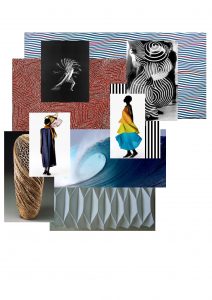
Bridget Riley uses colour and shape to create an illusion that makes a flat two dimensional image look 3D. The gradual change in the line is the base of the image making it have a bumpy texture that when layered with the other aspects allows the image to have movement and depth. By using a two-tone colours scheme, red and blue, it allows there to consist of separate parts which in effect adds a foreground and a background creating the depth previously mentioned. The colour red is the first to be seen by the eye which allows the ‘foreground’ to be seen initially and ahead of the ‘background’ which creates this dimensional illusion. When you step back and look at the design as a whole even more shapes are created such as zig zag pattern – this could be perceive differently making it a conversational piece. The simplicity of the design also allows the focus to stay on the illusion effect instead of being taken away by other contributing factors. Having the piece landscape also enables the eye to travel across the piece, again linking in ith this common theme of movement. Her work has key points and features that relate to those of the ocean such as the rhythm seen in the waves. Getting the aspect of movement across in a two dimensional image is something I would want to try and achieve in my on work whether that be print, weave or knit. This idea of texture and shape is also seen a lot in Issey Miyake’s work but instead of illusions he manipulates the look of pleats. In this recent collection this idea is seen throughout linking it to the elements such as water like Bridget Riley.


