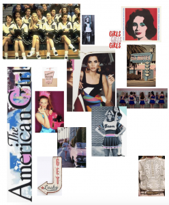
This mood board covers the influences in Roberta Einers Spring/Summer ‘16 collection.
Her collection was inspired by American pop art during the 50s, 60s and 70s. East coast meets west coast. The American girl. Bubble-gum colours as well as colour blocking from Andy Warhol. Her use of detailed embroidery can be seen to be influenced highly from Balmain.
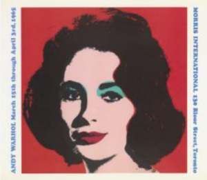
I have chosen to look further into this image by the notorious Andy Warhol. This was made as a exhibition poster that presents the portrait of actress, Elizabeth Taylor. Personally, I really like how simplistic this image is in shape and colour but also in practical process. He created it by using a simple screen printing method which really allows the colour to take center stage. To me, Warhol’s work epitomises colour blocking which is something that Roberta Einer has taken from his work and something that I could potentially look at in the future if I desired such inspiration within my own designs. On further research, I found out that Warhol had a fascination with the ‘celebrity death’ culture that began with his painting of Marilyn Monroe upon her tragic death in 1962. I think that this makes the image even more interesting to look at as an observer, as the image is hauntingly flat, yet so vibrant and full of life. Warhol could’ve wanted to celebrate their life through art, much like their own ‘art’ over the years. Now I know this, I can start to see something quite cold and chilling about his work, someone that once was at their peak of their careers, reduced, lifeless, without any emotion, much like the flat blocks of colour that he uses, which I think connotes the mark that is left behind them.
Tate, ‘Liz’, Andy Warhol, 1965. Avaliable from: http://www.tate.org.uk/art/artworks/warhol-liz-ar00320 [Accessed 14 November].


