
Problems & Fixes
Measuring Success
July 21, 2015
by Ash Smith
One of the biggest drawbacks of open data is that if the data is truly open, there is no reliable way of measuring its use. One of the most common questions we get is “what about analytics?” We have no answer… for our data to be open, it must be freely available and under a license that allows reuse and, specifically, republishing. Once we put it on the web we can track who downloads individual datasets from our domain, but once the data has been downloaded we can’t tell where it goes from there. It may get downloaded by someone who looks at it and deletes it, thinking it useless, or it may end up becoming part of a massively successful startup business. This is actually more of a problem than it seems, because a lot of people who use words like ‘impact’ and ‘synergy’ would rather have an average service that’s measurable than a fantastic service that isn’t.
But although we can’t tell exactly how much of our data is being used, or how much people rely on our tools, we have ways of making educated guesses, and I’ll cover three important ones here.
1. Someone complains if it breaks
I wrote whatweekisit around September 2013, just before the change of academic year. The odd thing about the academic year, at least at Southampton, is that the year starts on a Thursday, which means that there’s always one week per calendar year spread across two academic years. The period between Monday and Wednesday of this week is known as Week 52, and the Thursday onwards is known as Week 0 of the new year. I made absolutely sure this happened correctly in whatweekisit.
Come September 2014 and I got a ticket on our bug report system. Not just that, but I’ve also had an email and a coffee-room discussion about how whatweekisit has gone wrong. I inform all of them that this is, in fact, the way the academic year works, and whatweekisit is correct to split the week into two in this way. But in doing so, I feel satisfaction in the knowledge that enough people are using my service that I get multiple complaints when it behaves unexpectedly.
2. Someone hacks it
It’s a known fact that the more popular something is, the more of a target it becomes. Frankly, if I was writing a piece of malware that I wanted to infect as many machines as possible, I’d write it for Windows rather than Linux, purely because it’s a more common desktop operating system, not because I like programming Windows. So it’s for this reason that you see MySQL exploits, Drupal vulnerabilities and Internet Explorer flaws in the news all the time, but don’t hear anything about malware targeted at triplestores, for example. So it’s a testament to the popularity of a platform or service when people are writing malware for it, or trying to exploit it in some way.
Some years ago, Chris actually built several nonsense datasets – one asserting that all people in the world named Dave are the same person, for example – in order to illustrate this problem. I actually look forward to the day that someone works out how to do a SPARQL injection attack, as it’ll mean that linked open data is being taken seriously enough that people want to abuse it.
3. It wins an award!
We run a multi-award-winning service. The most recent award we received was for innovation in catering, a field I personally know nothing about. For the last few months I’ve been perfecting a mutually beneficial system for the University’s catering department. Last year the law changed and all catering outlets in the UK now need to provide accurate information on what allergens are contained within their food. My system takes a spreadsheet, filled in at source by a chef, and converts it into RDF. Once it’s in RDF, it’s used to generate the catering website, some printable menus in Word format, and, more recently, some nice digital signs around the staff club showing today’s menu. We get up-to-date data on the food being served in the University, and Catering get their menus completely automated and remain within the law, as all food allergens are clearly printed on the menus, and the only human effort involved is a chef updating a spreadsheet once a day, something that already happened before I got involved. Whenever I explain the system to someone in my team it’s met with a kind of “is that all?” sort of look, but to a Catering department, who do not program computers for a living, it’s a dream come true. I for one didn’t really comprehend that until I was stood on a stage in a posh hotel in London being congratulated by several hundred catering professionals.
This list is in no way scientific, or exhaustive, and hopefully we’ll have more evidence of success to add in the future.
Building Entrance Data
August 7, 2014
by Ash Smith
The University’s Web and Internet Science research group recently had their annual “WAIS Fest”. This is a few days every year in which the researchers all down tools and do something fun and interesting. It gives them all a chance to work with people they may not always work with – important in such a large research group – but also it allows the group to try some things they may not normally be able to get done in their normal line of work. WAIS Fests are nearly always productive. In the past, WAIS Fest themes have actually become the basis of prize-winning research publications, and even started funding bids. The Open Data Service have benefited from these events in the past, which is why we always make a point of getting involved.
This year, I ran my own theme: crowdsourcing data. We’re getting pretty good at getting information from the various sub-organisations of the university, usually by showing that linking open data makes it greater than the sum of its parts. But there is some information that simply doesn’t exist in any University system, and one thing we are missing is entrance and exit information for the buildings on campus. Buildings and Estates don’t keep this information, so it’s up to us to get hold of it somehow. So our idea was to come up with a way of making it simple to curate a dataset in this way. The other nice thing about Estates not having official identifiers and descriptors for building portals is that we got to make our own, and craft the URIs as we like.
We were actually dealt a useful trump card in our quest. Our team was made up of Chris and myself, and also Alex Hovden, a WAIS summer intern. Alex uses a motorised wheelchair to move about and has had a few problems operating some of the lab doors, which are not easy for wheelchair users to operate. So when Alex volunteered to go around campus making notes of the locations of building doorways, we decided he should note down which doors he could not access, and list this in our data as well.
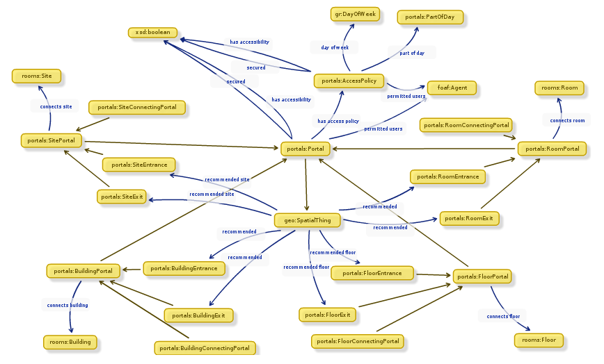 While Alex was off collecting data, Chris and I designed an ontology to describe entryways in linked data. It’s a lot harder than it sounds. To design our ontology we used Neologism, which is an excellent web-based tool for generating ontologies quickly, but the actual modelling process was where most of the work was. We opted for the umbrella term ‘portal’ as it nicely covers all possible entrances to things without explicitly stating entry or exit. A doorway is a portal, so indeed is a tunnel or a bridge. We also had disagreements as to whether or not security properties should be lumped together with access methods, and whether entrance/exit should be a property or a sub-class of the portal class. The task did get a bit serious once or twice as we started considering whether saying “Open Sesame” would count as an access method, and whether or not we should mention pre-1988 daleks in our description of a door with steps (we did.)
Once we had a way of representing the data, it was quite a simple task of writing a script to generate triples from Alex’s spreadsheet, and modifying the pages on data.southampton.ac.uk that describe buildings. Chris also built a smaller, hand-maintained file that lists common learning spaces such as lecture theatres, and which external door is the closest. This is now listed on the room pages, such as on this page about a lecture theatre in the Life Sciences building. Although they’re still lacking information on entry method and access restrictions, we now have a page for all the building external doors on campus that we know about, such as this page, about the south entrance to Building 2, which explains that the entrance has steps and is not easily accessible by people in wheelchairs.
Of course there are always things that don’t go to plan, and we need to learn more about certain things. One idea Chris had for getting latitude/longitude points of the doors was to leave the GPS on his phone on while taking photos of each door, and also take a photo of his feet stood next to each door with the intention of pulling the GPS information from the photo’s EXIF meta-data. This didn’t go as planned because the GPS on some phones isn’t very accurate, and although all of the geo-tagged photos were clearly on campus, many were next to the wrong building. We had plans to ask people to crowdsource spacial data by asking people to send us geo-tagged photographs, but this clearly won’t work.
The other thing we discovered is that RDF is a great way of representing this data because you can simply leave out the bits you don’t know. For example, there were several doors to which we don’t have access, and it’s not always obvious how a door opens unless you can actually open it. We were trying to list which doors require you to push or pull, which open with a push-button and which are on a sensor. It’s usually obvious which doors are on push-button, but unless you can actually see the door opening you can’t determine whether they’re manual or sensor-controlled. It doesn’t help that some things change based on time of day. For example, the doors on building 32 are sensor-controlled during the day, but become card access in the evening.
To conclude, it was another very beneficial WAIS Fest, as the output was not just a new, permanent feature for the Open Data website, but also we learned a lot about crowdsourcing, as well as the design of ontologies that describe something seemingly simple like doorways. The work we did will not just benefit lost students and members of staff, but will also hopefully benefit those with accessibility problems such as wheelchair users.
Adventures With Triplestores
November 13, 2013
by Ash Smith
Since its inception, the Southampton Open Data service has been run on 4Store. Reasons are varied, but it certainly helped that several of its key developers used to work at Southampton, and we have their mobile numbers! However, we recently began a project to see if we can replace it with something a bit more up-to-date, as our poor little server is starting to choke under increased load. Semantic Web technology has evolved, and we wanted to make sure we stay at the cutting edge.
As an extra incentive, none of us really had any experience setting up a triplestore, and we’ve had several requests for RDF-based databases from students, all of which we have had to decline. The University’s central IT department and well as Electronics and Computer Science both have procedures in place for students or researchers who need web space or relational databases for their projects, but it’s a shortcoming of our service that we can’t currently offer triplestores for those who need them. So we decided to start installing some triplestores on some Ubuntu machines and see what happens.
The experiments are still ongoing, but our first candidate was the excellent Sesame. This introduced an interesting problem – none of us are big fans of Java, nor have any of us used Apache Tomcat before. Tomcat is a Java-based web server and its ‘servlet container’ component is a requirement of Sesame, as well as many other triplestore back-ends. Being a team consisting of two system programmers and one ex-researcher who never really got the hang of Java, we were immediately overwhelmed by phrases like “deploy the WARs” and the comprehensive, if verbose, detail of Sesame’s official documentation.
Help was at hand thanks to this article by Blogger user Nadinima. Once we’d realised that installing Tomcat 7 on Ubuntu was a simple case of apt-get install tomcat, this blog post made the rest quite straightforward, and I got Sesame installed and configured in under an hour, despite my lack of Tomcat knowhow.
The next phase of the tests has been to modify my publisher tool Hedgehog so that it supports Sesame as well as 4Store. A positive side-effect of experimenting with different server architectures is that Hedgehog will become more versatile as a result. Currently Hedgehog is happily running on our development server, importing data into 4Store and Sesame simultaneously. We still need to do some stress-testing and then compare the performance to other stores, such as Parliament and Longwell, but I’ll modify Hedgehog appropriately if we discover it doesn’t work with them. Once we pick a favourite, we’ve got to work out how we’re going to transition to the new server architecture, which will probably involve lots of messing about with VMs and the writing of a custom SPARQL wrapper. But hopefully in doing so we can educate ourselves on the installation and configuration of triplestores, and also build a server image for those who want a triplestore set up quickly with a view to offering this as a standard service to members of the University.
Little Wins
October 17, 2013
by Christopher Gutteridge
We’ve had two small data related wins this week, which will sound a little odd.
I’ve been investigating the database of module pre-requisites. This is the list of modules you have to have completed before you do other modules. In the Physics department choices in early years can mean you can’t do a module you want a couple of years later, so we want to make it easier for the students to understand the implications of a choice.
There’s no reason not to try to solve the general case, so I was working with the database for all modules, not just Physics.
When studying the data I found one module in biology with a very confusing rule:
A and (B or C) or D.
Where each of the letters was really a module code. I spent ages trying to guess if it should be read as (A and (B or C)) or D but maybe it meant A and (B or C or D). It was pretty ambiguous, and I don’t have easy access to the documentation.
When I contacted the student support office for Biology I got an answer I didn’t expect… it was actually a typo, which they fixed.
This is a nice reminder that using data helps improve it.
Also this week, we discovered some prodedural confusion. Members of the university can add themselves to the phone directory, which stores your extension number and room & building of your office. The location data isn’t in the open data as our current approach is that would be a separate opt-in and we should get informed consent to make someone’s office location public. We use the location to generate a mailing list for each building, which is imperfect as people don’t always keep their info up to date, but it means when there’s lost keys or cake you can email a meaningful group of people. This information is also used by the ECS porters to find out which of the 6 ECS buildings a letter or package needs to go to.
A couple of ECS people who work in a research lab kept having their records disappear and nobody new why. Eventually the database sysprog figured it out; the people who look after the phonebook were deleting these records as they didn’t have a valid phone number. I should stress that the people deleting these records were not doing anything wrong, as we’ve not effectively communicated to them what we are using their information for.
I didn’t even know there were people who theoretically “owned” this data, as its updated by the people themselves. I’ve been using data from that database in intranet systems for about a decade!
Once again, this isn’t a problem, as it’s not a big change in procedure to ask them to keep records even if they have no phone number or an invalid phone number.
The next step is to find out who this team is, and go and show them how valuable this data is. Hopefully we can give some value back to them and enthuse them to tweak their procedures to enable us.
I suspect that we’ll encounter this pattern many more times in the future; a database which the owner sees as something used just for their immediate team’s benefit, but is actually the canonical and authoritative source of that data for the entire organisation.
There’s some really interesting cases where the data that exists isn’t ideal as it’s been set up for a single purpose. In our HR database your “manager” is the person who approves your leave. It makes total sense in hierarchical departments, but in the academic side of the university it would cause confusion if you assumed it meant line manager. I don’t know if somewhere there’s a second database. Maybe we should request a “manager, if different from leave approver” field, which would be the least work for HR to maintain and would make the data more useful in building intranet pages etc.
Good Data Practice
June 7, 2013
by Ash Smith
While building the University’s Open Data, we’ve seen many different types of data. Much of the information is exported from Oracle and MySQL databases, or from enterprise systems like Sharepoint, but the vast majority of what we use is in a tabular data format such as a spreadsheet.
Spreadsheets are actually a really good way of producing linked open data without any technical knowledge. A technical person just needs to write a single program or script that converts a spreadsheet into a computer-readable format, and anyone can then modify the spreadsheet to their heart’s content, you just need to run the script again afterwards. But this allows us to fall into a very common trap caused by bad spreadsheet discipline.
Spreadsheets are generally designed for human use. Most modern spreadsheet packages, such as Excel, allow the user to include headings, cell colours, lines, even import images and other files. There are also no strict rules about data type, so you can type a list of numbers in a column and then enter “N/A” or “see below” as part of the list, and the spreadsheet will not complain. This is fine for spreadsheets that only need to be read by people. However when generating information that might one day be read by computer, there is one very important 1975 Doctor Who quote you should remembered, “the trouble with computers is that they’re very sophisticated idiots”. They can only handle what they’re programmed to handle. So if I were to write a program that processes a spreadsheet for converting into linked open data, and then someone were to update a cell in the spreadsheet using the word ‘None’ rather than the number zero, the computer running my program will get confused and behave unexpectedly. This is why good data practice is essential when generating or updating data that may one day become linked open data.
So how can we avoid this? Well, one way is to employ super hackers who can pre-empt every possible anomaly in the data. But in a world with time and financial constraints this isn’t always an option! Joking aside, it’s a really quick and cheap fix to make sure that if you’re designing or editing a spreadsheet, you keep it as computer-friendly as possible. To this end, we’ve come up with what we consider to be the four most important rules for making your spreadsheet ‘linked-data-friendly’.
- Standardise your data format
Values should be numerical or a simple yes/no as far as possible. For example, if you were producing a list of food, rather than put ‘not suitable for vegetarians’ in a general comment field, add an extra column labelled ‘vegetarian’ and restrict the possible values to ‘yes’ or ‘no’. If this isn’t possible, keep to a small set of possible values and don’t deviate from these. ‘Red’, ‘Yellow’ and ‘Green’ is better than ‘Red’, ‘Burgundy’, ‘Yellow’, ‘Lime’, ‘Emerald’ and ‘Jade’, unless the exact shade of green is critically important. - Keep free text to a minimum
There is always room for a comments column. Sometimes we need to express something that can’t be represented as mere numbers. However, try not to put this in the actual data. The data should be as accurate as possible, and clarified by the comment field. So, for example, if you are maintaining a list of water coolers and their locations, you might have a ‘room’ column. If a cooler is in a corridor rather than a room, there are several ways you can represent this in a spreadsheet. You could leave the room empty and put ‘outside 2065’ in the comments, you could put ‘outside 2065’ as the room number, or you can put the room ‘2065’ as the room number and then write ‘outside’ in the comments. The third way is the linked data way! We still have consistent, numerical data to represent the room, but the comment clarifies to a human reader that the cooler is actually outside the room rather than within it. The computer may not be able to make sense of the ‘outside’ comment, but at least it can get the closest room correct. - Consistent, unambiguous identifiers
Computer scientists often refer to ‘primary keys’, and information architects will talk about ‘controlled vocabularies’, but at the end of the day we’re all talking about the same thing and that’s a way of identifying a specific thing in an unambiguous way. A good example of this is buildings in the University estate. Some buildings have names, some more than one, but all buildings have a number, so if you have a ‘building’ column in your data, make sure and use the number rather than the name. The same applies for rooms. A computer doesn’t understand ‘level 4 coffee room’ (and indeed many buildings may have a level 4 coffee room) but it does understand ’32/4032′ (for example). - Style is nothing to a computer
Although you may like to use headers, coloured cells and so on, don’t rely on them for meaning. When you export a spreadsheet to its raw data form, all the styling is lost, so making the vegetarian options in a menu green is not a good way to identify them. If it’s important, it should have a column. By all means, make your spreadsheet as pretty as you like – just be aware that it’s not going to look like that to a computer.
There are other things, but these are the most important. Next time you start a spreadsheet keep to these rules, and your spreadsheet will be trivial to convert and add to the open data service. Once its in data.soton.ac.uk it is really easy for us to give you loads of value add on your data. The value add increases the desirability and accessibility of your data and makes your data helpful. People use your data to make their lives easier and that reflects positively on you and boosts your reputation.
Unplanned Downtime
September 6, 2012
by Christopher Gutteridge
Some of the data.southampton.ac.uk related services have been unavailable this morning due to an unplanned power cut.
Sorry about that.
As the service becomes more important to the University, it’s clear that we need to make sure it’s as robust as possible, and reduce the risk of incidents like this in future.
Grasping the nettle and changing some URIs
March 24, 2011
by Christopher Gutteridge
We’ve realised that using UPPER CASE in some URIs looked fine in a spreadsheet but makes for ugly URLS, and if we’re stuck with them, we want them to look nice.
Hence I’ve taken an executive decision and renamed the URIs for all the Points of Service from looking like this
http://id.southampton.ac.uk/point-of-service/38-LATTES
to this
http://id.southampton.ac.uk/point-of-service/38-lattes
meaning the URL is now
http://data.southampton.ac.uk/point-of-service/38-lattes.html
This actually matters, as these are going to become the long term web pages for the catering points of service, so aesthetics are important, and “If t’were to be done, t’were best done quickly”.
We’ve seen lots of visitors as a result of the Register Article, which is nice. (we saw a 10x increase in visitors, so that’s good)
I’ve just added in the lunchtime menu for the Nuffield. They are not yet quite taking ownership of their data, but that’s just a case of getting them some training. I’ve also talked today to the manager of the on-campus book shop to see if they want to list some prices and products. I’m thinking they could do well to list the oddball stuff they sell like memory sticks & backpacks.
Mostly I’m preparing to tidy up the back-end code — it needs to be a bit more slick and logical, more on this later.
Also today our very own Nigel Shadbolt is featured in the first ever edition of the Google Magazine. (It’s a PDF!)
Minor Fixes
March 7, 2011
by Christopher Gutteridge
We’ve corrected a few 404 errors. Most notably the fact that the Excel spreadsheet in the payments dataset didn’t link properly.
We are also aware that the payments dataset contains some broken dates. We are using the RDF exported from the very new and experimental Open Data reporting tool for Agresso. We checked that data really hard to ensure it didn’t contain any information we didn’t have the right to publish, or was commercially sensitive, but totally missed a few 2011-13-13 dates! Unit 4, who make the software are working on a fix as we speak. This is a “beta” service, so you’ve got to accept a few hiccups.
The site has stood up today very well and we’ve got some great ideas on how to improve it. Watch this blog!