
Research
Building Entrance Data
August 7, 2014
by Ash Smith
The University’s Web and Internet Science research group recently had their annual “WAIS Fest”. This is a few days every year in which the researchers all down tools and do something fun and interesting. It gives them all a chance to work with people they may not always work with – important in such a large research group – but also it allows the group to try some things they may not normally be able to get done in their normal line of work. WAIS Fests are nearly always productive. In the past, WAIS Fest themes have actually become the basis of prize-winning research publications, and even started funding bids. The Open Data Service have benefited from these events in the past, which is why we always make a point of getting involved.
This year, I ran my own theme: crowdsourcing data. We’re getting pretty good at getting information from the various sub-organisations of the university, usually by showing that linking open data makes it greater than the sum of its parts. But there is some information that simply doesn’t exist in any University system, and one thing we are missing is entrance and exit information for the buildings on campus. Buildings and Estates don’t keep this information, so it’s up to us to get hold of it somehow. So our idea was to come up with a way of making it simple to curate a dataset in this way. The other nice thing about Estates not having official identifiers and descriptors for building portals is that we got to make our own, and craft the URIs as we like.
We were actually dealt a useful trump card in our quest. Our team was made up of Chris and myself, and also Alex Hovden, a WAIS summer intern. Alex uses a motorised wheelchair to move about and has had a few problems operating some of the lab doors, which are not easy for wheelchair users to operate. So when Alex volunteered to go around campus making notes of the locations of building doorways, we decided he should note down which doors he could not access, and list this in our data as well.
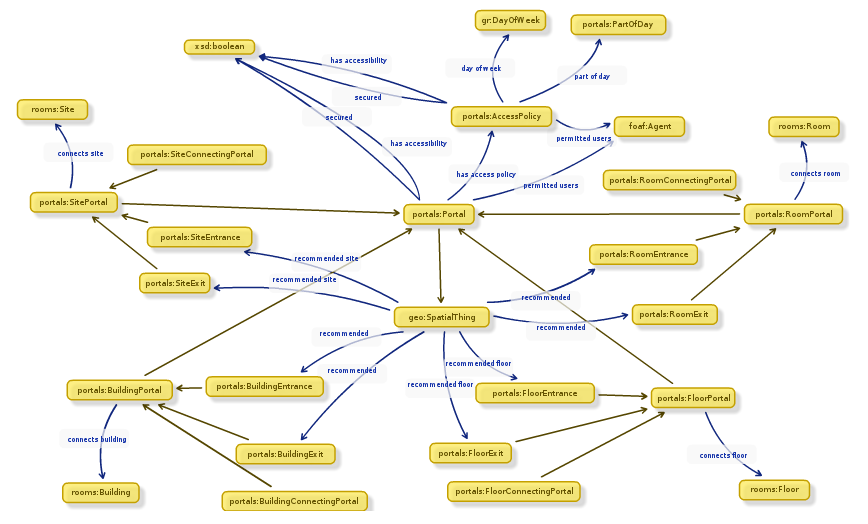 While Alex was off collecting data, Chris and I designed an ontology to describe entryways in linked data. It’s a lot harder than it sounds. To design our ontology we used Neologism, which is an excellent web-based tool for generating ontologies quickly, but the actual modelling process was where most of the work was. We opted for the umbrella term ‘portal’ as it nicely covers all possible entrances to things without explicitly stating entry or exit. A doorway is a portal, so indeed is a tunnel or a bridge. We also had disagreements as to whether or not security properties should be lumped together with access methods, and whether entrance/exit should be a property or a sub-class of the portal class. The task did get a bit serious once or twice as we started considering whether saying “Open Sesame” would count as an access method, and whether or not we should mention pre-1988 daleks in our description of a door with steps (we did.)
Once we had a way of representing the data, it was quite a simple task of writing a script to generate triples from Alex’s spreadsheet, and modifying the pages on data.southampton.ac.uk that describe buildings. Chris also built a smaller, hand-maintained file that lists common learning spaces such as lecture theatres, and which external door is the closest. This is now listed on the room pages, such as on this page about a lecture theatre in the Life Sciences building. Although they’re still lacking information on entry method and access restrictions, we now have a page for all the building external doors on campus that we know about, such as this page, about the south entrance to Building 2, which explains that the entrance has steps and is not easily accessible by people in wheelchairs.
Of course there are always things that don’t go to plan, and we need to learn more about certain things. One idea Chris had for getting latitude/longitude points of the doors was to leave the GPS on his phone on while taking photos of each door, and also take a photo of his feet stood next to each door with the intention of pulling the GPS information from the photo’s EXIF meta-data. This didn’t go as planned because the GPS on some phones isn’t very accurate, and although all of the geo-tagged photos were clearly on campus, many were next to the wrong building. We had plans to ask people to crowdsource spacial data by asking people to send us geo-tagged photographs, but this clearly won’t work.
The other thing we discovered is that RDF is a great way of representing this data because you can simply leave out the bits you don’t know. For example, there were several doors to which we don’t have access, and it’s not always obvious how a door opens unless you can actually open it. We were trying to list which doors require you to push or pull, which open with a push-button and which are on a sensor. It’s usually obvious which doors are on push-button, but unless you can actually see the door opening you can’t determine whether they’re manual or sensor-controlled. It doesn’t help that some things change based on time of day. For example, the doors on building 32 are sensor-controlled during the day, but become card access in the evening.
To conclude, it was another very beneficial WAIS Fest, as the output was not just a new, permanent feature for the Open Data website, but also we learned a lot about crowdsourcing, as well as the design of ontologies that describe something seemingly simple like doorways. The work we did will not just benefit lost students and members of staff, but will also hopefully benefit those with accessibility problems such as wheelchair users.
Adventures With Triplestores
November 13, 2013
by Ash Smith
Since its inception, the Southampton Open Data service has been run on 4Store. Reasons are varied, but it certainly helped that several of its key developers used to work at Southampton, and we have their mobile numbers! However, we recently began a project to see if we can replace it with something a bit more up-to-date, as our poor little server is starting to choke under increased load. Semantic Web technology has evolved, and we wanted to make sure we stay at the cutting edge.
As an extra incentive, none of us really had any experience setting up a triplestore, and we’ve had several requests for RDF-based databases from students, all of which we have had to decline. The University’s central IT department and well as Electronics and Computer Science both have procedures in place for students or researchers who need web space or relational databases for their projects, but it’s a shortcoming of our service that we can’t currently offer triplestores for those who need them. So we decided to start installing some triplestores on some Ubuntu machines and see what happens.
The experiments are still ongoing, but our first candidate was the excellent Sesame. This introduced an interesting problem – none of us are big fans of Java, nor have any of us used Apache Tomcat before. Tomcat is a Java-based web server and its ‘servlet container’ component is a requirement of Sesame, as well as many other triplestore back-ends. Being a team consisting of two system programmers and one ex-researcher who never really got the hang of Java, we were immediately overwhelmed by phrases like “deploy the WARs” and the comprehensive, if verbose, detail of Sesame’s official documentation.
Help was at hand thanks to this article by Blogger user Nadinima. Once we’d realised that installing Tomcat 7 on Ubuntu was a simple case of apt-get install tomcat, this blog post made the rest quite straightforward, and I got Sesame installed and configured in under an hour, despite my lack of Tomcat knowhow.
The next phase of the tests has been to modify my publisher tool Hedgehog so that it supports Sesame as well as 4Store. A positive side-effect of experimenting with different server architectures is that Hedgehog will become more versatile as a result. Currently Hedgehog is happily running on our development server, importing data into 4Store and Sesame simultaneously. We still need to do some stress-testing and then compare the performance to other stores, such as Parliament and Longwell, but I’ll modify Hedgehog appropriately if we discover it doesn’t work with them. Once we pick a favourite, we’ve got to work out how we’re going to transition to the new server architecture, which will probably involve lots of messing about with VMs and the writing of a custom SPARQL wrapper. But hopefully in doing so we can educate ourselves on the installation and configuration of triplestores, and also build a server image for those who want a triplestore set up quickly with a view to offering this as a standard service to members of the University.
Study of QR Codes in Southampton Bus Stops
March 27, 2012
by Christopher Gutteridge
Last year, an MSc student called Nick Gammer worked with data.southampton to study the value of QR Codes at bus-stops (linking to real-time data). There’s a few surprises in the results,
The key findings were:
The QR code trial was successful with increasing use over the life of the project.
Unprompted respondent comments were largely positive. The time trend of daily hit counts shows the project gained popularity over the time it was in operation, especially given book-marked hits were not recorded.
QR Code use was unaffected by the day of the week
There was little variation in average daily use and a One-Way ANOVA test confirmed no significant difference in average daily hits.
The QR code system was likely to have been beneficial to both regular, familiar, commuters and irregular, unfamiliar leisure travellers
Use was very consistent between weekdays/weekends and peak/inter-peak times. Also, survey results asking respondents whether they would be more likely to use the service on a familiar or unfamiliar route were reasonably evenly split (57% to 43% respectively). Furthermore, there was no significant difference in the change of acceptability of wait time between the two groups.
Scanning as opposed to entering the URL in a mobile browser was the preferred access method
Only 0.6% of hits recorded were through typing a URL
It is not beneficial to provide instructions on, or promotion of QR code use as there is no effect on uptake
Use of basic posters was higher in terms of absolute hits and footfall adjusted hits, however t-tests revealed not significantly greater for either data set.
It appears QR code posters placed at stops without a shelter receive higher QR code use
The average hit rate at stops without a shelter was substantially higher (28% greater usage) however due to insufficient without shelter stop numbers and footfall data this could not be formally tested.
There is substantial variation in use by area with the urban, university and interchange areas displaying much greater use that suburban areas.
This is true for absolute average hits per stop in given areas and even more pronounced when data is adjusted for footfall.
The presence of a display does not effect QR code use
Surprisingly the average footfall adjusted hit rate was not significantly higher for stops without a functioning display giving bus arrival times. This is supported by street survey data as respondents did not find wait time significantly more acceptable due to QR code use when a display was not available.
Use of the existing SMS arrival time service is low and could be redundant
None of the 67 street survey respondents used this service suggesting potential for replacement by essentially free and often real-time QR code provision.
The QR code system was easy to use
Eighty one percent of respondents found the system either very or quite easy to use.
Easy of use was not significantly influenced by smartphone ownership, however a significantly higher proportion of respondents aged over 40 found it more challenging.
Observed behavioural change was limited; the majority was in the form of utilisation of wait time.
Due to the methodology and high service frequencies the observed behavioural change was lower than previous studies. The only observed modifications were utilisation of wait time or going to a different stop. Further research is required.
System accuracy and reliability was adequate
Eighty eight percent of respondents believed the difference between their estimated and actual bus arrival times were less than the crucial 5 minutes. There were no system errors during demonstrations or from mobile survey comments and no vandalism occurred.
Arrival time provision through QR code use substantially improved the acceptability of wait time
Sixty five percent of respondents stated receiving wait times make their wait either much or a little more acceptable. There was no significant difference in the change of acceptability of wait time between respondents at stops with and without a display, frequent and infrequent travellers or passengers faced with a short and long wait.
QR code use lead to a valuable increase in feelings of safety
Thirty nine percent of respondents, mostly interviewed during daylight hours, felt safer after receiving wait times. A significantly higher proportion of female respondents exhibited positive changes in feelings of safety.
Potential patronage increases appear large although should be treated with caution
Fifty six percent of respondents stated they would be either a little or a lot more likely to use a bus as a result of QR code use. Previous studies reveal this is likely to substantially over-represent any resulting patronage change.
Knowledge of the difference between real-time and timetable arrival information is very poor and there could be substantial benefits from improving this knowledge
Only 10% of respondents knew the difference between timetable and real-time arrival times. Confidence in the system could potentially be greatly improved by informing passengers which times can be relied upon; confidence is an essential prerequisite for reaping the benefits RTI provision.
You can view the full report here: “An appraisal of QR code use to deliver bus arrival time information at bus stops in Southampton”