
More Little Wins
July 12, 2016
by Ash Smith
It was recently pointed out to us here in Open Data HQ that we don’t blog enough. We do a lot of things but most of them are little wins and not worth their own blog post. However, we’ve had enough little wins recently that it’s worth writing a paragraph or two about all of them.
Public People IDs
We have always had a few datasets containing information about people. The ePrints dataset, the public phonebook and, more recently, the facilities data all contain people triples. Sadly none of them linked up. This obviously troubled me.
We’ve always been a little timid around personal data. It’s a tough area – one wrong move and you’ll never live it down. Some businesses have been forced to close down due to poor management of personal data. Also, what some might consider acceptable some may not. I notice trends around the University – for example, most people in WAIS already have a public ‘people’ page, containing their email address, their degree and maybe a few other things, and see no wrong in it at all. Researchers actually need a public identity on their institutional website, it’s the way they communicate with other researchers and increase their reputation. But if I were to tell the groundskeeper or the staff in catering that their email addresses and photos are all going to be made public, they would probably be quite strongly opposed to the idea, and quite rightly so. I have no right to publish their personal information without their permission, and certainly not as open data.
We believe we have a compromise. We’ve assigned everyone in the University a URI, but that’s it. Occasionally these URIs resolve to something other than a blank page, but this only currently happens if (a) they have explicitly agreed to be in the public phonebook, (b) are the contact for a piece of equipment in our equipment database, or (c) I’ve added a bunch of information just for laughs (see http://data.southampton.ac.uk/person/D5mY.html for an example.) Even these pages are not visible to Google, and they are not centrally linked from anywhere so you can’t just scrape all the public people (unless you use the SPARQL endpoint I guess). But the point is that even people who have given us permission to publish their information are quite well hidden from Bad People™, and nobody else is public at all, even though we can refer to them in other datasets if we need to. I’m working with the team responsible for the recent main website re-brand, so I’ll link all this in with actual departmental people pages when I can. The main point is that everyone has a URI now, and these URIs are completely obfuscated and non-sequential, and (externally, at least) there is absolutely nothing you can do with them unless the person to which it refers is OK with their data being public. But we can use them to refer to people, and you can be sure the person referred to within one dataset is the same person being referred to by another.
An interesting quirk we encountered (hopefully before it caused any problems!) was what we lovingly refer to as the ‘four letter word problem’. The URIs referring to people were created by generating random numbers starting at over a million (so nobody gets to be ‘number 1’) and then base64-encoding them. The result is a four-digit alphanumeric string which means nothing, and this gets added to the URI. Someone pointed out to us that we run the risk of accidentally generating something along the lines of ‘D0rk’, and the poor person who gets assigned this ID won’t be too happy. Realising there are other (often far worse) four-letter words that might be accidentally generated, we found a digital copy of the dictionary and cross-checked every ID we’d generated and re-generated it if it was a dictionary word. Now whenever we generate a new ID, for a new member of staff, we check against a dictionary before ‘releasing’ the URI into the wild.
Waste Map
http://tools.southampton.ac.uk/waste-map/
This is an embeddable map of all the waste points on our many campuses. It’s particularly useful for people living in halls of residence, but is also used by Estates and Facilities when working with external contractors.
Nightingale Foyer Report
In the Nightingale building foyer there is a little touch-screen display from which anyone can look up the people who work in that building. The data comes from the Open Data Service, but we had to build a custom version of the data because of the embedded staff from professional services who also work in the building alongside the Nursing and Midwifery staff.
Room Shapes and Divisions
You will almost certainly have seen our lovely digital map, for which I am eternally grateful to Christopher Baines. It uses data from Open Street Map and our own open data, but in many cases where data does not exist, Chris went and created it anyway. The best example of this are the room shapes. Zoom in as far as you can on the map and the building shapes will open up into partial floor plans. We are actually not allowed to publish full floor plans for security reasons, but publicly accessible rooms are fair game. I’m currently working on a more maintainable version of the map, so I’ve taken the opportunity to convert all of Chris’ lovely polygons into an RDF description and published them as a dataset.
Additionally, I was asked a long time ago by one of the lab managers in Building 32 if the bays had URIs. The whole of levels 3 and 4 of Building 32 make up a big open plan lab area for Web Scientists, and this is split into bays of four to six people. At the time the bays didn’t have any URIs but I figured that because I’m the University’s only Linked Open Data specialist, it’s probably my job to assign them! So I did, and built a dataset describing their physical position within the lab.
ATMs
We’ve always had a list of ATMs on campus as part of the Amenities dataset, but that’s as far as it goes. A colleague of ours, Martin Chivers, suggested we include the location of all the ATMs in Southampton, and that the information is all available from various websites already. A few hours of googling added to my own personal knowledge and we now have a spreadsheet of ATM points for the central Southampton and Highfield areas. I’ll try to keep it up to date but the amenities dataset is manually maintained so I apologise if I miss one or two. Looking to the future, I believe we can keep this up to date automatically using Open Street Map, although this is basically crowd-sourced data and we’d like something better. The Link website actually contains a search engine for ATMs in Southampton, but this is almost certainly not open data and we have no right to republish it. So this remains an ongoing project.
Open Day Events
We’ve had lists of open day events before, but this year someone has already gone through the hassle of entering them all into our mobile app, MySouthampton. One Android phone and a copy of WireShark later and I’ve worked out where it gets its data and mercilessly stolen it! This of course means that the open data is up-to-date as long as MySouthampton is. I’ve described the events in the same way as we currently do seminars, etc, so you can always tell when it’s open day because suddenly all the buildings pages have enormous lists of events.
Visit from UCL
April 26, 2016
by Ash Smith
Last Thursday (21st April), we had a visit from some staff and students representing TechSoc at University College London. TechSoc, as the name suggests, is the technology society, and they have been investigating the feasibility of building an API for members of UCL to access data about the institution.
Despite our complete lack of entertainment budget (!) they were happy to get on a train and come and visit us to find out about our experiences in creating and maintaining the Open Data service. Wilhelm Klopp, one of their number, has written a nice blog post about the experience.
http://techsoc.io/blog/2016/04/22/southampton-trip/
Measuring Success
July 21, 2015
by Ash Smith
One of the biggest drawbacks of open data is that if the data is truly open, there is no reliable way of measuring its use. One of the most common questions we get is “what about analytics?” We have no answer… for our data to be open, it must be freely available and under a license that allows reuse and, specifically, republishing. Once we put it on the web we can track who downloads individual datasets from our domain, but once the data has been downloaded we can’t tell where it goes from there. It may get downloaded by someone who looks at it and deletes it, thinking it useless, or it may end up becoming part of a massively successful startup business. This is actually more of a problem than it seems, because a lot of people who use words like ‘impact’ and ‘synergy’ would rather have an average service that’s measurable than a fantastic service that isn’t.
But although we can’t tell exactly how much of our data is being used, or how much people rely on our tools, we have ways of making educated guesses, and I’ll cover three important ones here.
1. Someone complains if it breaks
I wrote whatweekisit around September 2013, just before the change of academic year. The odd thing about the academic year, at least at Southampton, is that the year starts on a Thursday, which means that there’s always one week per calendar year spread across two academic years. The period between Monday and Wednesday of this week is known as Week 52, and the Thursday onwards is known as Week 0 of the new year. I made absolutely sure this happened correctly in whatweekisit.
Come September 2014 and I got a ticket on our bug report system. Not just that, but I’ve also had an email and a coffee-room discussion about how whatweekisit has gone wrong. I inform all of them that this is, in fact, the way the academic year works, and whatweekisit is correct to split the week into two in this way. But in doing so, I feel satisfaction in the knowledge that enough people are using my service that I get multiple complaints when it behaves unexpectedly.
2. Someone hacks it
It’s a known fact that the more popular something is, the more of a target it becomes. Frankly, if I was writing a piece of malware that I wanted to infect as many machines as possible, I’d write it for Windows rather than Linux, purely because it’s a more common desktop operating system, not because I like programming Windows. So it’s for this reason that you see MySQL exploits, Drupal vulnerabilities and Internet Explorer flaws in the news all the time, but don’t hear anything about malware targeted at triplestores, for example. So it’s a testament to the popularity of a platform or service when people are writing malware for it, or trying to exploit it in some way.
Some years ago, Chris actually built several nonsense datasets – one asserting that all people in the world named Dave are the same person, for example – in order to illustrate this problem. I actually look forward to the day that someone works out how to do a SPARQL injection attack, as it’ll mean that linked open data is being taken seriously enough that people want to abuse it.
3. It wins an award!
We run a multi-award-winning service. The most recent award we received was for innovation in catering, a field I personally know nothing about. For the last few months I’ve been perfecting a mutually beneficial system for the University’s catering department. Last year the law changed and all catering outlets in the UK now need to provide accurate information on what allergens are contained within their food. My system takes a spreadsheet, filled in at source by a chef, and converts it into RDF. Once it’s in RDF, it’s used to generate the catering website, some printable menus in Word format, and, more recently, some nice digital signs around the staff club showing today’s menu. We get up-to-date data on the food being served in the University, and Catering get their menus completely automated and remain within the law, as all food allergens are clearly printed on the menus, and the only human effort involved is a chef updating a spreadsheet once a day, something that already happened before I got involved. Whenever I explain the system to someone in my team it’s met with a kind of “is that all?” sort of look, but to a Catering department, who do not program computers for a living, it’s a dream come true. I for one didn’t really comprehend that until I was stood on a stage in a posh hotel in London being congratulated by several hundred catering professionals.
This list is in no way scientific, or exhaustive, and hopefully we’ll have more evidence of success to add in the future.
Information (about the) Blackout
November 13, 2014
by Christopher Gutteridge
UPDATED Friday 14th. See end of post for update about the plans.
Friday sees the 3rd annual University Blackout event where everybody is encouraged to turn off their electrical equipment so we can see how much energy is save. Later in the evening, a team of 250 volunteers scamper around offices turning off remaining monitors and computers unless they have a pre-approved excemption certificate taped to them.
Obviously the savings this makes are only a drop in the ocean, but the headline figure in the infographic is 6%. I was interested in how they got that number, as last year I ran a building-by-building analysis of energy use, based on the open data provided by their system for each main building. eg. http://data.southampton.ac.uk/building/59.html?energy
From the horse’s mouth
(..or do I mean horse’s meter?)
I was invited to go and see how the system all works, and wheree the data comes from. It’s a small team with many responsibilities and bits of the system are more aged than other, so they can’t do all things for all people. They are monitoring well over 100 buildings over many sites.
To give the value for a building they use a virtual meter which is a function on top of one or more real world meters. The function can add the values of several meters, and sometimes apply a fiddle factor for known errors. Metering is not a simple task at these scales and the sum of all the meters never quite adds up. Some of the issues include a misinstallation. This is rare. Suspiciously low readings set off ther analysist’s spidey-sense and physical investigation led to the issue being found and corrected.
There’s more subtle cases though. We apparently have some meters which measure differently, depending on warmth, and we have meters which measure hot water flow which get slowly clogged and the measurements alter until they are cleaned, but that involves shutting stuff down and can’t be done often. It’s not all meters that play up, but the ones that do need to be considered when drawing conclusions from data.
I should stress that these are our internal meters which we use to monitor our systems, not the meters that decide how much we pay.This year the plan for measuring the impact of the blackout event is to focus on the campus figure rather than by building. A keen reporter at SotonTab, the unofficial student news site, got someone to total up energy usage all the buildings over last year’s Blackout, but given the variation of meter performance it’s hard to trust this data. The margin of error is higher than the number we’re looking for. This year the provisional plan for the official figure is to use the main power consumption value for each campus rather than using sets of individual buildings.
A molehill, but a molehill on a mountain
One of the big concerns with the project, that I share with some other malcontents, is that it is a feel-good exercise which does nothing to address the real issues of energy reduction. What I was unaware of is all the other work already done and being done to waste less resources.

An electric heater. Imagine lots of them turned off.
The really big one I was aware of but never really thought about, which is the Combined Heat & Power system on Highfield Campus. What this does is uses gas to generate both electricity and heat for the campus, wasting less energy (and causing less carbom emissions) than getting electricity from the grid. We hope to soon start publishing the summary data, but the headline figure is about half-a-million quid a year saved, or to put it another way. Imagine several hundred 1000 Watt heaters all running full blast all day every day, year in, year out, and for no good reason. That’s about the amount of energy the CHP system is saving. It ain’t the most sexy thing about our university, but it’s something we can all feel a bit of pride in.
Another part of their job is to study the data and spot and investigate changes in the way each building uses energy and see if there are any things to be done about them.In the context of all of these big things already being done, it starts to make more sense why they are now working on higher-effort, lower reward tasks such as encouraging people to turn off unused stuff– they’ve already done much of the easier savings.
- More information on university carbon management projects
- Lots of data (sheets) about building energy efficiency
But what’s actually worth turning off?
Many years ago I used a little gadget to find out how much power all my electronic posessions drew when on, and when on standby still turned-on-at-the-plug. It helpped me understand where it was most useful to put effort into powering off and unpluging my stuff when not in use.
There were two main surprises…

Unfairly accused.
First of all, my phone charger, when the phone was not attached, used no mesurable amount of power, so I stopped bothering turning them off.
The other surprise was my data projector. It used 200W when projecting but that’s not that surprising, I knew it was a high-energy-use item. What shocked me was that it used 30W when on standby mode doing nothing at all. As a result I always made sure it got turned off at the mains.
Obviously your-milage-may-vary, but the university buys many standard items which are all very similar like computers, monitors, fans, etc. What we could start doing is checking their power use and standby-power-use, and label all the units of that exact type we deploy in office and lab space so that staff can make an informed as to where there’s value in bothering to turn things off.
But why isn’t all the data open?
There’s several reasons to this.
One is that the raw meter data has many caveats to interpretation, and I’ll agree that it’s hard to get people to read the tasting notes going along with open data. One idea I’ve had is to make the “citation URL” the document describing the data, so if you do anything with the data and “must attribute” the data creator, that attribution must be to the document warning of the known issues with the data.
Oh, and some of the meters log an error as “0” (zero) rather than NULL, so that’s not ideal for statistical analysis. This is what you end up having to deal with in pragmatic real-world data.
The other reason it’s hard to get at the raw data is that the only way to get it is via the system which collates it and that is 1996, the era of Spice Girls and Buffy the Vampire Slayer. it might be just a bit older than some of our current freshers.
So obvisously it’s very slow and klunky and as usual the project to replace it is taking longer than hoped.
Why don’t we ask the experts
I asked them why they didn’t make it available and they said (to my embarrassment) that they do, you just need to ask nicely and they’ll give a password to any member of staff or student. They can be reached at metering@soton.ac.uk but remember they are a small team with lots of work, so they can’t just drop everything to help you get started.
Considering the number of experts in data analysis and interpretation we must have on staff and amongst the phd students and even undergrads, I’m hoping there’ll be a few who could help them lift new knowledge out of this data in ways that really can help us make real strides towards the goal of 20% reduction.
We don’t have a very good track record of using the expertise of our research staff to actually feed back into the way we run the university. This is all our fault, but if you think you might be able to add some insight to this (warts and all) data, please do get in touch with the metering team, they’d love to hear from you.
What ideas do you have for using data to save energy?
Update from the Blackout Team on Data Method Analysis
Neil Smith, the person who leads university sustainability projects has sent us this info:
1. Scope: Highfield, Avenue, WSA and Boldrewood (Block B and Annex)
2. Data sources:
- Information on the number of Pcs, monitors and other electrical equipment will be recorded on the night.
- University Automatic Monitoring Recording (AMR) system (for building half hourly electricity data). Note: not available for Boldrewood buildings. Note: the AMR relies on a network of meters and data loggers to record and transmit the data to the central database, data is also supplied daily from the University’s fiscal meter by the University’s Meter Operator Aggregator. In Blackout 2013, the system for a large area of the Highfield campus failed and this made it extremely difficult to calculate the electricity use over the weekend.
3. Analysis
- Audit data – the number of Pcs left switched on in a building will be published and compared to the values for 2012 and 2013 (where the data exists)
- AMR
- Highfield: the initial analysis will be for six high level meters. Note as a result of using these six meters, the data will be ‘noisy’.
- Avenue: one campus meter will be used for the data analysis
- WSA: four meters will be used for the data analysis
- Boldrewood: Validated data is not available for the campus and so only the number of Pcs left switched on will be used to assess the impact of Blackout
- Calculation: The average electricity consumption over the four October 2014 weekends will be compared with the electricity consumption over the Blackout weekend (measured from 1600 on Friday to 10 on Monday to capture when people start to leave and return to work. This data will only be published once checked, validated and signed off. This may take a few weeks.
4. Reporting
- Results will be posted on Sussed.
- A spread sheet showing the electricity data analysis will be made available on request
- Raw electricity data is available through the AMR and you can request access to the system by emailing details of the building(s) you are interested in to metering@soton.ac.uk.
- Electricity data is also available through the Open Data site
Thanks very much to the Blackout team for this update.
Building Entrance Data
August 7, 2014
by Ash Smith
The University’s Web and Internet Science research group recently had their annual “WAIS Fest”. This is a few days every year in which the researchers all down tools and do something fun and interesting. It gives them all a chance to work with people they may not always work with – important in such a large research group – but also it allows the group to try some things they may not normally be able to get done in their normal line of work. WAIS Fests are nearly always productive. In the past, WAIS Fest themes have actually become the basis of prize-winning research publications, and even started funding bids. The Open Data Service have benefited from these events in the past, which is why we always make a point of getting involved.
This year, I ran my own theme: crowdsourcing data. We’re getting pretty good at getting information from the various sub-organisations of the university, usually by showing that linking open data makes it greater than the sum of its parts. But there is some information that simply doesn’t exist in any University system, and one thing we are missing is entrance and exit information for the buildings on campus. Buildings and Estates don’t keep this information, so it’s up to us to get hold of it somehow. So our idea was to come up with a way of making it simple to curate a dataset in this way. The other nice thing about Estates not having official identifiers and descriptors for building portals is that we got to make our own, and craft the URIs as we like.
We were actually dealt a useful trump card in our quest. Our team was made up of Chris and myself, and also Alex Hovden, a WAIS summer intern. Alex uses a motorised wheelchair to move about and has had a few problems operating some of the lab doors, which are not easy for wheelchair users to operate. So when Alex volunteered to go around campus making notes of the locations of building doorways, we decided he should note down which doors he could not access, and list this in our data as well.
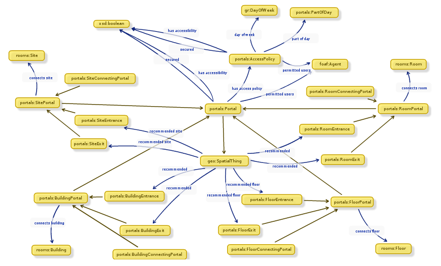 While Alex was off collecting data, Chris and I designed an ontology to describe entryways in linked data. It’s a lot harder than it sounds. To design our ontology we used Neologism, which is an excellent web-based tool for generating ontologies quickly, but the actual modelling process was where most of the work was. We opted for the umbrella term ‘portal’ as it nicely covers all possible entrances to things without explicitly stating entry or exit. A doorway is a portal, so indeed is a tunnel or a bridge. We also had disagreements as to whether or not security properties should be lumped together with access methods, and whether entrance/exit should be a property or a sub-class of the portal class. The task did get a bit serious once or twice as we started considering whether saying “Open Sesame” would count as an access method, and whether or not we should mention pre-1988 daleks in our description of a door with steps (we did.)
Once we had a way of representing the data, it was quite a simple task of writing a script to generate triples from Alex’s spreadsheet, and modifying the pages on data.southampton.ac.uk that describe buildings. Chris also built a smaller, hand-maintained file that lists common learning spaces such as lecture theatres, and which external door is the closest. This is now listed on the room pages, such as on this page about a lecture theatre in the Life Sciences building. Although they’re still lacking information on entry method and access restrictions, we now have a page for all the building external doors on campus that we know about, such as this page, about the south entrance to Building 2, which explains that the entrance has steps and is not easily accessible by people in wheelchairs.
Of course there are always things that don’t go to plan, and we need to learn more about certain things. One idea Chris had for getting latitude/longitude points of the doors was to leave the GPS on his phone on while taking photos of each door, and also take a photo of his feet stood next to each door with the intention of pulling the GPS information from the photo’s EXIF meta-data. This didn’t go as planned because the GPS on some phones isn’t very accurate, and although all of the geo-tagged photos were clearly on campus, many were next to the wrong building. We had plans to ask people to crowdsource spacial data by asking people to send us geo-tagged photographs, but this clearly won’t work.
The other thing we discovered is that RDF is a great way of representing this data because you can simply leave out the bits you don’t know. For example, there were several doors to which we don’t have access, and it’s not always obvious how a door opens unless you can actually open it. We were trying to list which doors require you to push or pull, which open with a push-button and which are on a sensor. It’s usually obvious which doors are on push-button, but unless you can actually see the door opening you can’t determine whether they’re manual or sensor-controlled. It doesn’t help that some things change based on time of day. For example, the doors on building 32 are sensor-controlled during the day, but become card access in the evening.
To conclude, it was another very beneficial WAIS Fest, as the output was not just a new, permanent feature for the Open Data website, but also we learned a lot about crowdsourcing, as well as the design of ontologies that describe something seemingly simple like doorways. The work we did will not just benefit lost students and members of staff, but will also hopefully benefit those with accessibility problems such as wheelchair users.
Adventures With Triplestores
November 13, 2013
by Ash Smith
Since its inception, the Southampton Open Data service has been run on 4Store. Reasons are varied, but it certainly helped that several of its key developers used to work at Southampton, and we have their mobile numbers! However, we recently began a project to see if we can replace it with something a bit more up-to-date, as our poor little server is starting to choke under increased load. Semantic Web technology has evolved, and we wanted to make sure we stay at the cutting edge.
As an extra incentive, none of us really had any experience setting up a triplestore, and we’ve had several requests for RDF-based databases from students, all of which we have had to decline. The University’s central IT department and well as Electronics and Computer Science both have procedures in place for students or researchers who need web space or relational databases for their projects, but it’s a shortcoming of our service that we can’t currently offer triplestores for those who need them. So we decided to start installing some triplestores on some Ubuntu machines and see what happens.
The experiments are still ongoing, but our first candidate was the excellent Sesame. This introduced an interesting problem – none of us are big fans of Java, nor have any of us used Apache Tomcat before. Tomcat is a Java-based web server and its ‘servlet container’ component is a requirement of Sesame, as well as many other triplestore back-ends. Being a team consisting of two system programmers and one ex-researcher who never really got the hang of Java, we were immediately overwhelmed by phrases like “deploy the WARs” and the comprehensive, if verbose, detail of Sesame’s official documentation.
Help was at hand thanks to this article by Blogger user Nadinima. Once we’d realised that installing Tomcat 7 on Ubuntu was a simple case of apt-get install tomcat, this blog post made the rest quite straightforward, and I got Sesame installed and configured in under an hour, despite my lack of Tomcat knowhow.
The next phase of the tests has been to modify my publisher tool Hedgehog so that it supports Sesame as well as 4Store. A positive side-effect of experimenting with different server architectures is that Hedgehog will become more versatile as a result. Currently Hedgehog is happily running on our development server, importing data into 4Store and Sesame simultaneously. We still need to do some stress-testing and then compare the performance to other stores, such as Parliament and Longwell, but I’ll modify Hedgehog appropriately if we discover it doesn’t work with them. Once we pick a favourite, we’ve got to work out how we’re going to transition to the new server architecture, which will probably involve lots of messing about with VMs and the writing of a custom SPARQL wrapper. But hopefully in doing so we can educate ourselves on the installation and configuration of triplestores, and also build a server image for those who want a triplestore set up quickly with a view to offering this as a standard service to members of the University.
Little Wins
October 17, 2013
by Christopher Gutteridge
We’ve had two small data related wins this week, which will sound a little odd.
I’ve been investigating the database of module pre-requisites. This is the list of modules you have to have completed before you do other modules. In the Physics department choices in early years can mean you can’t do a module you want a couple of years later, so we want to make it easier for the students to understand the implications of a choice.
There’s no reason not to try to solve the general case, so I was working with the database for all modules, not just Physics.
When studying the data I found one module in biology with a very confusing rule:
A and (B or C) or D.
Where each of the letters was really a module code. I spent ages trying to guess if it should be read as (A and (B or C)) or D but maybe it meant A and (B or C or D). It was pretty ambiguous, and I don’t have easy access to the documentation.
When I contacted the student support office for Biology I got an answer I didn’t expect… it was actually a typo, which they fixed.
This is a nice reminder that using data helps improve it.
Also this week, we discovered some prodedural confusion. Members of the university can add themselves to the phone directory, which stores your extension number and room & building of your office. The location data isn’t in the open data as our current approach is that would be a separate opt-in and we should get informed consent to make someone’s office location public. We use the location to generate a mailing list for each building, which is imperfect as people don’t always keep their info up to date, but it means when there’s lost keys or cake you can email a meaningful group of people. This information is also used by the ECS porters to find out which of the 6 ECS buildings a letter or package needs to go to.
A couple of ECS people who work in a research lab kept having their records disappear and nobody new why. Eventually the database sysprog figured it out; the people who look after the phonebook were deleting these records as they didn’t have a valid phone number. I should stress that the people deleting these records were not doing anything wrong, as we’ve not effectively communicated to them what we are using their information for.
I didn’t even know there were people who theoretically “owned” this data, as its updated by the people themselves. I’ve been using data from that database in intranet systems for about a decade!
Once again, this isn’t a problem, as it’s not a big change in procedure to ask them to keep records even if they have no phone number or an invalid phone number.
The next step is to find out who this team is, and go and show them how valuable this data is. Hopefully we can give some value back to them and enthuse them to tweak their procedures to enable us.
I suspect that we’ll encounter this pattern many more times in the future; a database which the owner sees as something used just for their immediate team’s benefit, but is actually the canonical and authoritative source of that data for the entire organisation.
There’s some really interesting cases where the data that exists isn’t ideal as it’s been set up for a single purpose. In our HR database your “manager” is the person who approves your leave. It makes total sense in hierarchical departments, but in the academic side of the university it would cause confusion if you assumed it meant line manager. I don’t know if somewhere there’s a second database. Maybe we should request a “manager, if different from leave approver” field, which would be the least work for HR to maintain and would make the data more useful in building intranet pages etc.
Running an Open Data stand at a University Open Day
September 10, 2013
by Ash Smith
 University open days are a great way for prospective students to find out about a university by seeing it for themselves. It gives the students – and their parents – a good idea of the campus, the area and the organisation, as well as giving them the chance to meet some of the staff. From the University’s point of view, open days are our chance to shine, in an attempt to convince our visitors that we’re the best place for them to spend three years of their lives.
Many universities ‘do’ open data, but very few, if any, do it on the same scale as Southampton. We’re also the first university to actually employ someone full-time to work on open data. So we in the Open Data Service were quite keen to get ourselves a stand at the open day, as we genuinely believe that the data and tools we provide are a massive plus for students studying here. Now that the open days are over for the year, I thought I’d blog about my experiences running these stands. I learned a lot, so this blog post is mainly so I don’t forget these lessons, but also my contribution to other people who want to run similar stands at their own institutions.
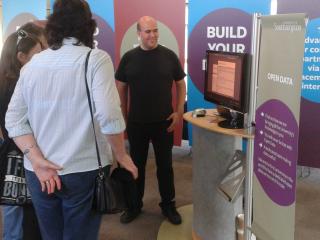
The main obstacle I needed to overcome was the fact that I’m not a salesperson. Coming from a research background means I’m comfortable talking to a large captive audience, but I had never before tried to grab people ‘off the street’ and talk to them personally about something they’ve probably never heard of, particularly if they have other goals in mind. Our stand was in a room alongside the accommodation service, the financial support service and the careers advice stand, all things that prospective students will actively seek out at open days. These stalls were pulling massive crowds, while myself, Pat and Chris were lucky to get more than a handful of people at any one time. As the few people curious enough to approach us on their own accord all asked us the same question – “What is open data?” – I can only assume that we were always going to be at a disadvantage by simply being something of which most people are completely unaware. Running a stand promoting something so new really does require a very proactive approach.
We tried to choose a good set of demos that really showed off how open data can be used to benefit students, and I made a point of not going too much into the technical details, as in my experience this tends to scare people off. My aim was to always start with a good opening gambit such as “can I show you one of the perks of studying at Southampton?” Once I had an audience, I began by explaining in 20 seconds what the Open Data Service actually do. Then I showed the data in friendly, non-technical form with the help of Colin Williams’ excellent Open Data Map. Depending on who I was talking to I then went on to demo our new bus finder service, which we’ll be launching officially in time for Freshers’ Week, and then my workstation finder. This was particularly good on the Saturday because most of the rooms on campus were closed for the weekend and showing zero machines available. I explained to prospective students that this is a possible stumbling block if you have a deadline on Monday and need access to a computer, but not if you have our tools, as you can find an alternative computer quickly without having to go around looking for one. All this, I felt, was a good way of showing the usefulness of open data without actually getting too technical. Of course, throughout the day I occasionally got to talk to someone hoping to study computer science, meaning I could talk to them more frankly and tell them that all the data is available for them to hack something together themselves if they so wish.
Overall, it went very well. I spoke to lots of people, and even if I personally didn’t convince anyone to choose Southampton, I think a lot of people went home a bit more knowledgeable about the value of open data. I guess getting up early and coming in to work all weekend isn’t everyone’s idea of fun, but we’re all about mutual benefits and this was a chance to promote the University and open data at the same time, so we were completely happy to do this. It certainly wasn’t without its rewards, either. My personal highlight was on the Friday afternoon. I managed to get the attention of a prospective student, and I spent a few minutes showing her the tools we provide and explaining situations in which they would be useful. She ran over to her parents and actually dragged them away from one of the other stands before excitedly asking me to start again and show them everything I’d just showed her. I guess I did something right!
Unplanned Outage
July 8, 2013
by Christopher Gutteridge
We had an unplanned outage over part of this weekend. This was due to a logfile unexpectedly growing huge. We do have monitors in place but this time we didn’t catch the alert emails in time. The log normally takes 3.2Mb per week, and last week using 25Gb!
Ash was working very hard all of Friday & Saturday, at the Open Days, showing off the Open Data Service to potential students and their parents.
Open Data Open Day – Hackers summary
June 27, 2013
by Patrick McSweeney
As you know from Ash’s previous post ran an Open Data Open Day for people in the University to come and learn about open data. As part of the event we invited the University top hackers to come and do some open data hacking. The template is one familiar to many of you who have attended our events or JISC hack days before. Simply get hackers to sit down together, form into teams of 2-5 people, give them a blank slate, float some ideas, keep coffee on tap and periodically wheel food in and out. At the end of the day go to the bar so that each team can present what they have been working on over a hard earned beer.
One of the key aims for the day was to link up people who had data with people who could do something cool with it. The hack day is a good way to do this because you have a room full of people who can do something cool. Then over the course of the day people with data drop by and talk to the hackers, tell them about there data and get ideas to do cool stuff. It is a friendly and informal environment to work in and people come out with some really good ideas. What always surprises me is, even though I have participated in at least 30 and run at least 5, the outputs from the day are always so amazing good. This hack day was no exception and our teams came out with a combination of the awesomely cool and mind-bogglingly useful stuff.
The outputs were:
LOD Search and the data.southampton.ac.uk usability study
Collin Williams (CISCO Systems) , Rikki Prince, Biscuits Newton and Andreas Galazis Decided the usability of data.southampton.ac.uk was not good enough for non-technical people. They performed a usability study of the site and identified key areas of weakness to feed back to us. The biggest problem they found was that the search on data.southampton was nearly unusable. To combat the problem they created LOD Search, a SPARQL smart search indexing tool which can generate a usual search engine on any SPARQL end point. The demo they presented was very very impressive and prompted a lot of questions from the audience. Attempts to trip up the system by asking for difficult things gave it no trouble at all and the interface was surprisingly good given the short time available to work on it.

Adam Field (iSolutions), Matt Smith (iSolutions) and Lisha Chen-Wilson (iSolutions) met Adam Tewksbury from the University transport office. He was looking for a cool map and video of cycle routes which he can embed in the transport website and attach to the open data pages and maps. The team took helmet cam videos and GPS data about the route and combined them to make cool video which moves the pointer on an open street map as the the video plays. The technique is very powerful and reproducible for any combination of video and GPS data in KML or CSV format. Hopefully this will result in more students and staff getting on to their bikes to cycles the safe routes of Southampton.

Exchange Calendar to iCal
Martin Chivers (iSolutions) spent a chunk of the morning in talks learning about the nuts and bolts of open data. In the afternoon he grabbed a laptop and cracked really big data.southampton.ac.uk walnut. He created a commandline tool which exports a exchange calendar as iCal. One of our big bug bears in open data has been getting data out of exchange and this tool hit the problem squarely on the head. In the past we have had to ask users with temporal data to set up an account on Google calendar since we can get data out of it but not from our own exchange server. Now users will be able to work in their normal workflow without having to use a tool outside of the University to do a fair ordinary task. As a demo he was kind enough to give us the iSolution change management calendar as open data.
Exchange Calendar to iCal on github

Southampton Blackout the real story
Tyler Ward (ECS) was more of a victim of circumstance than a hacking volunteer at our Hack Day. He was collocated with us to work on ECS’s media sensation Erica the Rhino but since he is keen got caught up in the open data hackery. The University of Southampton ran a media campaign called the Southampton Blackout to promote efficient power use at the University. The write up from our Comms team had some interesting mathematical inaccuracies which made the integrity of the finds questionable. Tylers aim was to use open energy usage data to tell the real story of the Southampton blackout. What he found is that some buildings during the blackout were using more energy not less to a level which almost eclipses the savings made in other buildings. He found some interesting trends in the data particularly in the figure below for ECS Mountbatten Silcon Fab lab. His close analysis of data was able to deduce where future campaigns should be targeting next an where savings can be made most easily.

All in all the day was a great success and lots of fun for the hackers involved. To quote Adam Field:
I had fun. It’s not often that I can take a problem and spend a day solving it.