Back to Reality (almost)
March 9, 2011
by Christopher Gutteridge
We’re spending this week catching up on little jobs we put on hold to get data.southampton ready on time, but there’s people who keep offering me data!
Unilink Happy
The Unilink office have offered to take over looking after the bike shed location data, as they look after that service. That’s great! Our goal is for the ColinSourced data to be slowly handed over to parts of the university administration, with his dataset left to be the odds and ends which nobody is specifically responsible for. We’ve also been discussing how to advertise the bus-times related features to students and Unilink users. I don’t want to dive in with both feet for a week or two, in case there’s issues that’ve not come to light yet. I’m dead proud of the fact that their receptionist told her boss “yes, I can look after that data, it’s just a google spreadsheet, it’s easy!”. That’s our goal!
Muster Points
I got a great suggestion from Mike, our facilities manager, that we could add public safety information about buildings. We don’t need every detail of every fire escape (there’s signs in buildings for that), but we could usefully add a list of first aiders and a map polygon of the muster point (which we can render on the building page). We’ve created a mini dataset for the ECS buildings muster points, but I’ve not yet had time to import it into the site.
Google data a bit Shonky
My contact for university buildings data pointed out (rightly) that we had the incorrect location on the Highfield Site page for a few things. That’s not my data!! It’s the labels added by Google based on whatever they’ve found on the web. In this case the data would be accurate enough if planning how to drive to the Gallery, but useless if you are plotting a site map.
I fixed it by just using “t=k” instead of “t=h” which turns off the labels from Google.
Of course the best way to get better data into Google is to publish it on the web! Anybody got any advice on how to get Google to read the locations of our stuff?
How does it all work, then?
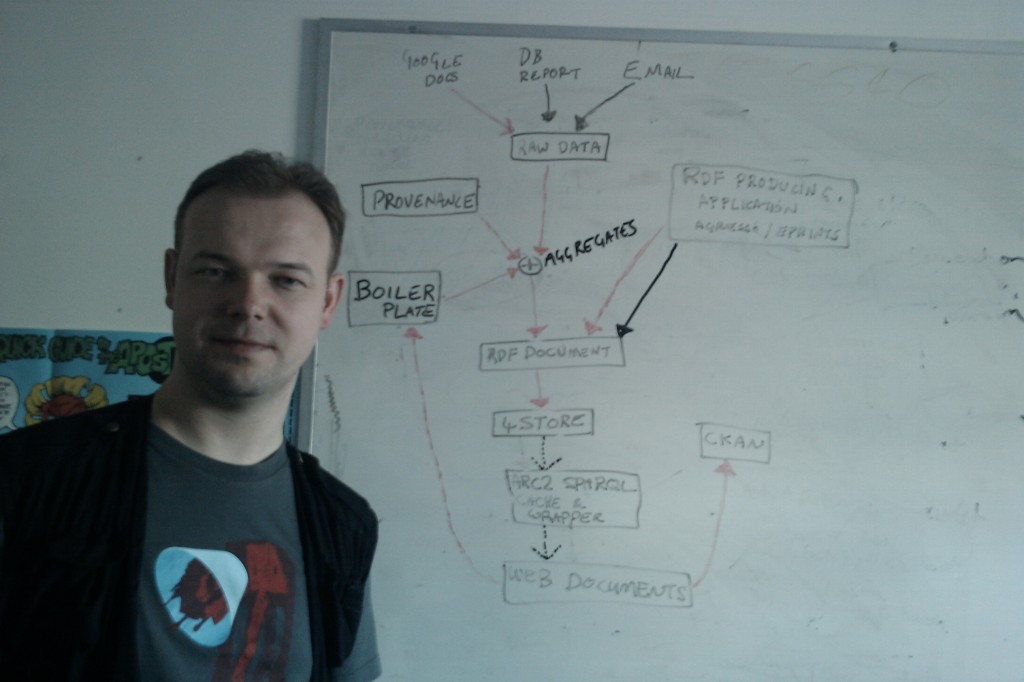
I’ll write on the Web Team Blog, sometime soon, an explanation of how the systems on the data site work, but for now here’s the diagram.
The first thing you’ll notice about this diagram is that I’ve had a hair cut. I really hated how I look in the last picture I posted here and was sick of trying to look after it. Fresh new look for Spring!
OK, the diagram has 3 colours of arrows but I couldn’t find 3 pens so the dotted arrows at the bottom are the 3rd colour. Doing more with less!
The black arrows represent manual processes like people emailing me data and me copying into the correct directory.
The red arrows are all the stuff which happen when I run “publish dataset” (warning Perl!).
The dotted lines are triggered when a request is made to a URL. It’s not very complicated and the script does most of the heavy lifting.
The long term goal is for something to download copies of spreadsheets (etc.) once an hour and MD5 them. If the checksum has changed since the last publication date, then it’ll republish automatically. That way I can leave it polling the spreadsheet describing the location of our cycle sheds, and if it ever changes it’ll republish it without bothering me. I work hard to get to be lazy later!
Dave Challis would like to point out that I’ve skipped all his clever stuff around the 4store and ARC section so he’ll write a post later to explain that in more detail.
Recognition Back Home
There’s been lots of tweets, but few blog posts about this site so far, but it’s nice to be mentioned on the hyper-local blog from my home town!
Categories: Data Ideas and New Data.


You look brilliant Chris, dare I say like a manager! Though a cool geeky t-shirt manager, so you’ve still got the edge – whew! Though I do hate how much younger you look than me now!