The GitHub, for those interested, for our WAISfest ’14 project is available here.
I spent a good portion of last week copying and pasting information from module syllabi (yes, that’s actually a real word) into something called Syllabus Editor. The specific details of this task are irrelevant, as I’m just using it as an introduction to something far more exciting. Anyway, several hours into the copy-paste wonder, Patrick promised me that the next few days would more than make up for it, as I was to be going to something called WAISfest (I’m ashamed to admit that the first time I heard it mentioned in conversation I thought I’d heard the phrase ‘Wastefest’, not quite as enticing…).
WAIS = Web And Internet Science (Research Group)
fest = festival. Though I hope you knew that part already.
So yes, WAISfest is basically a hackathon – people from within WAIS come up with a basic idea to work upon, people join whichever group sounds interesting to them, then three days later everyone presents their progress. Here has been my experience:
Day One, Thursday 31st July 2014: Wandering into the specified lecture hall at 09:30 I wasn’t entirely sure what to expect – I had been promised by Patrick that I’d have three days of over-stimulation, and the general attitude of everyone towards WAISfest seemed to be one of excitement. On entering the hall, there was a table with free tea, coffee and endless pastries. I am a student, free food is my raison d’être, we are off to a good start (Pastry Count: I).
After a brief introduction by Rikki Prince to a) what WAISfest is and b) the general plan for the coming days, people started to present their ideas. Amongst the ideas were things such as location-aware narratives, the distance at which some common websites are identifiable (or, as I like to call it, Rikki’s ‘Can people from the other side of the room tell I’m not actually working?’) and analysing images from Flickr to predict seasons. There were, of course, many more such topics, which you can read about here.
Presentations done, the leads of each group were dispersed throughout the room and the crowd unleashed upon them. As the more astute of you may have determined already, I went with the Flickr seasonal analysis choice, which was led by Dr. Jonathan Hare. Groups assigned (as it turned out, our group ended up as just Jon and myself), people dispersed and ‘work’ began – though not before stopping once more at the refreshments table (Pastry Count: II).
Jon had done some similar work at a previous WAISfest, plus had a convenient 46 million images (with their meta-data) downloaded from Flickr lying around, so we were in a good position to start working. The first steps were to determine how we were going to filter our data-set, and how we were going to analyse it. Our initial filter involved a simple grep on the meta-data, and after various trials and manual check, we decided to search upon the word ‘leaves’ – this gave us about 85,000 results.
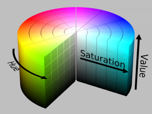
To analyse the images themselves we used OpenIMAJ to perform some basic colour analysis. We interpreted colour in the images using the HSV (Hue Saturation Value) colour space, then defined certain areas of the space as green (roughly 60 to 150 degrees) red (roughly 330 to 60 degrees), or black (the rest) – low saturation and low value areas were also defined as black. Each pixel of the image was then coloured accordingly, leaving us with trichrome resulting images. Ignoring the black, we could then calculate a ‘Colour Value’ based on the ratio of green and red, using a formula (that we may have made up) based upon the Normalised Difference Vegetation Index: (Red – Green) / (Red + Green), giving us between -1 (all green) and 1 (all red).
All of the actual analysis was completed using the Hadoop framework. Hadoop MapReduce is designed for parallel processing of large amounts of data across large clusters – we had a large amount of data to be processed, and access to a cluster, so it all rather made sense. Normally MapReduce consists of, unsurprisingly, map and reduce functions – the map transforms input key/value pairs to output key/value pairs, and the reduce generates the desired output from them. However, as our analysis was rather simple, we just had a single map function that took in a list of ID and image pairs and output ID and colour value pairs.
Mid-afternoon there was a coffee break held in the rec. room, most people showed up to discuss how everyone was getting along (Pastry Count: III). After a short break, we went downstairs and back to work (Pastry Count: IV).
Day Two, Friday 1st August 2014: Jon and myself met up at 09:30 at his office and got back to work. Our MapReduce had finished the previous evening, so now it was a case of visualising it and seeing if it came out as hoped. At 12:30 there was to be a presentation session with lunch – so we wanted to ideally have something to show by then.
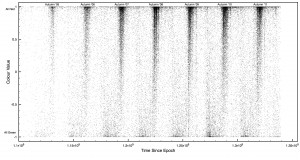
On looking over the data, things actually seemed to be coming out the way we wanted (I’m still always a little surprised when things come out as expected). We managed to get some basic plots (of colour value vs. time) knocked up in time for the lunch session in order to show our progress. These plots showed high clusters of red images every autumn, and smaller clusters of green every spring – the colours correlated to what we’d hoped, and it also hinted that people took more photos of trees in the autumn (which does make sense).
After lunch we got back to work (Pastry Count: V), and back to a more complicated visualisation. Using OpenIMAJ with the colour value, latitude, longitude and date of each image we created a visualisation which showed the location of each image over time, as a coloured dot. This was then overlayed onto a map of the world, to give clearer perspective. This resulted in a rather pretty display, which showed some rather interesting data: Focusing on East Coast US, as that had a huge amount of data, you could clearly see the cycle from green to red, and back, over the years. The red would also sweep down from the North each autumn, following the pattern you’d expect of seasons – our analysis (on some level) had worked.
With some initial visualisation complete, it was decided to go back and try to retrieve more data. A quick script was written up to search through the title, description and tags of the image meta-data looking for specific words (a smarter search than using grep) – we then searched for ‘leaves’ again, but this time with many foreign translations slotted in; ‘hojas’, ‘bladeren’, ‘löv’, ‘laub’, amongst others. This resulted in about 90,000 images, surprisingly few more – this may very well be a product of the demographic of Flickr. Another Hadoop MapRedudce was left to retrieve the matching images, and we left for the weekend.
Day Three, Monday 4th August 2014: The final day of WAISfest, time to bring everything together into something presentable. Before that, however, we had a few more things to do. The first of which was a comparison of our results to the NASA MODIS NDVI. The MODIS images were downloaded and greyscaled, then our data was aggregated into 16-day windows to align with them. For every point of data we had, we then analysed the corresponding location from the MODIS data to see if there was any correlation. A positive correlation was found, with a gradient of about 0.15 – not perfect, but it was there. These comparisons were then turned into another visualisation, showing the average colour of latitude-divided strips for both sets of data over time.
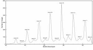
A final few other graphs were created, showing images taken over time (ignoring the colour index) to build upon the earlier trend found that people take more photos of leaves in the autumn. It was shown that the number of photos taken in autumn were many times greater than those in spring, the second most common time of year. Interestingly, it also showed that (from our available data of pre-2012) there were fewer images in 2010 and 2011 than there were in 2009 – whether this is indicative of less attractive autumns, a decline in popularity of Flickr, or any another reason, I am not in any position to tell. These final graphs, along with everything else created thus far, was wrapped up together in a presentation to give that afternoon. We never did include the image data from our second sweep…
Everyone gathered in the (freezing cold) lecture hall come afternoon to present their findings. I cannot begin to give a summary of all the different outcomes, but it seemed that every group had fared well, and WAISfest ’14 seemed to have been a success. Our presentation also seemed rather well received, so I cannot complain. This was followed by a gathering in the coffee room with pizza, drinks and cakes (Pastry Count: VI). Not a bad end to a pretty good few days.
Overall WAISfest ’14 was a lot of fun, and I also learnt a fair bit (I’ve been meaning to look into Hadoop for a while). It was a great event that provided something different and creative, and I hope that I’m available next year to partake again.
Apologies if some of the first links to people/events aren’t working, they’re behind the ECS login and not available elsewhere.


0 Responses
Stay in touch with the conversation, subscribe to the RSS feed for comments on this post.