
We love data here in MLE. We already release the workstation availability data used by open data and use even more open data in apps like MySouthampton. Last week we released a different type of information.
Panopto has some detailed statistics within it. If you are an instructor on a course you can see some detailed graphs for your videos using the Stats button (http://support.panopto.com/documentation/video-management/viewing-folder-statistics), but until now it’s been difficult to see how the entire service has been performing. Last week we released daily statistics for views, unique viewers and hours viewed for the entire site going back 5 years.
If you would like to use the data, you’ll find it here: Google Docs. If raw data isn’t your thing, then take a look at the graphs below to see how Panopto usage has increased year on year.

Panopto hours viewed, 2010/11 against 2011/12

Panopto hours viewed, 2011/12 against 2012/13
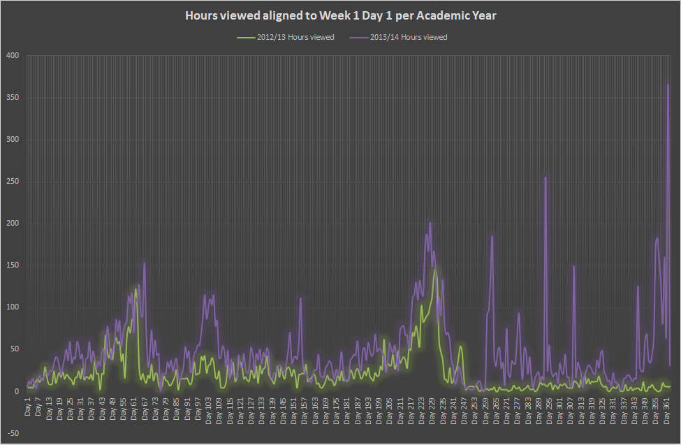
Panopto hours viewed, 2012/13 against 2013/14
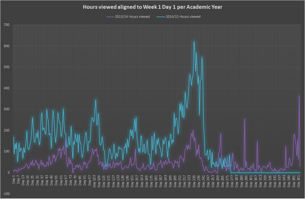
Panopto hours viewed, 2013/14 against 2014/15 (to date)
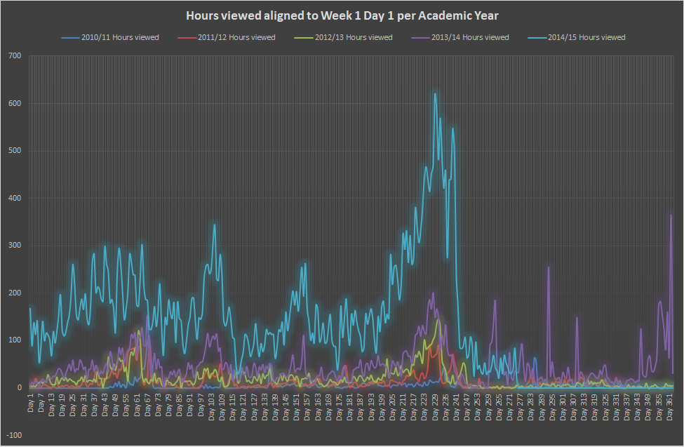
Panopto usage from 2010 until July 2015