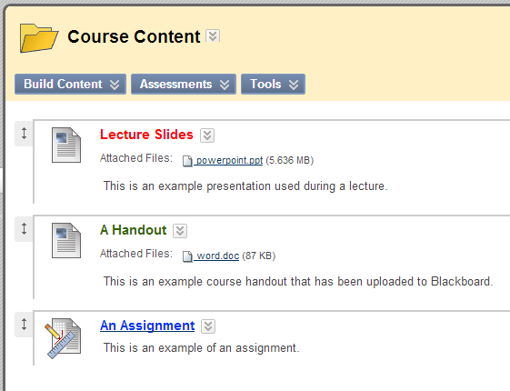
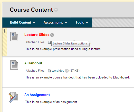
When we upgrade Blackboard this summer, there will be a number of updates to the user interface. Blackboard has listened to feedback from users who found the user interface too cluttered.
The main theme of the new interface is to only see icons when you need to, rather than seeing them all the time.
Watch this video to find out about the updated interface with a focus on the action button.
Below follows more detailed explanation and screenshots.
The action button
We click on the action button when we wish to edit or change an existing piece of content.
In our current version of Blackboard the action button is shown beside every relevant item all the time while Edit Mode is enabled.
When we upgrade Blackboard instructors will find that the action button is only shown while their mouse is hovering over the item they wish to change. This reduces on-screen clutter.


