It’s love data week starting Monday 15th February. I like playing with data but am so better at finding interesting ways to visualise it than I am at interpreting it!

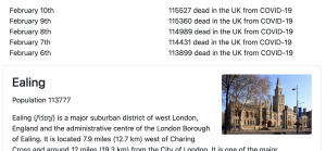
As of the 6th of February, more people in Britain have died with a COVID diagnosis than the entire population of Ealing.
The data that impacts all of our lives right now is the UK COVID statistics. Helpfully, these are available from an API. My first idea for this data was to try to find a way for the numbers to land with people in an emotional way. I hit on the idea of showing milestones in UK COVID deaths in terms of city populations, getting the data from DBPedia. However this was a bit sparse so I expanded it to any “UK settlement of 1000 or more”. Sadly, we were already past that threshold when I wrote it. You can see my COVID cities tool on the web, and the code is available from GitHub.
I thought a lot about how R is a terrible value for public understanding. R=0.9 good, R=1.1 bad. It’s a measure of change in scale but not in a format anybody uses in their daily lives. I figured the one place the public are comfortable with exponential growth rates is mortgages so a clearer number would be, say, (R-1)*100 which would give a +/- percentage of new cases per case. But R is also very difficult to relate to what’s going on and what’s likely to happen next. It also really matters what the current number of cases are. Occasional spikes in R when there’s 10 cases a day isn’t a big concern. When there’s 1000 cases a day it really is. So after a lot of though I’ve made a visualisation that shows things I think are more useful for public understanding of what’s going on with COVID.
 My COVID projection page shows the data I think is useful. The grey barchart is the 7 day averaged number of cases. The green & red bar is the daily change (this is very smoothed out by working out the weekly change in the 7 day average and converting that to a daily change. I think this is a really good indicator of when things were getting worse and better rather than the case numbers themselves. To make the recent values visible I truncated the really big growth from earlier in the year so it didn’t skew the scale too much.
Next I wrote a function to work out how long it is taking cases to double or halve. I think this is a really good way to explain why the virus is different to cancer. This virus can double in cases every three days which sounds more like a loan shark than a mortgage. Writing this equation meant that I used log() for the first time in a really long time!
The final column is what I think of as the “EEEP!” factor. It projects today’s cases (not the 7 day average) by the current growth rate for 28 days and sees where we’re heading for if things don’t change. For this to be a concern cases have to be high AND increasing. I think that EEEP! factor is good for showing why lockdowns were needed.
The final feature I added is to mark weekends and the national lockdowns and other events – although this is complicated buy the fact that NI, Wales, England & Scotland may not quite be doing the same thing as each other.
You can see that lockdowns followed peaks in the “EEEP!” factor, although lockdown #2 was several weeks after Eeeeep #2.
What it does show is that contrary to what you’d believe from my Facebook feed, there was a sustained fall in cases for many weeks after the Cummings incident. It makes it very visible when lockdowns started working and it does show a few notable spikes in the rate of increase – red peaks in the red/green column, which suggest something caused them in the days or weeks before hand.
Notable peaks in the rate of increase were July 8th, September 12th, October 9th, December 22nd, Jan 4th. I’m tempted to correlate Schools and Universities reopening and Christmas to explain the Sept, Oct and Jan peaks but correlation/causation and all that. I have no guess at what caused the spikes in July & December. Any ideas?
I’m not an expert at interpreting data so please don’t quote my interpretations of this data as a source of truth!
[UPDATE: I got inspired this morning to add a new column, “Doublings” which shows how many times cases have to halve to get back to 1 case. Obviously by that point cases from borders will be more of an issue that community transmission, but it’s sobering to see that with lockdown it takes two weeks to halve and to get to 1 case would take exactly half a year, so mid-August. Hopefully Summer and vaccines will change this picture]


Would be interesting to do this with hospitalisations rather than cases. Is that data available anywhere?
That data is available from the API. I’ll see how hard it is to add an option.
Turns out it was really easy to add.
New Admissions: https://www.southampton.ac.uk/~totl/UKCOVID/projection.php?metric=newAdmissions
Hospital Cases: https://www.southampton.ac.uk/~totl/UKCOVID/projection.php?metric=hospitalCases
For a list of valid metrics see https://coronavirus.data.gov.uk/details/developers-guide#structure-metrics and open the list.