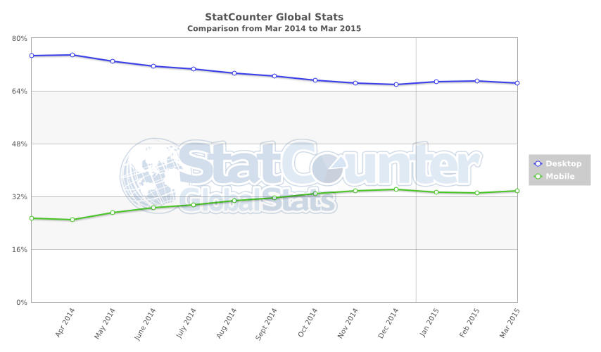
A Wireframe design is a screen blueprint of application, and the wireframe could help understand the vision of application. And the design is shown below.
1. index page:
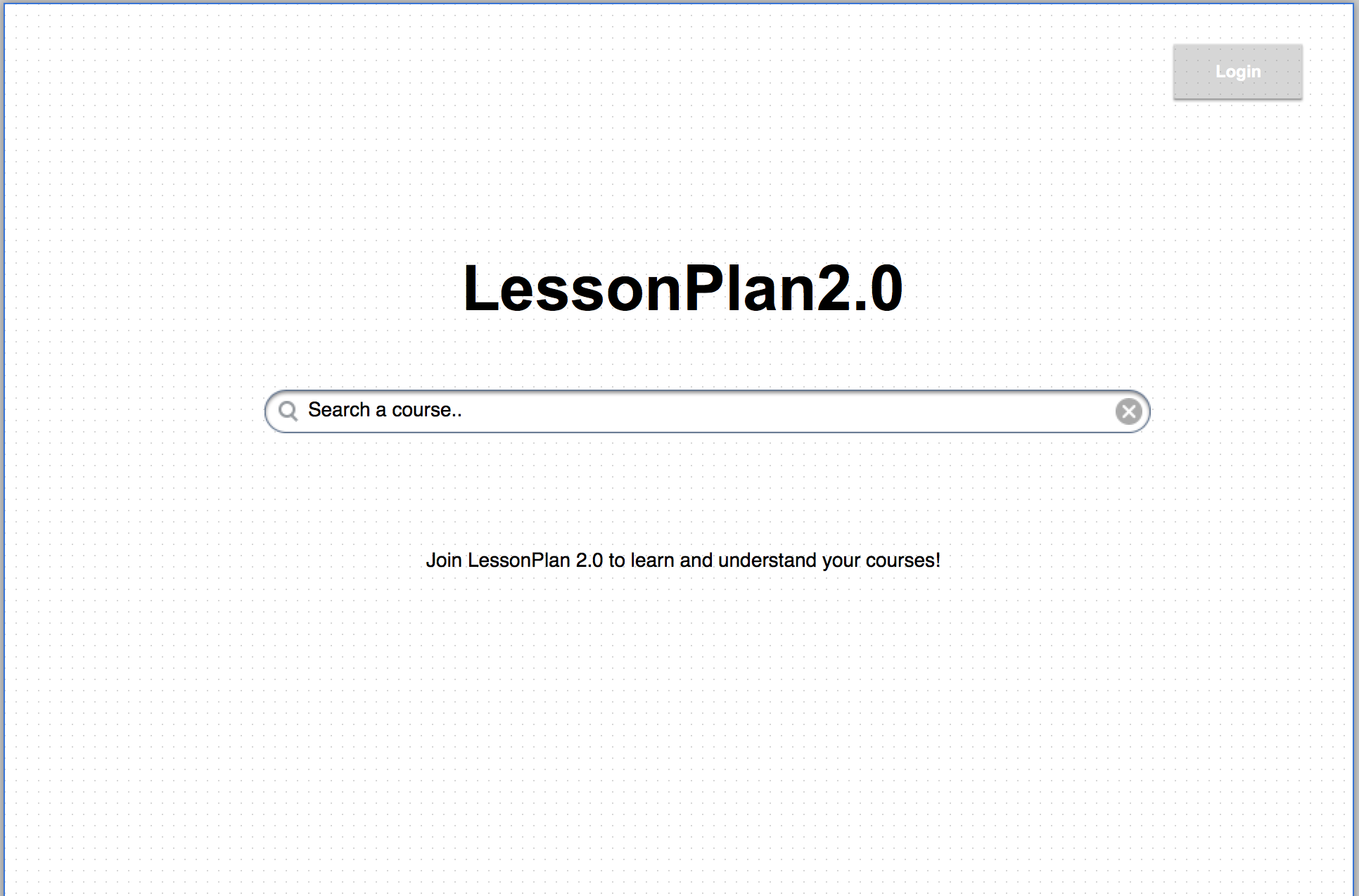
Because the system allow user view the rating and review without login, the search function does not require user to login. But user could also choose to login to use the system, and the button at top would show as “MyAccount”.
1-1 index page without login
1-2 index page with login
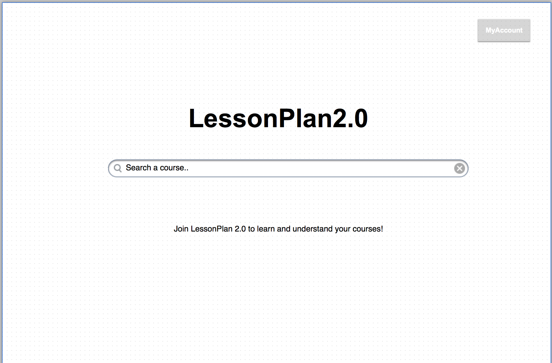
2. Search result: The result would show the course name, and the school name will shown below.
2-1 search result without login

2-2 search result after login
3. The description of module page: A module page has three parts: Description, Rating, and communication.
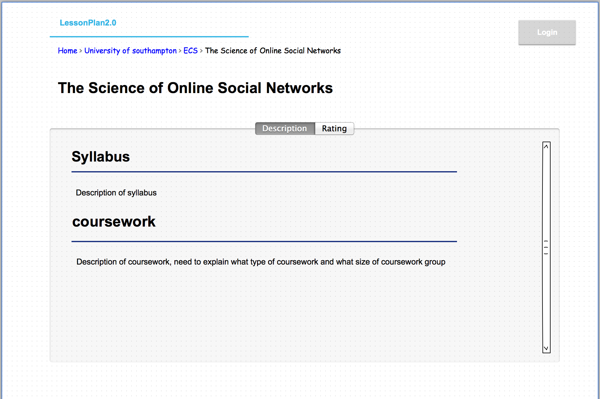
3-1 Description page. without login
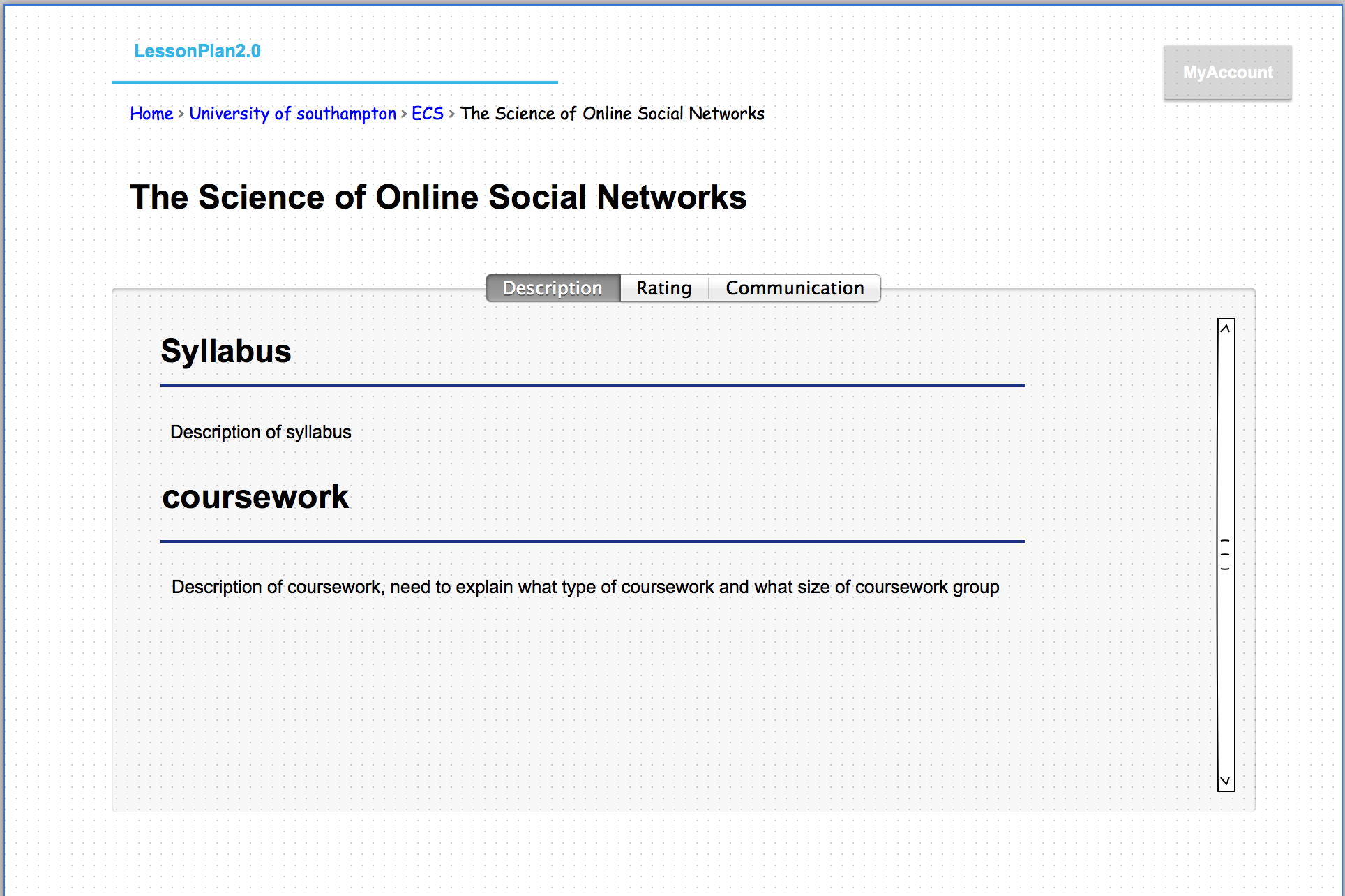
3-2 Description page after login. If the user has enrolled the course, the page would should the “communication” tab.
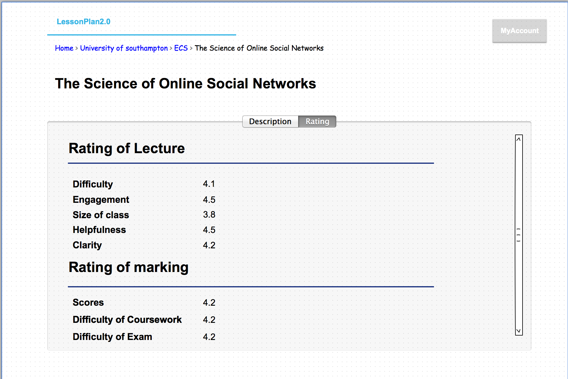
4. The Rating of module: if a user
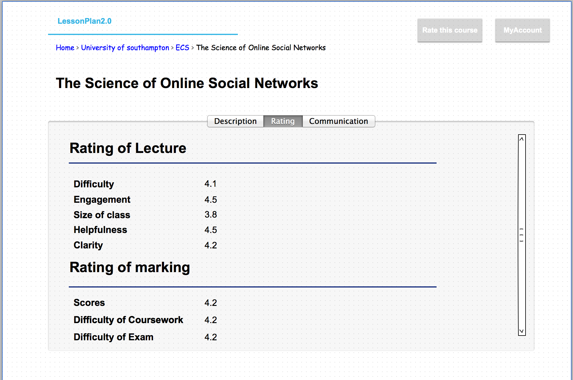
4-1 The Rating page with a enroll user. There would be a “Rate this course” button shown.
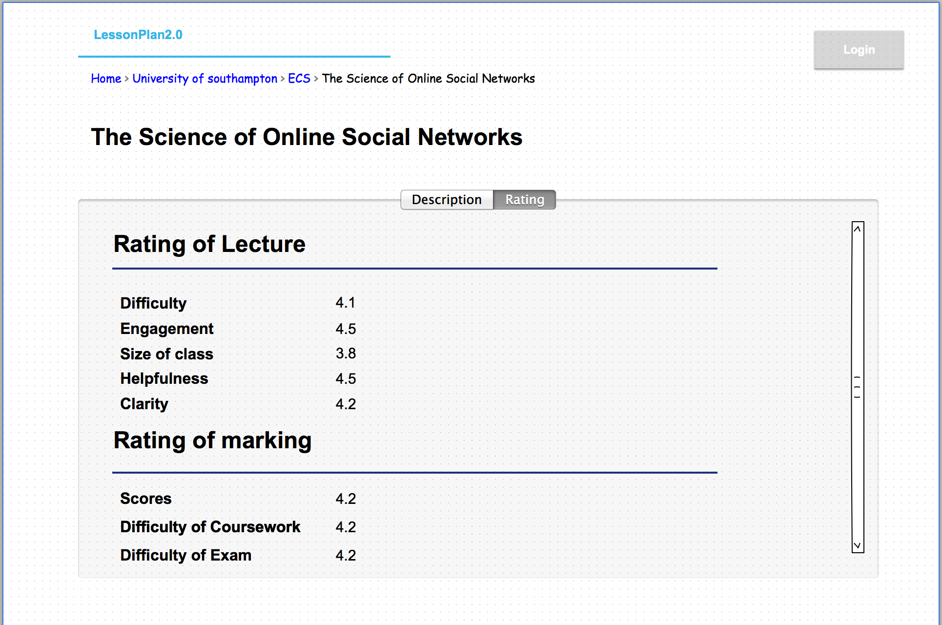
4-2 Rating page without login
4-3 A logon user but not enroll would see the page similar with user without login.
5. Rate a course:
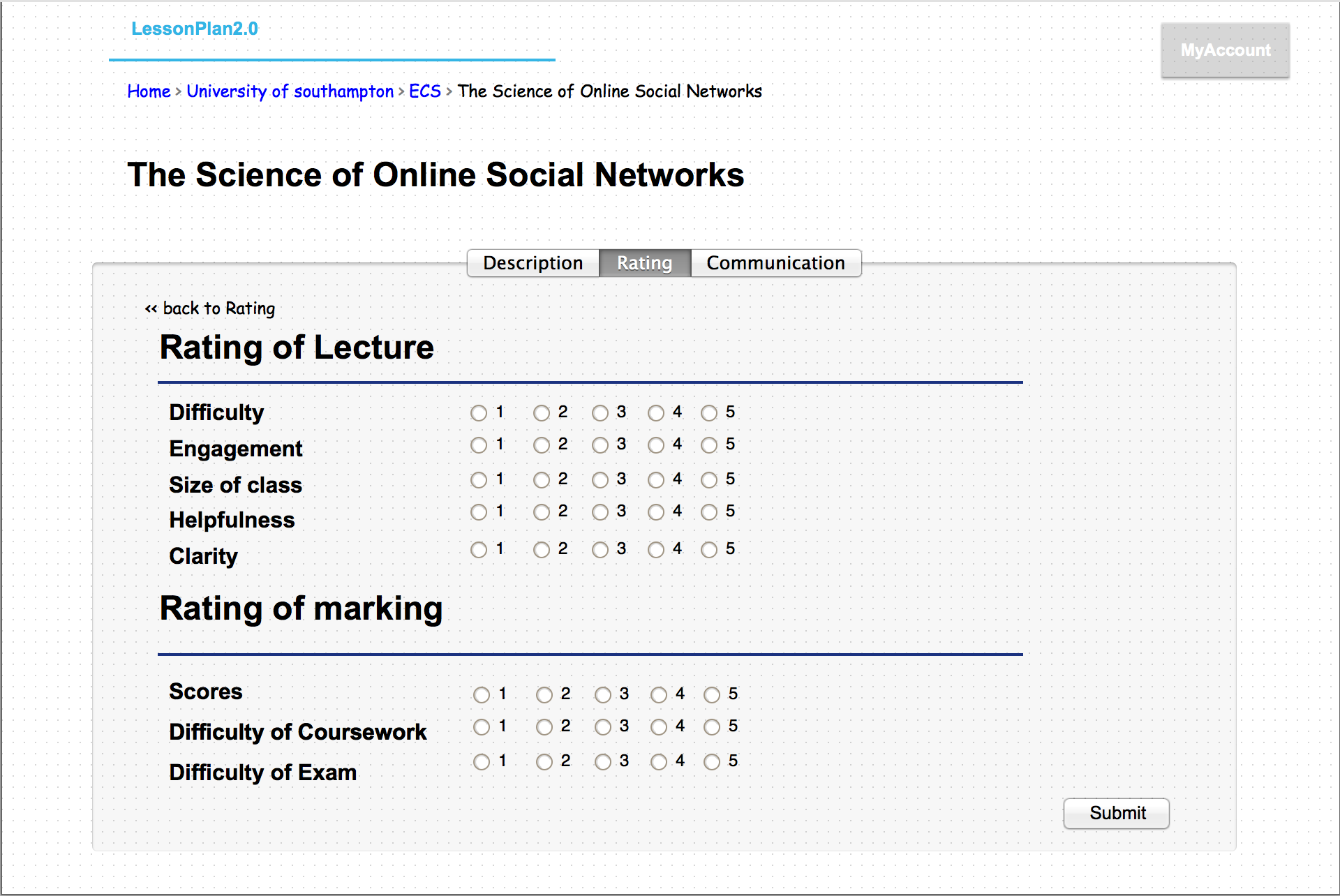
5. A enroll user could rate the course.
6. communication: The system allow user to post and make comments with their classmates.
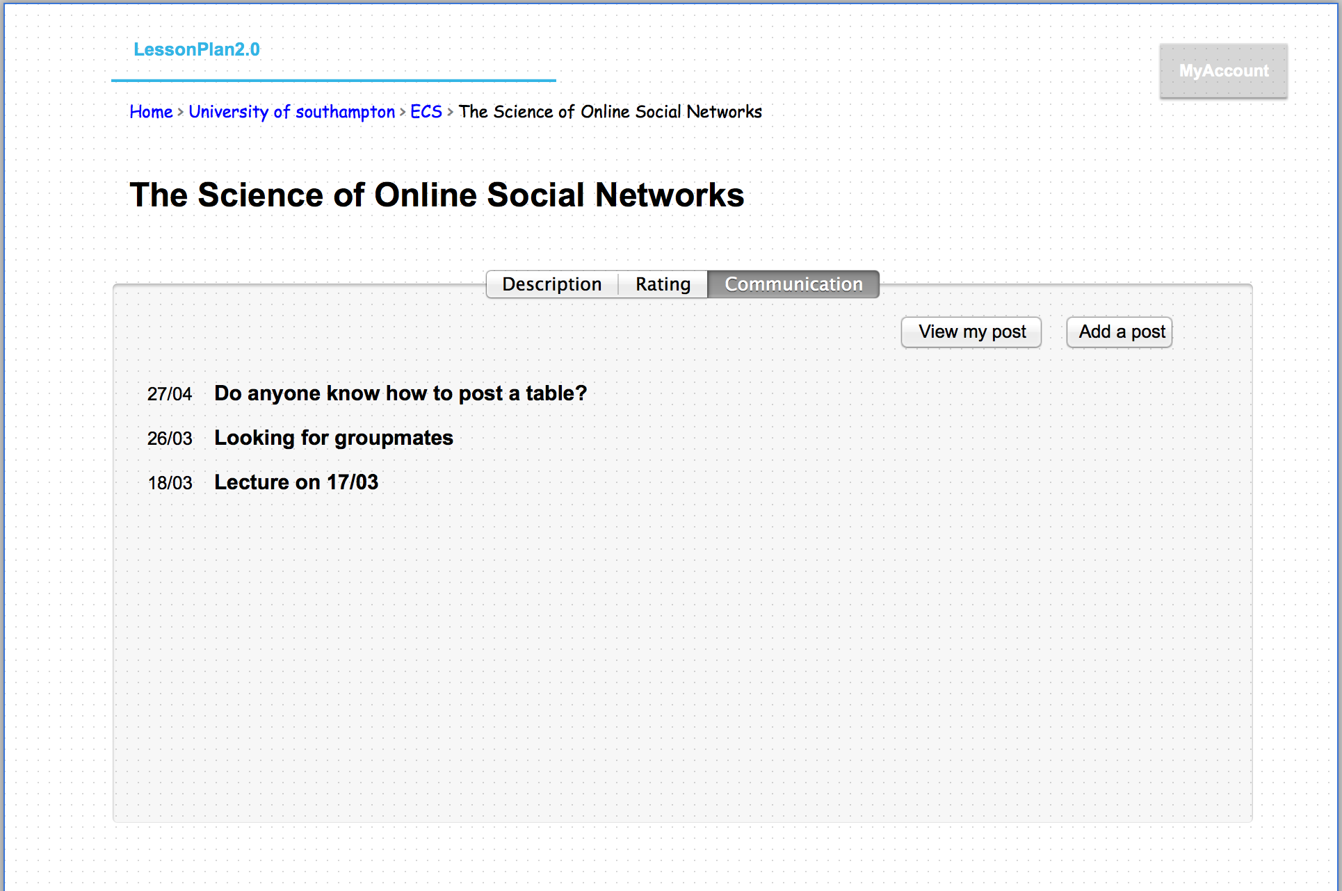
6-1 Communication page, would see all the posts on it. And user could view their post or add post.
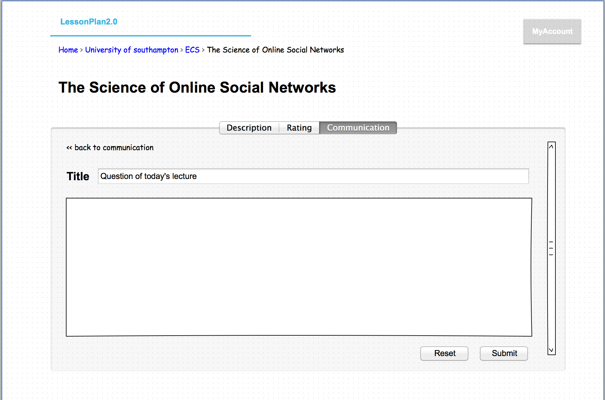
6-2 Add a new post.
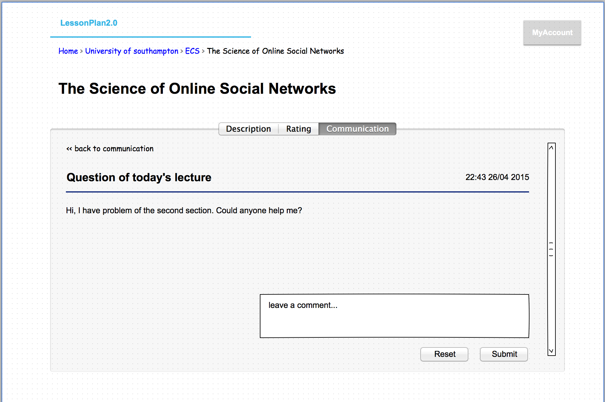
6-3 inside the post. user could make comments
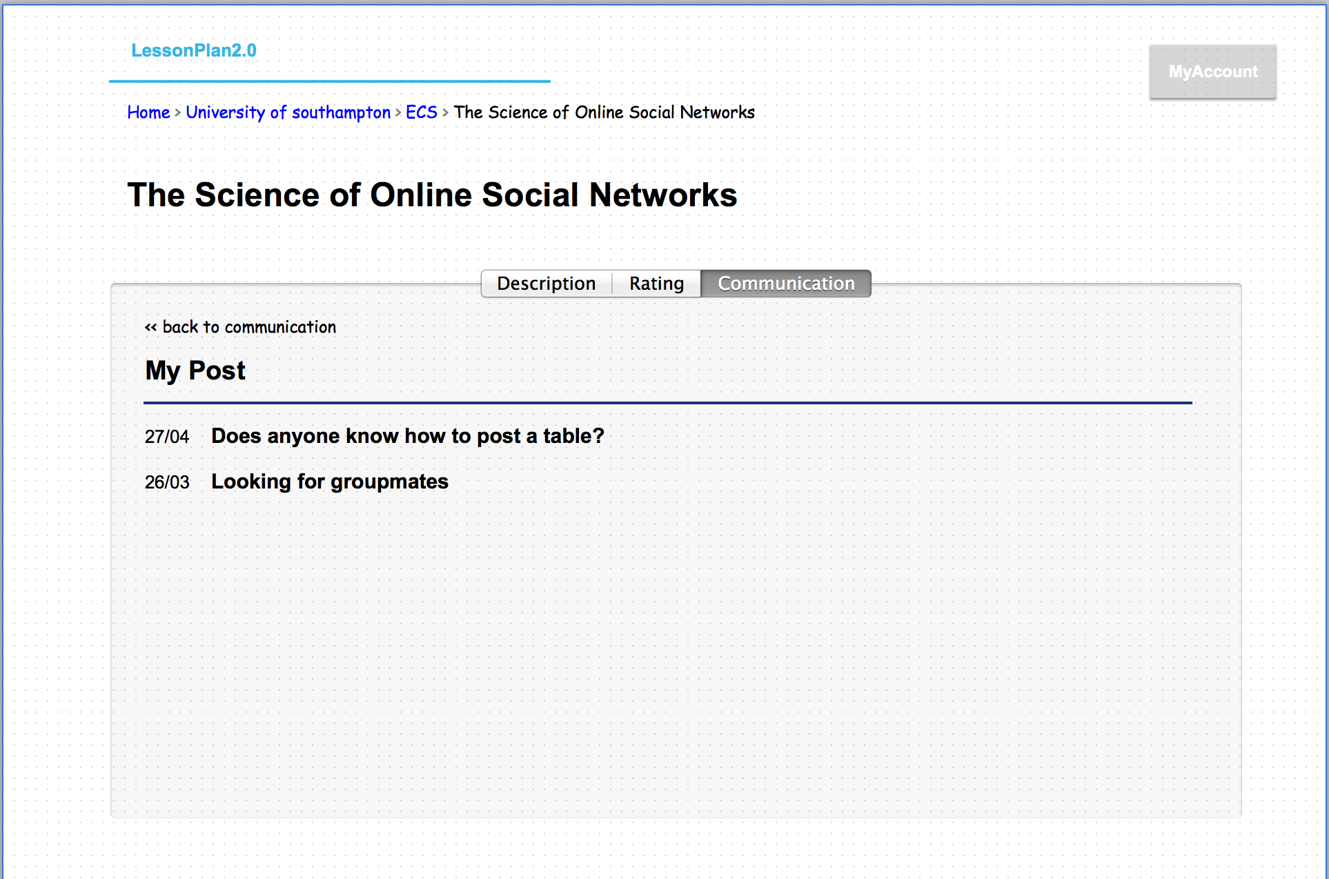
6-4 user could view all their posts.
7. Account: this page include the profile and courses taken.
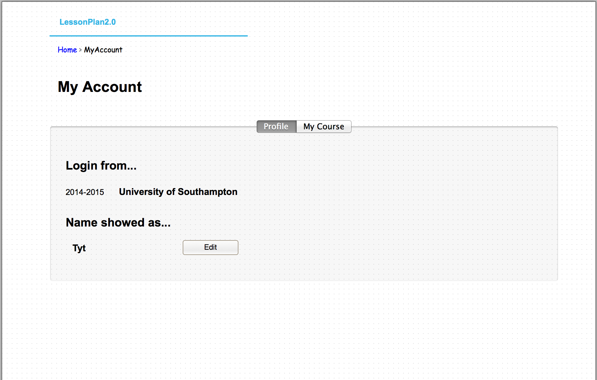
7-1 the profile tab would show where user login from and their nickname.
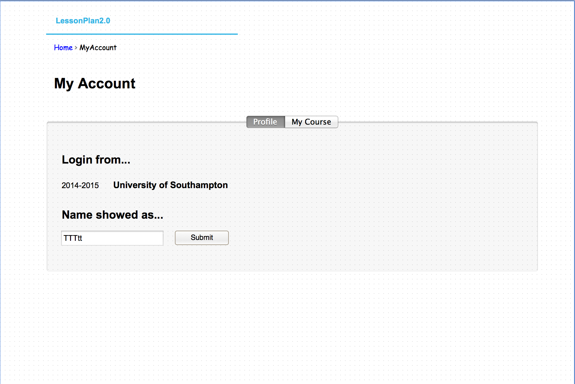
7-2 user could edit their shown name.
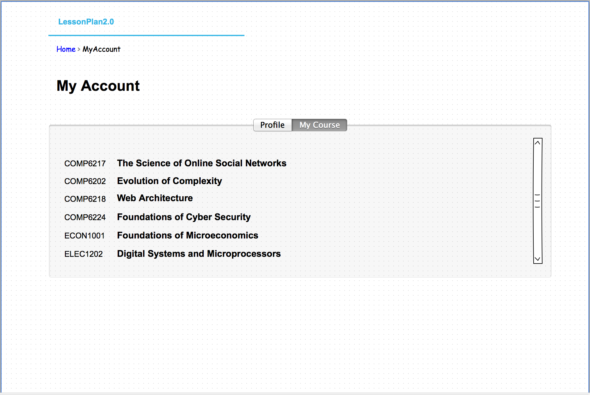
7-3 The course page would show all the courses taken