
In this modern era of digital consumption, mobile phones and tablets are an ever increasingly popular way of accessing websites, both at home and on the go.
In fact, according to StatCounter, mobile devices now account for a third of internet traffic.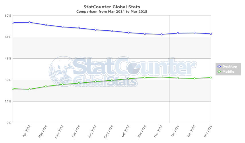
With this in mind, we will be designing our website with a responsive design. This means that on small form-factors, such as mobile and tablet, the layout will automatically adapt to be more appropriate. This approach will ensure full functionality of the site for all users and will be achieved using the Bootstrap CSS framework. Bootstrap is a framework that helps developers build “mobile first” apps with numerous helper classes that perform the adaptation automatically.