Archive for category Innovation and Creativity (Idea)
TravelSafe Key Features Demo
Posted by Ashiru Ali in Conclusions, Design, Innovation and Creativity (Idea), Media Use on 29/04/2015
As the conclusion to the project the group would like to demonstrate how the app TravelSafe may be used. Download version can be found in TravelSafe Key Features Demo
The demo draws upon multiple design and engineering stages that have been developed throughout the project, for example logo and wireframe designs, emphasis is placed on the key features of the product; obvious screens such as “Login” (or authentication via the API of popular social networks), “Logout”, Language Translation” have been left out of this demo.
This post represents a visual conclusion to the project and summarises the product in a clear and concise way. As a result it also summarises the design steps that occurred throughout the project, illustrating the developmental story. The presentation and designs are both innovative and creative.
Project Conclusion
Posted by Briony Gray in Conclusions, Innovation and Creativity (Idea), Media Use, Structure and Story on 29/04/2015
Summary of the project
The aim of the project was to conceive, research and design the TravelSafe application to the point where it can then be subjected to extensive product testing, qualitative and quantitative research. As part of this development the group has kept an online journal that records our work out-put, project decisions and research outcomes in a clear and professional manner. These are easy to access and to follow, and are tagged in a coherent way that corresponds to the marking criteria. Each member has contributed to the online portfolio, and consequently to the development of the product.
Throughout the portfolio the group has explained and recorded many posts which illustrate a number of criteria. These include: an analysis matrix to compare multiple different suggestions, success criteria, similar applications research, establishing a target audience as well as justifying the reasons behind platform choice and pricing, determined a project methodology, sought and adapted the project to expert advice, numerous designs steps including theory and logo designs, numerous engineering steps and diagrams such as UML and class diagrams, utilised background research to influence engineering steps, and developed a product that may fit into a potential market.
What the group has produced
The One Percent are pleased to announce the introduction of the TravelSafe application and its video demonstration.
TravelSafe is a mobile application for anyone travelling anywhere in the world, whether at home or abroad. The application will consist of a safest route generator, which generates three safe routes from point to point, as well as a safety rating of areas within a given city which are both generated using open data and crime statistics. It will also provide travel information, such as bus and train times, locations and maps as well as weather information including severe weather updates and safety tips compiled from embassies, the World Health Organisation and social media and news feeds. Other functions will be the ability for the user to input information such as their travel insurance, flight details and important numbers, such as a lost credit card and incorporation of translation functionality. Finally, there will be a resource pack available to download which will provide a summary of the information and can be accessed offline to avoid roaming costs.
Next Steps
Our next steps are to collate our work so far in order to pitch the idea of TravelSafe to a Dragon’s Den panel. We will be pitching for funding to help us continue with the user-based research for our application, as well as the costs of implementation and testing. This is of paramount importance to the product as in order for the app to advice on safety all data sets, usability and reliability must be at the highest level otherwise individuals may potentially be put in danger. Any remaining funding will then be used in the process of releasing our application, such as advertising initiatives including a company website.
Broken down, these are the proposed uses for the funding:
- market research: from user focus groups to expert opinions, funding will be used to attract participants and host these events in order to obtain a better understanding of the types of users and their ideas for the application
- implementation: if needed, money will be used to cover any costs for licensing, hardware or software
- testing: as with the market research, funding will be used to gather groups of users in two stages to test prototypes of the applications
- release: funding will also be used to release the application to the market, covering costs such as advertising and the creation and hosting of a business website
extra: any leftover funding will be used to cover overheads such as staff costs as well as further development costs as needed. This may vary depending on test results and dataset reliability.
Written by Briony and Emily.
This post represents Structure and Story, Creativity and Innovation categories within the marking criteria. This is evident as the post sums up the overall project, presents the product the group has created, outlines future steps for its development beyond our project and demonstrates innovation and creativity in both product idea and future considerations.
Cost Analysis for Future Testing
Posted by Po Ting Tse in Conclusions, Engineering, Innovation and Creativity (Idea), Media Use, Structure and Story on 27/04/2015
Introduction
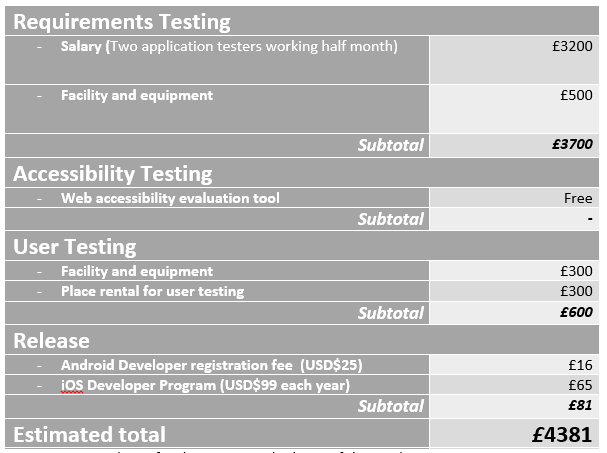
Based on the future test plan and refined project plan, this post presents a vague cost analysis for the testing and release of the product.
Requirements Testing
The requirements testing contains 17 tests, which relate to 11 functional requirements and 6 non-functional requirements. The application will be tested with free automated validation tools.
As scheduled, the whole testing will be assigned 15 days, with 2 application testers working full time. According to ITJobSearch.co.uk which monitors the UK IT job market, an average annual salary of software testing job is £38,000. Therefore, the salary for hiring two application testers during the testing periods would be estimated to be £3200.
On the other hand, the facility and equipment cost may contribute to around £500, which includes buying two mobile devices for testing.
Accessibility Test
This test will be assigned 8 days to complete. Since the group will use free web accessibility evaluation tools (Pearce, 2015), no software fee contributes in this test category.
User Testing
This test will be assigned 8 days to complete. Firstly, it was a tough decision to decide how many users would be involved in the user testing, since the number of users will affect the estimated testing costs and time required. Researchers have various opinions on the number of users involved in the user testing, some suggested 5 users would be enough (Virzi, 1992), some claiming that 5 was not enough (Spool & Schroeder, 2001), while some suggested it should be around 8 to 12 (Hwang & Salvendy, 2010), and some claimed that 15 could cover most of the usability problems (Jakob & Landauer, 1993).
The group decided to keep the voluntary users number above all of the minimum ones that researchers suggested. Finally, the group agreed that the minimum number of user will be 2 sets of 15 voluntary users, resulting 30 users in total. By assuming each user contributes to £10 of the place rental cost, the place rental for user testing would be £300. On the other hand, the facility and equipment cost may contribute to around £500, which could be buying one additional mobile device for testing.
Release cost
The release cost is basically the publishing fees on different mobile application platforms. Up to 25th April, the Android Play’s (http://developer.android.com/distribute/googleplay/start.html) registration fee is USD$25 (ie. £16) and the iOS Developer Program’s (https://developer.apple.com/programs/ios/ ) is USD$99 each year (ie. £65/year) .
Estimated total cost for the testing and release of the product
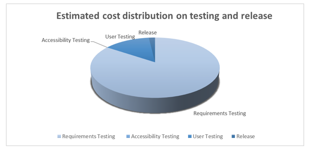
Therefore, table 1 is the estimated cost for the testing and release of the product, which the total cost would be £4381 . From the pie chart in figure 1, the requirement testings dominate the cost, while user testing and release cost result are less than a quarter of the cost.
Table 1: Estimated cost for the testing and release of the product
Figure 1 Estimated cost distribution on testing and release product
Conclusion
This post gives a vague cost analysis for the testing and release of the product, and the estimated total cost would be £4381. The costs mentioned above are minimal expenses. Other factors, such as using proprietary software, recruiting users for testing and marketing, are not be considered in this analysis.
This post represents considerable consideration of the product above and beyond the marking criteria and the success criteria, showing innovation. It illustrates a realistic plan for a cost benefit analysis of the product which would be a vital component to testing and further development, showing story and structure. It also features media components to illustrate this such as a pie chart. Finally, this post discusses the break down of engineering stages and the costs that these would have.
References
Hwang, W. & Salvendy, G., 2010. Number of people required for usability evaluation: the 10±2 rule. Commun. ACM, 53(5), pp. 130-133.
Jakob, N. & Landauer, T. K., 1993. A mathematical model of the finding of usability problems. ACM Proceedings of the INTERACT’93 and CHI’93 conference on Human factors in computing systems., pp. 206-213.
Pearce, E., 2015. Future Test Plan for the App. [Online]
Available at: http://blog.soton.ac.uk/onep/2015/04/27/test-plan/
[Accessed 25 April 2015].
Spool, J. & Schroeder, W., 2001. Testing Web Sites: Five Users is Nowhere Near Enough. In: CHI ’01 Extended Abstracts on Human Factors in Computing Systems. Seattle: ACM, pp. 285–286.
Virzi, R. A., 1992. Refining the test phase of usability evaluation: How many subjects is enough?. Human Factors: The Journal of the Human Factors and Ergonomics Society , 34(4), pp. 457-468.
By Po Ting Tse
TravelSafe Logo Designs
Posted by Briony Gray in Design, Innovation and Creativity (Idea), Media Use on 05/04/2015
An important consideration for the usability and desirability of Apps is the visual aesthetics (Airey, 2009). These may potentially convince new users to use the app based on their interests coinciding with the image presented with (Pittard et al., 2007). Literature and market research was conducted, and certain resources were deemed useful in the creation of designs for web apps, this can be found in the Design Theory post. The literature is listed in the references below. The media resource on web design for mobile applications can be found here https://www.youtube.com/watch?v=r3sDuuWC6-Y, and designing tips for cross-platform apps here https://www.youtube.com/watch?v=0oS-tvCUbBs
Based on these we have decided to make a range of designs for the app logo that summarise the features of the app while presenting a ‘travel friendly’ vibe. They also take into consideration design decisions that literature suggests is important for apps: this includes having a clear message, using neutral colours, having easy to read text, having a well laid out image, and having a logo that an individual will remember easily(Adams et al., 2006; Airey, 2009). The final designs are listed below:
Design number 1 corresponds with the success criteria of good market design stipulated by Airey (2009) and Pittard et al., (2007) as it features neutral colours that apply to both genders, it projects an image of travel which reflects one of the primary uses of the app, it presents a friendly image which users may trust and feel safe using, the image also uses neutral colours which presents a colour theme, the image is surrounded by negative space which draws the eye to the simple image, and finally it is clearly laid out with a spaced title and no other text.
Following on from design number 1 above, design number 2 (right) is a slight variation of the design success criteria previously stated. This design features a number of colours which lend the user to think that travelling is exciting and diverse (Airey, 2009), the image shows a suitcase which strongly represents the notion of travel which is a primary use for the app, the suitcase has surrounding objects such as a map that further illustrate travel, the bold white title draws the eye as the image has may different colours, the title is clearly laid out with no other text.
Following on from design number 1 above, design number 3 (left) is a slight variation of the design success criteria previously stated. This design is very simplistic and minimalist which allows the image to represent that app rather than allowing colour or image to takeaway from its message. In this design the image highlights the presence of safety while using the app, that it can be trusted easily, and that the design is no-fuss and so the app should be no-fuss. In addition it has a clear and laid out title which indicates the app name, featuring no other text.
Following on from design number 1 above, design number 4 (right) is a slight variation of the design success criteria previously stated. The design is extremely clear and simplistic and only features a title, which ensures that the user knows exactly which app they are using. The design features no images, and minimal colour to highlight the title which keeps user attention of the name of the app. This is effectively cutting out image association with an object or service, and instead encourages the user to learn the app name directly (Adams et al., 2006).
Following on from design number 1 above, design number 5 (left) is a slight variation of the design success criteria previously stated. In this an image of the world in shown held in a pair of hands, indicating that travel it within the users own hands. Although the colours are fairly vibrant, they are limited which creates a colour theme. The title is clear and spaced which draws the eye as it is framed by the image behind it. No other text is featured making it easy to read. However despite the global imagery there is no other indication that the app can be used for other travel purposes such as transportation services or route generation.
To decide which design to pick we have held a vote with all group members in which each may choose a favourite. The result of this was that design number 1 embodied all design choices stipulated by literature, and was liked the best by the group. In addition to this these five logos have been presented to the experts interviewed regarding the app features. The expert opinions will serve to better guide our decision as to which design to choose as our final app logo. The expert guidance and opinion post will follow shortly.
Written by Briony.
This post represents that the group has chosen appropriate economic and social Contextual Factors that directly link to the marking criteria, and are vital to understanding what requirements app design has. This is based on market analysis, evaluation, and expert opinions. There is evidence that research has been chosen intelligently (by reference to literature and analysis) to produce a conclusion of professional quality, leading to a successful product.
This post additionally represents Engineering and Design decisions. These are based on the Contextual Factors and literature review which the group have tailored the product to incorporate. This means that the app design has considerable research, fluent design and well planned steps to achieve this. This post illustrates how and why the product has been influenced in its design, and shows how engineering this app feature will solve problems, and how the product will further incorporate design decisions.
In addition, this post illustrates considerable use of media, innovation and creativity. This is apparent through applying Contextual Research, Design steps and engineering guidelines to produce logo designs which contribute to the product, summarise what the product does, and provides visualisations that align with the target market.
References
Adams, S., Morioka, N., & Stone, T. L. (2006). Logo design workbook: a hands-on guide to creating logos. Rockport Publishers.
Airey, D. (2009). Logo design love: A guide to creating iconic brand identities. New Riders.
Pittard, N., Ewing, M., & Jevons, C. (2007). Aesthetic theory and logo design: Examining consumer response to proportion across cultures. International Marketing Review, 24(4), 457-473.
Similar Applications
Posted by Emily Pearce in Contextual Factors and Research, Innovation and Creativity (Idea) on 05/03/2015
As part of the research the group conducted into the market and the features we wanted to include, the group wanted to find out what is already out there. There are huge numbers of articles referring to the best travel apps, but below is a breakdown of some applications available on different platforms and that each have a different feature that is going to be incorporated into TravelSafe. At the bottom of this posts are links to related articles from a number of different sites and contributors identifying the top travel applications.
Journi [1]
- social network for sharing posts (pictures and notes with geolocation) to a shared timeline
- can invite friends and family and send them automatic updates in real-time via web/app/email
- further sharing to Facebook and Twitter
- Apple only, Free
- weaknesses: lack of geographical ties or tagging, no offline resources, no travel information.
StaySafe [2]
- GPS tracker app that emails or texts the users exact location to emergency contacts if you don’t check-in (e.g. after working, socialising, travelling alone)
- Works with “sessions” – need to have checked in by end of session
- Apple and Android, £4.99
- weaknesses: No offline resources, no user input to improve safety ratings, expensive.
AroundMe [3]
- finds nearest restaurants, banks, gas stations, book hotels
- Apple and Windows phone, Free
- weaknesses: No real time updated information, no travel information, no offline resources.
EmergenSee [4]
- With just a click of a button, you can transmit video, audio and GPS to your selected friends and family so that they can hear, see and track what’s going on. They can alert authority if you can’t
- Apple and Android, Free
- weaknesses: No user input to improve datasets, no travel information, no offline resources.
TripIt [5]
- consolidates all your travel reservations (hotel, air, car rental etc.)
- Can share itinerary with friends and family
- Apple, Android, Blackberry, Free
- could link this to travel alerts and updates?
- weaknesses: No specialised travel tool such as a route generator, no safety ratings.
AllSubway [6]
- maps for subway and metro in cities around the world
- Apple only, 79p
- weaknesses: No safety information or tips, no offline resources, competes with paper copies in a city.
Road Buddy [7]
- checks publically available police data on criminal damage, drugs offences, public disorder and violent crime and then plots a route avoiding as many as possible on Google Map
- Firefox OS only but planning to expand
- weaknesses: No offline resources, no user input to improve datasets.
SafeRoute [8]
- US only
- Android only, 60p
- provides GPS enabled crime statistics and safety levels for every city in US providing there’s enough crime data
- Provides safety levels for each zip code in some major cities
- Also has comments from users section
- Removed from app store due to pending patent infringements
- weaknesses: Not an original app, no user input, no offline resources, no travel information.
Conclusions
It is apparent through market analysis that a majority of travel and safety apps either do not charge for use, or charge a minimal amount. Therefore in order to keep within the trend of this market TravelSafe should do this is also, which will ensure that it fits the needs of the target audience. Another key trend with the apps evaluated is that often the name of the app corresponds to the basic concept of the project in a few words or less. Again, this is another consideration for the group’s own project, which the current name TravelSafe reflects well. Finally, a noticeable trend with the apps reviewed is that none of them feature more than a couple of definable features, such as emergency contacts input or travel information. This is where the TravelSafe app will find its niche market as it will combine multiple features where existing apps only combine two or three. In order to decide on these apps however, the group has asked for expert advice to help guide the project as the success criteria dictate that the project must not be subjected to extensive qualitative or quantitative tests at this stage.
Based on the weaknesses of these apps, the group are now in a position to create a short-list of app features which other apps in the market to not appear to fully meet. A large consideration for this list is for the TravelSafe app to utilise multiple features. The combination of these features will ensure that TravelSafe is unique, and offers something more than the others on the market.
This post represents that the group has chosen appropriate economic and social Contextual Factors that directly link to the marking criteria, and are vital to understanding what requirements the product will have. These take the form of market analysis, evaluation of existing products, and identification of app features. There is evidence that these have been chosen intelligently (by reference to literature and analysis) to produce a conclusion of professional quality, leading to a successful product.
In addition there is evidence of Innovation and Creativity which is shown via tailoring the group project to address existing weaknesses of app’s in the target market. Subsequently this shows that the product has gone beyond expectations by meeting a genuine gap in a market, which leads to a commercially viable product idea.
News Articles
“The World’s 50 Best Travel Apps” – David Clack (http://www.timeout.com/travel/features/1169/the-worlds-50-best-travel-apps)
“10 best travel apps for iOS and Android” – Jessica Naziri, 2014 (http://www.techradar.com/news/phone-and-communications/mobile-phones/best-travel-app-1278014)
“Best Travel Apps for 2015” – Alexandra Talty, 2014 (http://www.forbes.com/sites/alexandratalty/2014/12/11/best-travel-apps-for-2015/)
“Top 20 best travel apps: recommended by SkyScanner” – James Teideman, 2013 (http://www.skyscanner.net/news/top-20-best-travel-apps-recommended-skyscanner)
Written by Emily.
References
- Journi, 2015, Travel Blogging rediscovered [Online] [Available at: https://www.journiapp.com/] [Last Accessed: March 2015]
- Safe Apps Ltd, 2015, Stay Safe – Smart Personal Safety [Online] [Available at: http://www.staysafeapp.com/staysafe-personal/] [Last Accessed: March 2015]
- Flying Code Ltd, 2015, AroundMe – Because you’re going places [Online] [Available at: http://www.aroundmeapp.com/] [Last Accessed: March 2015]
- EmergenSee App, 2015, EmergenSee Personal Security System [Online] [Available at: http://emergensee.com/] [Last Accessed: March 2015]
- Concur Technologies Inc., 2015, Tripit – All of your travel plans on-the-go! [Online] [Available at: https://www.tripit.com/uhp/mobile] [Last Accessed: March 2015]
- AllSubway, 2015, AllSubway [Online] [Available at: http://carmat.altervista.org/AllSubway.html] [Last Accessed: March 2015]
- Warman, M., 2013, Road Buddy mobile app plots safe routes to walk home, The Telegraph [Online] [Available at: http://www.telegraph.co.uk/technology/news/10047029/Road-Buddy-mobile-app-plots-safe-routes-to-walk-home.html] [Last Accessed: March 2015]
- GeoOasis Inc, 2011, SafeRoute, [Online] [Available at: http://www.geooasis.com/SafeRoute/] [Last Accessed: March 2015]
Choosing an Idea with an Analysis matrix
Posted by Briony Gray in Innovation and Creativity (Idea), Structure and Story on 28/02/2015
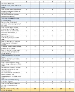
After our initial meeting we decided to go away and individually research a possible idea for our group project. We wrote out 15 criteria that these would be marked against by using the assessment criteria listed in the module’s resource specification. In the next meeting we pitched each idea to the rest of the group, and discussed our thoughts and considerations on a number of topics. For instance, if there was a limitation to someone’s idea we discussed a way in which it could be improved or changed to better meet our deciding criteria before deciding on a project. Once each idea had been pitched and discussed we wrote an analysis matrix, plotting each of the ideas against the criteria and one another. This allowed us to clearly identify stronger ideas based on the assessment criteria, and is shown in the table below. Taking each score into account we also held a group vote so that each member’s concerns and preferences could be taken into account. The list of our 6 ideas are explained below:
- Meeting scheduler
The number of back and forth emails that have to be sent to decide on a convenient date for both people, with tools and technologies available to us, planning a meeting should be a lot easier than it is. Existing technologies like Google, Apple and Microsoft calendars haven’t made this easy on a large scale, however smaller versions and applications exist. Therefore I propose a single page app that that allows users manage and schedule meetings; including meeting places and times. The main Technologies is will use are HTML 5 geolocation, Email API, Google MAP and Places API, and a Calendar. Useful features may include the use of common types of meeting Templates, frequently used days, time and places, meeting with multiple people, a Mobile app version and a possible business case. It would benefit members of a business, friends, family, and institutional staff.
- StudnetLinks
Although this idea is widely known and fairly popular it still poses a problem for students. This idea addresses the limitations in the article “Can social network improve project management”, and can be tailored specifically for group coursework for university students. The key areas it addresses are students complain that “group coursework” assessment is not fair sometime, despite of distribution of marks, and international students facing social and communication problems because of originating from a different education system. The focus therefore is workgroup assignments and final projects, aiding all types of students from different backgrounds in order for them to feel like the work has been fairly distributed. The features of this are as follows:
– All modules have their own page each of which can allow students share their profiles. This is in order to help students get each other and each one knows others’ skills.
– Each student posts their skills, his/her background and area interested in.
– After students grouped up a close and secrete should be created.
– Each group page should provide area for update codes, Q&A as well as enables students to schedule tasks and alert them at the deadline for each one.
– At the end of coursework, a report on proportion of student’s contribution should be issued (AS GITHUP)
– An area for posting stuff related to the modules (AS A DISSCUTION AREA IN BLACKBOARD)
– With regard to subject of dissertation, some of projects are varied. For example, the final project would be on disabilities, so I do need writing about laws of disabilities and I don’t have any idea about. Thus, I need to contact with laws’ students to explain some critical points and where I can find that. This is just an example.
– Search for students in particular department would be easily.
- Travel Safety app
This idea is a travel safety app which alerts travellers about tourist black-spots and suggests detour routes to avoid going unsafe areas The information is contributed from the social network and other reliable media. The app may have the features as follows:
– It can suggest the most safe route, and give useful guidance/tips (ie. be careful to the pickpocket before taking the train in Paris)
– It will make use of social networks to connect travellers and its news
– Verification of taxis/ tour guides/ hotels/shops/restaurants/police office (prevent illegal operators, black taxis or being overcharged)
– Alert travel updates
– Detect user’s current GPS location and provide suitable emergency contact.
– Provide corresponding embassy details, credit card lost emergency call, insurance company details and claiming procedure
- Tool to improve existing group sites in academia
Based on the literature I have been reading it suggests that group study for university students in particular could greatly be improved by better management tools, as in most cases students prefer to use social media as a lack of any other competitive options. Specifically I think it should target existing student-based sites that aim to help project management, such as Medeley, and identify how they could be improved. Often this will be something along the lines of ‘it doesnt have an option to invite others to meetings’, or ‘for a project papers that the group are reading can’t easily be stored in the same place for all to have access to’. We can then propose key changes (or a new site entirely) that improves the weak areas, I.e. a group discussion area in blackboard, paper sharing, meeting planning, and personal deadlines all in the same space.
- Online Memorials
This idea is based upon the collection and presentation of personal information after someone has died. In many cases when someone dies their social networking profiles remain, but act as a place for friends and family to visit to remember them or leave comments. However, a majority of people actually have more than one profile on social media sites, and these aren’t linked up. For example if you gave a family member permission to change your account if you have died, they would not have the same permission on another social networking platform, so your profile on one site may be a cut-off memorial that not everyone can access. This idea is for a tool that scrapes information from each of these platforms (once a family or friend has permission to do so) and displays it on one profile/site, thus making it easier for everyone to see.
- Charity Crowdsourcing
My suggestion for our social network was something that combines crowdfunding and charity donation sites like JustGiving. This idea is that people can have a profile, show interest in charities/causes etc, create events for fundraisers that people can join in with or do at the same time elsewhere (for example, how Macmillan coffee morning takes place in lots of different places, run by lots of different people but all on the same day) – basically a platform for allowing this.
In conclusion we have picked idea number 3, the travel safety application, as it fits both the most criteria in the matrix, and each member was happy with the idea. Further research and a gantt chart mapping out the stages of our project will follow shortly.
This post represents that coherent structure and story are present in the portfolio which uses the entry and tags mechanism of the blog system. It tells the story of the project by explaining individual roles clearly, explaining why these were decided, and what outcome they will produce later on in the project.
In addition this post represents Innovation and Creativity by identifying a project idea in a novel and well-informed manner.
This post also represents that the group has chosen appropriate criteria for the comparison of ideas that directly link to the marking criteria. The analysis matrix criteria were chosen intelligently to produce a project of professional quality, leading to a successful product.
Written by Briony.
Introduction to Our Project
Posted by Briony Gray in Contextual Factors and Research, Innovation and Creativity (Idea) on 27/02/2015
Welcome to the blog of Group 4 in The Science of Online Social Networks!
As our introductory post we would like to explain how the first few weeks of the course have shaped and produced an intriguing project idea, and the future steps we plan to take to develop it further. We would also like to introduce our ‘company name’, based on the internet culture and lecture topic of the 90 – 9 – 1 percent rule (Hargettatai and Walejko, 2008):
We are ‘The One Percent’.
The purpose of this blog is to have a professional digital narrative of our project, which includes all of the choices and decisions that we have made, and the outcomes these have produced to our idea. Consequently this is a great resource for the members of the group who can access data and information quickly and easily. It is also a great tool for understanding our project – it allows the reader to follow the process of our project at each and every stage. Not only does this include all of our research, designs and engineering development: it also shows you the aspects that rarely cross over into fortfolios. For example, the problems that we faced throughout, a sense of the group dynamic and productivity, and the human discussions that were present in meetings throughout.
Over the previous few weeks we have been brainstorming thoughts, producing innovative ideas and addressing the existing weaknesses of social networking websites and App’s. These include the expectations vs reality of online privacy (Gilbert et al., 2011), a limited number of app features per project (Gavalas, 2011), and language barriers for a an increasingly global technological trend (Godwin-Jones, 2011). Our ideas covered a wide spectrum of potential projects: ranging from sites for improved group project management for university students, a site for arranging meetings using personal preferences of local areas, charity fundraising combined with crowdsourcing, to the scraping and storing of personal data across platforms to create an ‘online memorial’ for those who have deceased.
Despite many promising propositions, we have selected our final project idea which takes the form of an app designed for safer travel. This was done by creating an analysis matrix, which compared each idea to a number of criteria, which included the marking criteria of the project and what we personally felt the idea must incorporate in order to be innovative and successful. You can find the analysis matrix here. But what use is an idea without any in depth background research?
The next week was spent researching a number of aspects regarding the app, which included:
- Identifying a set list of features it was going to have based on a market evaluation of similar travel apps. The features we have selected, although a majority of which already exist, do not feature in one single app for easier use (Gavalas, 2011). Fully researching and designing how they may work and interact with one another is therefore extremely important for the production of an app which is original in the safety market by having multiple features.
- Our target audience, a vital consideration for much of the design-work. Both surrounding literature and market evaluation suggests that there is not an age group most likely to travel, and so our app must be user-friendly and easy to use for a wide range of ages. This represents vital market information from which we may learn a lot, and in turn tailor our own application for greater success. For example, through this we may identify a target audience for safety applications, and in response we may incorporate this audience into our own project projections.
- Economic and social factors that require consideration, for example should we charge money for our app? This may be vital market research as knowing the economic background of the market may dictate whether the public perceives charging to feel safer as morally viable or not. This would ensure that our pricing choice coincides with the trends in the market we aim to be a part of.
- Identifying potential datasets we could use for certain features, for example the use of governmental open data crime statistics to generate a ‘safest’ route for a traveller. This again represents vital background knowledge which will contribute to a smoother running application. In addition to this, it may further help determine the pricing of our app as open sets may keep set-up costs low, allowing us to reduce app cost should we feel this ties in with our market analysis.
This research has produced an initial framework for our app, and a themed name which is ‘TravelSafe’:
TravelSafe is a mobile application for anyone travelling anywhere in the world, whether at home or abroad. The application will consist of a safest route generator, which generates three safe routes from point to point, as well as a safety rating of areas within a given city which are both generated using open data and crime statistics. It will also provide travel information, such as bus and train times, locations and maps as well as weather information including severe weather updates and safety tips compiled from embassies, the World Health Organisation and social media and news feeds. Other functions will be the ability for the user to input information such as their travel insurance, flight details and important numbers, such as a lost credit card and incorporation of translation functionality. Finally, there will be a resource pack available to download which will provide a summary of the information and can be accessed offline to avoid roaming costs. The app features will be developed and researched later in the portfolio. You can skip to determining app feature research, expert opinions regarding features, and specific feature posts beginning with the Safest Route Generator onwards.
In the upcoming weeks we have a planned out a number of stages that will develop our project further, these take the form of:
- Designing interface and graphics of the app
- Demonstrating examples of code that are linked to certain features of the app
- Examples of the datasets that will be used to produce personalised information within the app
- Platform considerations
This post represents that coherent Structure and Story are present in the portfolio which uses the entry and tags mechanism of the blog system. It tells the story of the project by explaining individual roles clearly, explaining why these were decided, and what outcome they will produce later on in the project.
In addition this post represents Innovation and Creativity by demonstrating ideas that are original and beyond the expected thinking for this assignment – this is clear by the niche product design that is commercially viable in its target market.
This post also represents Contextual Considerations that take the form of background research, social and economic considerations, technological considerations, and most importantly using the research learnt to shape the development and outcome of the product.
This post lays the foundations for strong design and engineering steps later on in the project.
References
Gavalas, D., & Economou, D. (2011). Development platforms for mobile applications: Status and trends. Software, IEEE, 28(1), 77-86.
Gilbert, P., Chun, B. G., Cox, L. P., & Jung, J. (2011, June). Vision: automated security validation of mobile apps at app markets. In Proceedings of the second international workshop on Mobile cloud computing and services (pp. 21-26). ACM.
Godwin-Jones, R. (2011). Emerging technologies: Mobile apps for language learning. Language Learning & Technology, 15(2), 2-11.
Hargittai, E., & Walejko, G. (2008). The participation divide: content creation and sharing in the digital age 1. Information, Community and Society, 11(2), 239-256.
