Archive for category Design
TravelSafe Key Features Demo
Posted by Ashiru Ali in Conclusions, Design, Innovation and Creativity (Idea), Media Use on 29/04/2015
As the conclusion to the project the group would like to demonstrate how the app TravelSafe may be used. Download version can be found in TravelSafe Key Features Demo
The demo draws upon multiple design and engineering stages that have been developed throughout the project, for example logo and wireframe designs, emphasis is placed on the key features of the product; obvious screens such as “Login” (or authentication via the API of popular social networks), “Logout”, Language Translation” have been left out of this demo.
This post represents a visual conclusion to the project and summarises the product in a clear and concise way. As a result it also summarises the design steps that occurred throughout the project, illustrating the developmental story. The presentation and designs are both innovative and creative.
Future Test Plan for the App
Posted by Emily Pearce in Design, Engineering, Structure and Story on 27/04/2015
Before the group begins implementation, a test plan has been developed to demonstrate how the TravelSafe web application will be tested and the tools that will be used, in order to provide an idea of how the success of the project will be determined.
Requirements Testing
| Test No. | Requirement | Test Description | Test Values | Success Criteria |
| F1 | The system must be able to allow a user to search and select a location based on GPS data | Open the application and use GPS data to select the user’s current location to be used with the application features | GPS data | The application pinpoints the users location and transfers this information to the next screen for use with functionality |
| F2 | The system must be able to allow a user to select a location from a list of saved locations | Open the application, select ‘View Saved Locations’ and then choose a location to be used with the application features | Saved Locations | Saved locations can be viewed and selected with the location transferred to the next screen for use with the functionality |
| F3 | For each location it must be able to generate three point to point safe routes using area safety ratings | Select ‘Route Generator’ | User’s current location and input destination | Three routes are generated from point-to-point with any necessary safety warnings labelled |
| F4 | For each location it must be able to provide a safety rating of a user’s surroundings area based on publicly available crime data | Select ‘Safety of Area’ | Location data | The application will pinpoint areas to avoid/be careful of with the reason numbered and displayed in a scrollable list |
| F5 | For each location it must be able to provide travel information from publicly available times and maps | Select ‘Travel Information’ and choose from Bus, Train, Underground or Travel Alerts | Bus Locations | For each transport type, a map of the stops and a timetable should be displayed |
| F6 | For each location it must be able to provide weather information from publicly available updates | Select ‘Weather Information’ | Location data | A 5-day forecast for the current location is displayed as well as a list of weather warnings |
| F7 | For each location it must be able to provide an updated news feed from RSS feeds of news and safety tips from Government sources | Select ‘News and Updates’ | Location Data | A scrollable list of breaking news and safety alerts, sorted by timestamp (most recent first) is displayed, with any safety alerts locked to the top of the list |
| F8 | For each location it must be able to download a pack of the data that can be accessed and used offline from on-device storage | Select ‘Download Pack’ | Location Data | The user can open an application specific folder on their mobile providing the information for the selected area |
| F9 | Provide translation functionality through use of the Google Translate API | From the home screen, select ‘Translate’ | Free text input:”Je t’aime TravelSafe” | User can select translation languages and Google provides translated text as well as an audio recording |
| F10 | Have a section dedicated to user-input information as free text | From the home screen select ‘My Travel Information’ | Free text input”Lost Credit Card Contact: 01111 111111″ | The user is able to store data in this section, with no limitation on character type |
| F11 | Be able to save new locations | Load a location and select ‘Save this location’ | Location Data | The user can click save on a location and it will appear in the list of saved locations |
| Test No. | Requirement | Test Description | Test Values | Success Criteria |
| NF1 | The system shall be a web-based application | As requested in the requirements | The code | The application is web-based |
| NF2 | The system shall provide a comprehensive list of help and instructions for use | The user can locate, open and scroll through help questions | User input | The user can locate the help section and find answers to their problems at least 80% of the time |
| NF3 | The system shall use a consistent style, layout and colour scheme throughout the application | Navigate through the application | User Testing | At least 90% of the users rate the application a minimum of 4/5 for style, layout and colour scheme |
| NF4 | The system shall take all reasonable steps to improve accessibility | Navigate through the application | Accessibility Testing | The web application conforms to accessibility standards |
| NF5 | The system shall be intuitive for use | Navigate through the application | User Testing | At least 90% of the users rate the application a minimum of 4/5 for being easy to use |
| NF6 | The system shall be compatible with Microsoft Internet Explorer, Google Chrome, Mozilla Firefox and Apple Safari to ensure compatibility with mobile browsers | As requested in the requirements | The code | The web application should be fully functional in each of the specified browsers. |
Accessibility
In order to determine if the application is accessible, the group will make use of a number of online resources, including:
- Tools from the Web Accessibility Initiative
- Web Accessibility Evaluation Tool
- Tools from W3C to validate CSS and HTML markup
- SortSite Evaluation Tool
Between them, these tools provide testing across the multiple standards and legislation as well as provide warning errors designed to increase ease of use for those with accessibility issues and therefore everyone using the application.
User Testing
In order to determine the success of the application, the group will also make use of user testing consisting of a questionnaire to be filled out during observed sessions. This will allow the group to take notes on the ways that different users use the application, any sticking points or common areas of confusion and help questions that need to be added, as well as providing the user feedback. This process will take place a minimum of twice with two sets of different users from varying demographics, with users taking part voluntarily.
Written by Emily.
This post represents that the group has considered appropriate economic and social Contextual Factors that directly link to the marking criteria, which are vital to the further development of the product after this project has finished. This is above and beyond what is expected from the marking criteria.
This post additionally represents Engineering and Design decisions. These are based on the Contextual Factors and literature review which the group have tailored the product to incorporate. This means that the app’s future is based upon considerable research, fluent design and well planned engineering steps. This post illustrates how and why the product has been influenced in its design, testing requirements and engineering. It also shows how the engineering and technology of the app is likely to be apparent in its future testing.
Future Tools and Technologies
Posted by Emily Pearce in Design, Engineering on 22/04/2015
Although implementation of TravelSafe will not take place until after the group has conducted market research, this post is dedicated to discussing and justifying the different tools and technologies that will be used in the implementation stages.
As discussed in an earlier post [1], TravelSafe will be a web-based application, run in the browser, in order to prevent the need to develop an application for each individual platform that may be desired. If, for any reason, this decision is changed at a later stage due to feedback from potential users and experts, the group has also discussed the technologies that would be used for each platform.
Web-Based Application
Members of the group have previous experience of developing web applications from both university modules and extra-curricular interests. For the group, the main choice is between Notepad++ and Sublime Text and is simply a matter of preference for each developer.
Notepad++ is available on Windows and Sublime Text is available across Windows, Mac and Linux. Both make use of colour-coded text for variable identification and each piece of software has their own set of shortcuts to try and increase a user’s productivity and ease of use. Notepad++ is free to download and Sublime Text 2 has an unlimited evaluation period though both Sublime Text 2 and 3 require a license for continued use. Both text editors support multiple file types, including CSS, HTML, JavaScript and PHP as well as many others and there is a range of support for both. Finally, both editors provide testing through functionality to run code in a specified browser.
Mobile-Based Application
Android
In order to develop an Android mobile application, the group will make use of the software and software development kits (SDK) available at the Android developers website. Android Studio is the Android specific Integrated Development Environment (IDE), complete with the separate SDK tools (some are already installed, some can be added in from the IDE) and emulator images for the different devices and Android platforms.
The reason for using this set of software is that it has been developed specifically for Android and therefore would allow the group to develop platform-specific code in the correct framework, as well as provide emulator testing on a range of devices and platforms so that TravelSafe can be released with a range of versions supported. There is also a large amount of documentation and examples readily available through the Android Developer website. Previously, members of the group had experience using the Eclipse IDE with Android Developer Tools (ADT) which provides many of the same features[2], however Android Studio is now the official IDE and would allow the group to receive constant IDE updates and support.
Apple
As with Android, Apple provide an iOS Dev Center providing resources and download links for the software needed to create iOS applications, including reference guides, sample code and information articles. Apple applications are coded in the Objective-C language or using Swift, the new programming language for iOS and iOS X [3]. In order to develop iOS applications, a Mac computer running OS X 10.9.4 or later is needed, along with the latest version of Xcode and the iOS SDK [4]. The Xcode download includes the Xcode IDE, compiler, iOS simuulator, SDKs and the Swift programming language [5].
The reason for using this specific set of tools is the same as with Android – it would allow the group to write platform-specific code as well as provide simulated testing and plenty of help documentation and examples, as well as regular updates to the software itself so that the code is up-to-date.
Windows
Again, like with Android and Apple, Windows provides a dedicated development center. Windows applications can be written in a variety of languages including C# or C++ with XAML, C++ with DirectX and JavaScript with HTML/CSS. A single project can then be used to create apps across the range of devices running Windows and for Windows Phone.
The IDE that would be used to develop Windows application is Visual Studio, and they recommend the latest version – Visual Studio Express 2013 for Windows and is available for download from the Dev Center [6]. As with the Android and Apple specific IDEs, the Visual Studio IDE provides all the tools that may be needed to develop a Windows application, and again is the group’s choice due to the range of tutorials and documentation provided.
Written by Millie.
This post represents that the group has considered appropriate economic and social Contextual Factors that directly link to the marking criteria, which are vital to the further development of the product after this project has finished. This is above and beyond what is expected from the marking criteria.
This post additionally represents Engineering and Design decisions. These are based on the Contextual Factors and literature review which the group have tailored the product to incorporate. This means that the app’s future is based upon considerable research, fluent design and well planned engineering steps. This post illustrates how and why the product has been influenced in its design, technological requirements and engineering. It also shows how the engineering and technology of the app is likely to be apparent in its future testing.
References
[1] The One Percent, 2015, Determining the App’s Platform [Online] [Available at: http://blog.soton.ac.uk/onep/2015/03/22/web-based-or-mobile-based-app/] [Last Accessed: April 2015]
[2] Android Developers, 2015, Android Developer Tools [Online] [Available at: http://developer.android.com/tools/help/adt.html] [Last Accessed: April 2015]
[3] Apple Developer, 2015, Swift: A new programming language for iOS and iOS X, “Introducing Swift” [Online] [Available at: https://developer.apple.com/swift/] [Last Accessed: April 2015]
[4] iOS Developer Library, 2015, Start Developing iOS Apps Today, “Setup”, [Online] [Available at: https://developer.apple.com/library/ios/referencelibrary/GettingStarted/RoadMapiOS/] [Last Accessed: April 2015]
[5] Apple Developer, 2015, Xcode: The complete toolset for building great apps., [Online] [Available at: https://developer.apple.com/xcode/downloads/] [Last Accessed: April 2015]
[6] Windows Dev Center, 2015, Get Started, “Get set up”, [Online] [Available at: https://dev.windows.com/en-us/getstarted#2] [Last Accessed: April 2015]
Written by Emily.
Structural Design of the App – Class Diagram
Posted by Po Ting Tse in Design, Engineering, Media Use on 14/04/2015
Based on the proposed use case diagram, the group would like to present the structural design of the application. Figure 1 is the class diagram consists of 12 classes including User, Nationality, Creditcard, CreditcardCompany, Organisation, Embassy, Country, City, Location, Rating, Route, Weather.
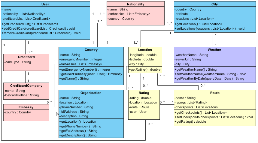
Figure 1 The class diagram of the application
The class diagram is divided into three parts:
1) Emergency (Figure 2): The classes store essential information, including the contact of embassy and Credit Card Company. The classes related are User, Nationality, Creditcard, CreditcardCompany, Organisation, Embassy.
Class User records the user details and operations and the classes contains essential information, including the contact of embassy and Credit Card Company. Users can store their basic card details in the application, and it links to corresponding cardlost hotlines when there is emergency. The application does not store any personal details (eg. credit card number) to reduce the privacy risks.
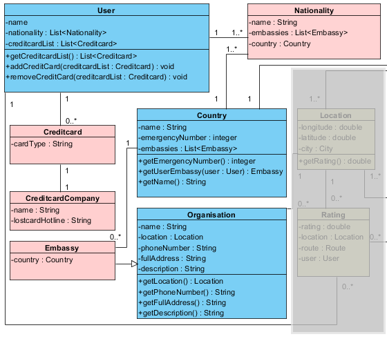
Figure 2 the classes related to emergency situations
2) Generate safety Routes (Figure 3): Class Country contains a list of City class. Each route stores a sequence of locations as checkpoints of the route. Users can rate a route, a location after they finish the route.
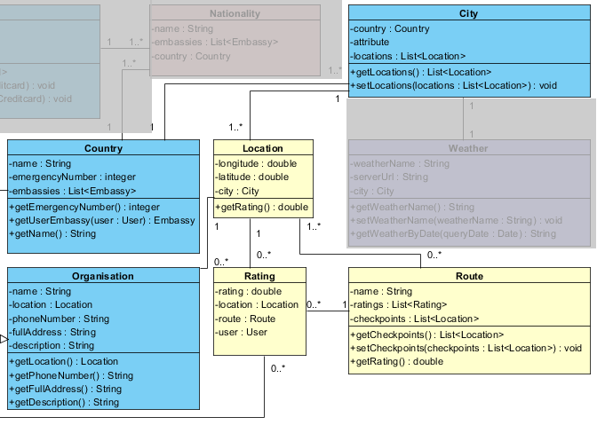
Figure 3 the classes related to generate safety routes
3) Weather integration (Figure 4): the weather information is considered while generating every safety routes. The Weather Class contains functions for retrieving specific weather information.
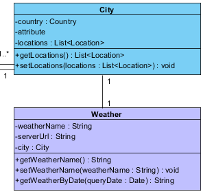
Figure 4 the classes related to weather
Written by Po Ting Tse
This post represents that the group has chosen appropriate economic and social Contextual Factors that directly link to the marking criteria, and are vital to understanding what requirements app design has. This is based on market analysis, evaluation, and previous engineering decisions. There is evidence that research has been chosen intelligently (by reference to literature and analysis) to produce a conclusion of professional quality, leading to a successful product.
This post additionally represents Engineering and Design decisions. These are based on the Contextual Factors and literature review which the group have tailored the product to incorporate. This means that the activity diagram has considerable research, fluent design and well planned engineering steps to achieve this. This post illustrates how and why the product has been influenced in its design and engineering, and shows how the engineering of the app will solve problems through multiple class diagrams.
In addition, this post illustrates considerable use of media, innovation and creativity. This is apparent through applying Contextual Research, Design steps and engineering guidelines to produce class diagrams which contribute to the product, summarises what the product does, and provides visualisations that align with the target market.
Furthermore this post features the use of different types of media evident in the class diagrams.
Use Case Diagram
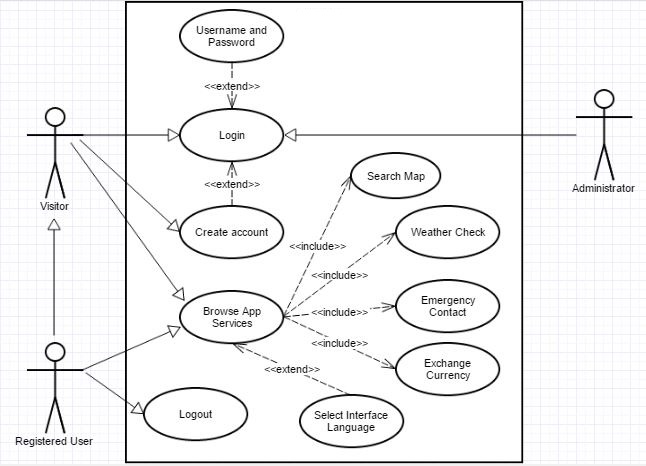
Posted by Ayoub Elgassier in Design, Engineering, Media Use on 13/04/2015
The below use case diagrams demonstrates interaction between user and the application. There are three use cases are designed for our application, which are as follows:
The first use case shows interaction with the main functions of the application. The application offers services, such as login and multi-lingual interface. The user can select interface language (Default English) and then application services can be browsed.
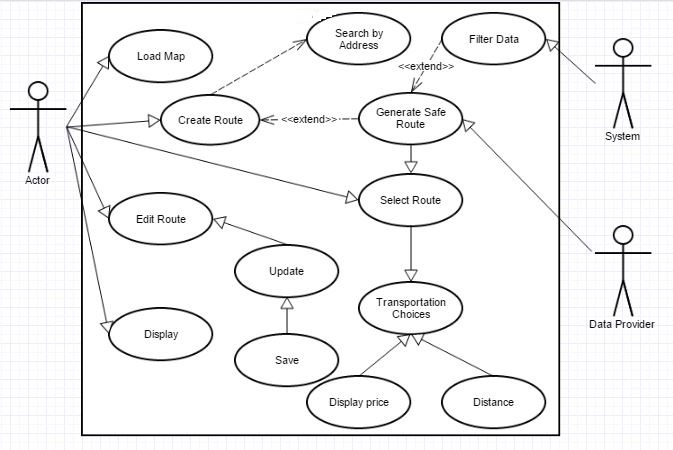
The second diagram represents the interaction between user and search map. A user can specify a route and the system will evaluate the safest routes in order to reach the target place.
The user can load a stored route or edit existing route in addition to create a route by searched by address.A safe route would be generated by filtering the data, which is based on rating of areas provided by Data Provider, by the system. Afterwards, the user can choose the appropriate route and the select type of transportation.
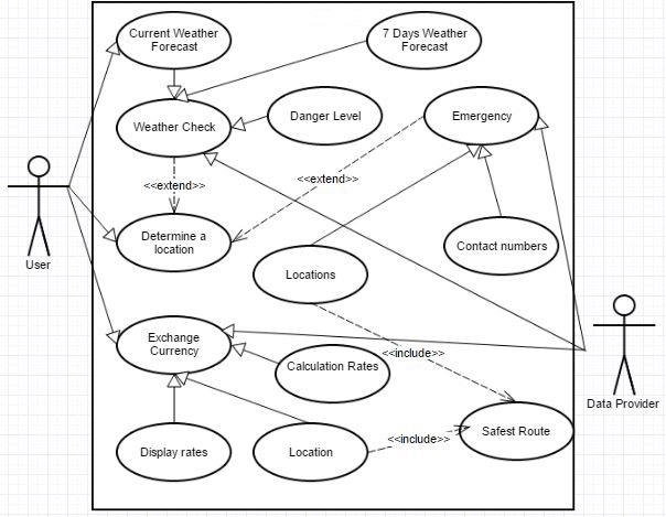
The final diagram shows the functions which are described in Information Travel Update blog.
The user can select a certain location in order to display weather forecast for that place. Additionally, the application provides a feature which is ‘Danger’. For example, it might be some beaches unfit for swimming. Another service, the application allows users to specify their current locations in order to reach the nearest post office and exchange currency rates can be displayed. Finally, the application offers Emergency contacts and locations.
Written by Ayoub.
This post represents that the group has chosen appropriate economic and social Contextual Factors that directly link to the marking criteria, and are vital to understanding what requirements app design has. This is based on market analysis, evaluation, and previous engineering decisions. There is evidence that research has been chosen intelligently (by reference to literature and analysis) to produce a conclusion of professional quality, leading to a successful product.
This post additionally represents Engineering and Design decisions. These are based on the Contextual Factors and literature review which the group have tailored the product to incorporate. This means that the activity diagram has considerable research, fluent design and well planned engineering steps to achieve this. This post illustrates how the product has been influenced in its design and engineering, and shows how the engineering of the app will solve problems through use case diagrams.
In addition, this post illustrates considerable use of media, innovation and creativity. This is apparent through applying Contextual Research, Design steps and engineering guidelines to produce use case diagrams which contribute to the product, summarises what the product does, and provides visualisations that align with the target market.
Furthermore this post features the use of different types of media evident in the use case diagrams.
Activity Process for Safest Route Generation
Posted by Ashiru Ali in Design, Engineering, Media Use on 07/04/2015
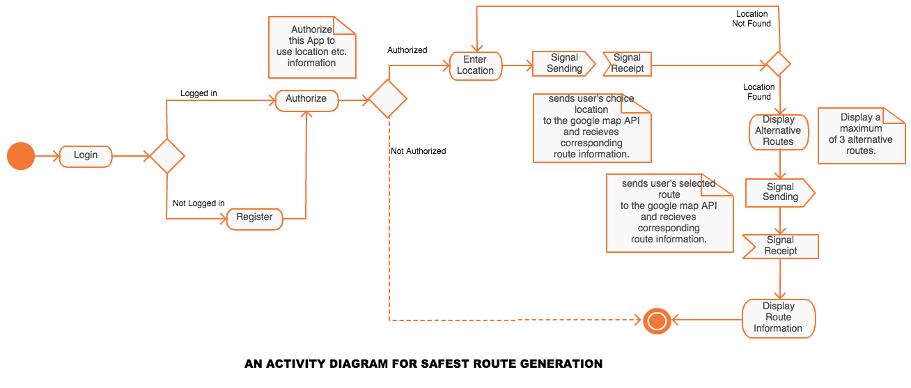
TravelSafe leverages the google maps API to generate a safest possible route to a destination based on individual reviews, crime statistics, embassy twitter feeds, disease control agencies of the specific country. It also calculates the distance on each generated optional route.
The activity process is as follows;
- The user logs in or register if they haven’t registered.
- The user gives authorisation to the app to use its resources, such as the location, network, sms, optionally Facebook etc.
- If the user does not grant required permissions, TravelSafe exits to the default screen
- otherwise, it prompts for destination location to be enter.
- calls the google maps API with the filled-in location and get all alternative routes to the destination rated by “safety”
- The user then selects a desired alternative route.
- TravelSafe requests the detail information for the selected route and displays it to the user.
This post represents that the group has chosen appropriate economic and social Contextual Factors that directly link to the marking criteria, and are vital to understanding what requirements app design has. This is based on market analysis, evaluation, and previous engineering decisions. There is evidence that research has been chosen intelligently (by reference to literature and analysis) to produce a conclusion of professional quality, leading to a successful product.
This post additionally represents Engineering and Design decisions. These are based on the Contextual Factors and literature review which the group have tailored the product to incorporate. This means that the activity diagram has considerable research, fluent design and well planned engineering steps to achieve this. This post illustrates how and why the product has been influenced in its design and engineering, and shows how the engineering of this safest route generator app feature will solve problems through a UML diagram.
In addition, this post illustrates considerable use of media, innovation and creativity. This is apparent through applying Contextual Research, Design steps and engineering guidelines to produce an activity diagram which contributes to the product, summarises what the product does, and provides visualisations that align with the target market.
Furthermore this post features the use of different types of media evident in the UML diagram.
References
UML Activity diagram drawn with Creately Online Diagramming tool.
Wireframe Designs
Posted by Emily Pearce in Design, Engineering, Media Use on 06/04/2015
Follwing on from the last blog about design theory, below are the prototype designs for TravelSafe. The group wanted to go with a simple, minimalist look so that the application is more intuitive to use for the user. These prototypes were developed using Balsamiq Mockups (https://balsamiq.com/).
Site Map
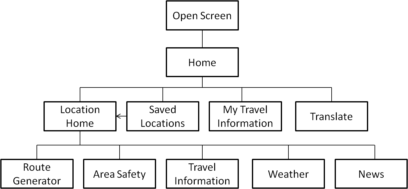
The diagram above shows the site map for the application, with each page extended in the wireframes below.
Our Designs
Here are the first two screens that the user will see when they enter TravelSafe.
The screen in Figure 1 has been kept as simple as possible so that it is as self-explanatory as possible for the user.
Figure 2 has been kept as simple as possible, and used to divide the rest of the content that is shown below.
If a user selects ‘View Saved Locations’, Figure 3 is the screen that the user will be taken to. When the users searches a location from the Home screen, the bottom of the page will give them the option to save the location – a shortcut for places you visit all the time so that they don’t have to search for it every time (see Figure 4). If they search a location, or click ‘View Live Updates’ on a saved location, they will be taken to the screen in Figure 4 where they can choose what action they want to take, or go back to the previous screen.
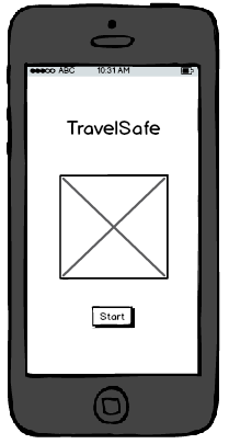
Figure 1
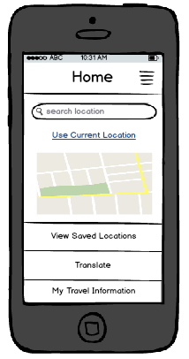
Figure 2
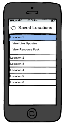
Figure 3
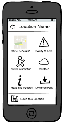
Figure 4
The next five screens show examples of the kind of information the user would see, updated for each location. If they were to download a resource pack, the information would be taken from each of these and saved into a folder on their phone, accessible from ‘View Saved Locations’ and giving them access to:
- bus and train timetables
- ungerground/metro map
- area map
- 7-day forecast
- list of areas to avoid
- travel, health and safety tips from Government organisations such as embassises, World Health Organisation and Police.
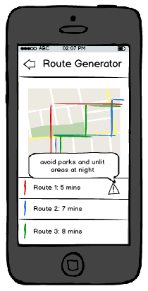
Figure 5
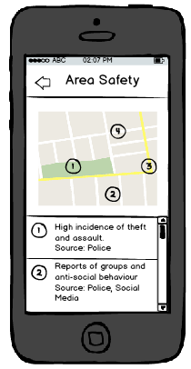
Figure 6
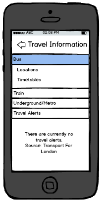
Figure 7
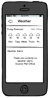
Figure 8
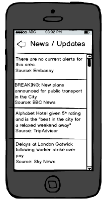
Figure 9
The last set of functionality included in the application is the ‘Translate’ functionality and the ability to access and edit a user’s own information, as shown below. The translate functionality would make use of Google’s API to incorporate Google Translate, giving access to a large number of languages as well as the ability for the phone to “speak” the translation – this would allow travellers to show locals what they were trying to say to aid understanding. The idea of ‘My Information’ is to give the user a place to store important information that they might need, such as Travel Insurance information, flight details and passport number so that they have a quick and easy way to access it, straight from the menu on the home screen.
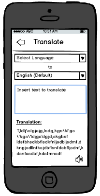
Figure 10
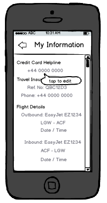
Figure 11
As these designs show, the group has tried to keep a consistent design throughout all the screens, as well as minimising the amount of searching a user has to do and a limited number of steps between all screens. In terms of maintaining standards, the mobile phone application would work alongside all usual touch screen functionality, such as swiping and touch input.
Written by Emily.
This post represents that the group has chosen appropriate economic and social Contextual Factors that directly link to the marking criteria, and are vital to understanding what requirements app design has. This is based on market analysis, evaluation, and platform decisions. There is evidence that research has been chosen intelligently (by reference to literature and analysis) to produce a conclusion of professional quality, leading to a successful product.
This post additionally represents Engineering and Design decisions. These are based on the Contextual Factors and literature review which the group have tailored the product to incorporate. This means that the app design has considerable research, fluent design and well planned steps to achieve this. This post illustrates how and why the product has been influenced in its design, and shows how engineering this app feature will solve problems, and how the product will further incorporate design decisions.
In addition, this post illustrates considerable use of media, innovation and creativity. This is apparent through applying Contextual Research, Design steps and engineering guidelines to produce wireframe designs which contribute to the product solution, summarise what the product does, and provides visualisations that align with the target market.
TravelSafe Logo Designs
Posted by Briony Gray in Design, Innovation and Creativity (Idea), Media Use on 05/04/2015
An important consideration for the usability and desirability of Apps is the visual aesthetics (Airey, 2009). These may potentially convince new users to use the app based on their interests coinciding with the image presented with (Pittard et al., 2007). Literature and market research was conducted, and certain resources were deemed useful in the creation of designs for web apps, this can be found in the Design Theory post. The literature is listed in the references below. The media resource on web design for mobile applications can be found here https://www.youtube.com/watch?v=r3sDuuWC6-Y, and designing tips for cross-platform apps here https://www.youtube.com/watch?v=0oS-tvCUbBs
Based on these we have decided to make a range of designs for the app logo that summarise the features of the app while presenting a ‘travel friendly’ vibe. They also take into consideration design decisions that literature suggests is important for apps: this includes having a clear message, using neutral colours, having easy to read text, having a well laid out image, and having a logo that an individual will remember easily(Adams et al., 2006; Airey, 2009). The final designs are listed below:

Design number 1.
Design number 1 corresponds with the success criteria of good market design stipulated by Airey (2009) and Pittard et al., (2007) as it features neutral colours that apply to both genders, it projects an image of travel which reflects one of the primary uses of the app, it presents a friendly image which users may trust and feel safe using, the image also uses neutral colours which presents a colour theme, the image is surrounded by negative space which draws the eye to the simple image, and finally it is clearly laid out with a spaced title and no other text.

Design number 2.
Following on from design number 1 above, design number 2 (right) is a slight variation of the design success criteria previously stated. This design features a number of colours which lend the user to think that travelling is exciting and diverse (Airey, 2009), the image shows a suitcase which strongly represents the notion of travel which is a primary use for the app, the suitcase has surrounding objects such as a map that further illustrate travel, the bold white title draws the eye as the image has may different colours, the title is clearly laid out with no other text.

Design number 3. (image rights stock photo www.dreamstime.com)
Following on from design number 1 above, design number 3 (left) is a slight variation of the design success criteria previously stated. This design is very simplistic and minimalist which allows the image to represent that app rather than allowing colour or image to takeaway from its message. In this design the image highlights the presence of safety while using the app, that it can be trusted easily, and that the design is no-fuss and so the app should be no-fuss. In addition it has a clear and laid out title which indicates the app name, featuring no other text.

Design number 4. (image rights stock photo to www.dreamstime.com)
Following on from design number 1 above, design number 4 (right) is a slight variation of the design success criteria previously stated. The design is extremely clear and simplistic and only features a title, which ensures that the user knows exactly which app they are using. The design features no images, and minimal colour to highlight the title which keeps user attention of the name of the app. This is effectively cutting out image association with an object or service, and instead encourages the user to learn the app name directly (Adams et al., 2006).

Design number 5.
Following on from design number 1 above, design number 5 (left) is a slight variation of the design success criteria previously stated. In this an image of the world in shown held in a pair of hands, indicating that travel it within the users own hands. Although the colours are fairly vibrant, they are limited which creates a colour theme. The title is clear and spaced which draws the eye as it is framed by the image behind it. No other text is featured making it easy to read. However despite the global imagery there is no other indication that the app can be used for other travel purposes such as transportation services or route generation.
To decide which design to pick we have held a vote with all group members in which each may choose a favourite. The result of this was that design number 1 embodied all design choices stipulated by literature, and was liked the best by the group. In addition to this these five logos have been presented to the experts interviewed regarding the app features. The expert opinions will serve to better guide our decision as to which design to choose as our final app logo. The expert guidance and opinion post will follow shortly.
Written by Briony.
This post represents that the group has chosen appropriate economic and social Contextual Factors that directly link to the marking criteria, and are vital to understanding what requirements app design has. This is based on market analysis, evaluation, and expert opinions. There is evidence that research has been chosen intelligently (by reference to literature and analysis) to produce a conclusion of professional quality, leading to a successful product.
This post additionally represents Engineering and Design decisions. These are based on the Contextual Factors and literature review which the group have tailored the product to incorporate. This means that the app design has considerable research, fluent design and well planned steps to achieve this. This post illustrates how and why the product has been influenced in its design, and shows how engineering this app feature will solve problems, and how the product will further incorporate design decisions.
In addition, this post illustrates considerable use of media, innovation and creativity. This is apparent through applying Contextual Research, Design steps and engineering guidelines to produce logo designs which contribute to the product, summarise what the product does, and provides visualisations that align with the target market.
References
Adams, S., Morioka, N., & Stone, T. L. (2006). Logo design workbook: a hands-on guide to creating logos. Rockport Publishers.
Airey, D. (2009). Logo design love: A guide to creating iconic brand identities. New Riders.
Pittard, N., Ewing, M., & Jevons, C. (2007). Aesthetic theory and logo design: Examining consumer response to proportion across cultures. International Marketing Review, 24(4), 457-473.
Design Theory
Posted by Emily Pearce in Contextual Factors and Research, Design on 31/03/2015
In preparation for the next blog post, the group wanted to take a look at the academics behind designing the user interfaces that people encounter every day, to see why these principles are important. In the next blog post, the group will be showing the prototype designs to see how well the guidelines have been followed.
Design Theory
One commonly used theory in UI (User Interface) design is “Sheniderman’s Eight Golden Rules” [1], which was created to improve the usability of an application by having a well designed UI and good interaction design. The rules are as follows:
- Strive for consistency – consistent layouts, colours, terminology, commands and sequences of action
- Enable frequent users to use shortcuts – abbreviations, function keys, hidden commands
- Offer informative feedback
- Design dialog to yield closure – sequences of actions should have a beginning, middle and end, and the completion of groups of actions should provide closure
- Offer simple error handling – design the system to prevent error, and if there is an error provide simple ways to handle it
- Permit easy reversal of actions – encourages exploration of the interface by reducing anxiety about what could happen as the error can be undone
- Support internal locus of control – design the system so the user feels that they are controlling it, not responding to it
- Reduce short-term memory load – keep displays simple, consolidate multiple displays and provide sufficient training
Another design theory commonly used is Nielsen’s 10 Usability Heuristics for User Interface Design [2], and these are:
- Visibility of system status – keep the user informed with what is happening by providing appropriate feedback within a reasonable time
- Match between the system and the real world – the system should speak the users’ language with familiar words, phrases and concepts rather than system-oriented terms. Follow real-world conventions to make information appear in a natural and logical order
- User control and freedom – provide “emergency exit” for leaving unwanted actions and support undo and redo
- Consistency and standards – follow platform conventions for words, situations and actions to prevent misunderstanding
- Error prevention – use careful design to prevent errors by eliminating error-prone conditions or check for them and provide users with a confirmation option before they commit to that action
- Recognition rather than recall – minimise memory load by making objects, actions and options visible, make sure the user doesn’t have to remember information between dialogs and ensure that instructions are visible or easily retrievable
- Flexibility and efficiency of use – allow users to tailor frequent actions
- Aesthetic and minimalist design – dialogs should not contain irrelevant or rarely needed information
- Help users recognise, diagnose and recover from errors – error messages should use plain language, indicate the problem and suggest a constructive solution
- Help and documentation – whilst it’s best if systems don’t require documentation to be used, any information should be easy to search, focused on the task, not too large and list concrete steps to be completed
As shown, most of these rules match up in some way and are simply there to make life easier for the user, such as preventing frustration when they – can’t find what they are looking for, or something goes wrong and it simply says, “An error has occurred!”. Good interface design is important in everything – for example, if a user is shopping online, it can be argued that they are not going to keep visiting a site that makes it difficult to find what they are looking for and creates an error every time they attempt an action.
Whilst these design theories are not the law, simply guidelines, it is still best practice and is becoming continually more championed in the technology world, with big organisations creating their own guidelines and providing accreditation for both usability and accessibility. Further work is also being done to see how these apply specificially to mobile devices, and Gong and Tarasewich [3] look into how Shneiderman’s rules need to be modified, as well as stating their own specific guidelines, (some of which are similar to Nielsen) and these are:
- Design for multiple and dynamic contexts è allow user to configure to their needs and preferences, including text size and brightness, as well as double, single or no-handed operation
- Design for small devices – word selection vs text input
- Design for limited and split attention – sound and tactile output options
- Design for speed and recovery – allow for applications to be stopped, started and resumed with little or no effort
- Design for “top-down” interaction – present high-level information and let the user decide whether to view the details
- Allow for personalisation – provide the users with the ability to change settings to their needs or likes
- Design for enjoyment – applications should be visibly pleasing and fun as well as usable
Further Reading
As well as design heuristics for interface design, there are also legislation and principles governing usability and accessibility, particularly on the Web, but lots of it can be applied across the board.For example:
- Section 508 of the US Rehabilitation Act – http://www.section508.gov/
- Web Content Accessibility Guidelines (WCAG 2.0) – http://www.w3.org/TR/WCAG20/
This post represents that the group has chosen appropriate economic and social Contextual Factors that directly link to the marking criteria, and are vital to understanding what requirements app design has. This is based on market analysis, evaluation, and expert opinions. There is evidence that research has been chosen intelligently (by reference to literature and analysis) to produce a conclusion of professional quality, leading to a successful product.
This post additionally represents Engineering and Design decisions. These are based on the Contextual Factors and literature review which the group have tailored the product to incorporate. This means that the app design has considerable research, fluent design and well planned steps to achieve this. This post illustrates how and why the product has been influenced in its design, and shows how engineering this app feature will solve problems, and how the product will further incorporate design decisions.
References
[1] Shneiderman, B. (1986). Designing the user interface-strategies for effective human-computer interaction. Pearson Education India.
[2] Nielsen, J. (1994). Heuristic evaluation. In Nielsen, J., and Mack, R.L. (Eds.),Usability Inspection Methods, John Wiley & Sons, New York, NY.
[3] Gong, J., & Tarasewich, P. (2004). Guidelines for handheld mobile device interface design. In Proceedings of DSI 2004 Annual Meeting (pp. 3751-3756).
Written by Emily.
App Feature: Travel Updates Information
Posted by Ayoub Elgassier in Contextual Factors and Research, Design, Engineering on 26/03/2015
Introduction
Travel is one of an indispensable aspect in our life as well as technology. Number of users, who access social network via smartphones is more than 4 billion in order to acquire travel information (Chung & Koo, 2015) . They point out that social media can be a solution to provide users their “wants”, “needs” and “demands”. Therefore, it might be inferred that travel information is a vitally important factor for tourists. According to our investigation, there might be no application which covers all travel information in one application, including a safety aspect. Therefore, one objective of our application is to incorporate travel information in one application considering safety aspect. Hence this blog concentrates on featuring transportation, weather, emergency content, exchange money and emergency situations updates.
Travel information
Travel information could become an important factor for travellers by reason of increasing number of travellers annually (Chung & Koo, 2015). The former causes numerous obstacles. One of these is increase pressure on transportation (Li, 2010). Firstly, it is widely known that transportation is an essential factor to reach destinations and to move easily between places (Li, 2010). Secondly, in big cities, for example London, there are many transportation options available, for instance, trains, buses, taxis and underground, each of which reaches specific areas. Thus, distinguishing among these might be difficult or even remember. Since Public Transportation Datasets are available online (http://data.gov.uk/dataset/nptdr ), it could be easily utilised by using graph matrices and algorithms build a safest route generator (discussed in Briony’s feature Blog post). Combining advanced technology with travel information improves safety and efficiency of transportation and create a corporation environment between travellers and transportation means (Li, 2010). As a result, the application is based on to solve of the preceding points in addition to safety aspects and it considers two types of traffic information en-route and pre-trip route.
Weather updates
Weather is another aspect which might play a vital role in tourism, acquiring information about weather could be important in order to help to make a right decision. For example, Asian countries like Malaysia, they have a monsoon. Consequently on the weather forecast application, you can decide whether to take an umbrella or not. Additionally, in terms of safety, the application offers dangerous areas, such as city faces floods regularly and also there some mountains are about to fusion, so climbers can be alerted.
Emergency updates
Emergency updates in case of stolen or lost passports, or even your credit or debit card, your state’s embassy can assist you to find a way to solve the issue, for example, reissued a new passport. Thus, embassy details, such as contacts number and location, should be provided in order to deal with your situation immediately and that might help to make a right decision and procedure. The application provides this option to get your embassy readily in addition to communication means. Additionally, emergency numbers, such as, ambulances and polices, are taken into account.
Exchange money
Money exchange rates are important to understand rates of currency so that to be aware how much you will receive after an exchange (https://openexchangerates.org/). Meaning, application converts currency, which is another service in this application, to a required currency. Moreover, the application data would be updated frequently. Additionally, it provides places of post offices.
Places: this application also offers location and hotels booking according to Safety/Reliability rating of area (discussed by Kaley).
Problems and limitations
There are many application provide these kind of services. However, the problem is, according to our research, it seems no one application combines all these features in one application in addition to safety. Limitations of the travel update information may be dependent on one’s internet connection. However this may be combated by offering the user a downloadable travel information pack (discussed in Emily’s feature post).
Conclusion
This application contains different options which are transportation, serious weather, emergency, exchange rates. Overall, this application’s feature reduce amount of cost and time which are critical factors in travelling. This might help tourists to make a better decision for their trips. Additionally, it can improve traveller’s experience.
This post represents that the group has chosen appropriate economic and social Contextual Factors that directly link to the marking criteria, and are vital to understanding what requirements a specific app feature has. This is based on market analysis, evaluation, and expert opinions. There is evidence that questions that the app feature has been chosen intelligently (by reference to literature and analysis) to produce a conclusion of professional quality, leading to a successful product.
This post additionally represents Engineering and Design decisions. These are based on the Contextual Factors and literature review which the group have tailored the product to incorporate. This means that the app feature has considerable research, fluent design and well planned out engineering steps. All of which are apparent in this post, and are also illustrated with media. This app feature dictates future engineering steps, illustrates how and why the product has been influenced in its design, and shows how engineering this app feature will solve problems.
References
Chung, N., & Koo, C. (2015). Telematics and Informatics The use of social media in travel information search. Telematics and Informatics, 32(2), 215–229. doi:10.1016/j.tele.2014.08.005
Li, C. (2010). Travel Information Service system for public travel based on SOA. Service Operations and Logistics and Informatics (SOLI …, 321–324. Retrieved from http://ieeexplore.ieee.org/xpls/abs_all.jsp?arnumber=5551560