Archive for category Front-end Design
3speech on the World Wide Web
Posted by epan in Front-end Design, Other on May 10, 2012
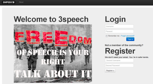
Since 3speech can only be accessed through the i2p network, we decided to raise awareness of our platform by using a domain in the World Wide Web. The figure below shows a screenshot of the created webpage.
3speech on the World Wide Web
The webpage will also contain details instructions on how to install i2p and reach the community of 3speech.
User Interface Screenshot
Posted by epan in Front-end Design on May 10, 2012
Based on the research on User Interface design and the choice of a navigation scheme, we started building a demo user interface.
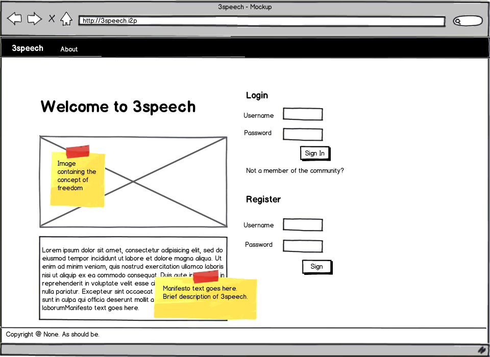
First of all, we created the login page of 3speech. This is what we came up with:
3speech - Login page
The page will contain the following manifest:
From now on, it can never be the same as before…because the place we are from does not exist anymore.
The Web is changing, and not for the better. Online freedom of speech is under attack by authorities, corporations and governments. Lobbyists are twisting anti-piracy laws to hide their true intentions and to further their own agendas. Censorship is their weapon of choice and they are trying to utilize it to its fullest extent. They are trying to limit the free flow of information at the cost of your fundamental right to free speech. This cannot be accepted. This should not be accepted.
What we are seeing is only the beginning and things will only get worse. The only solution is to raise awareness and promote open conversations about the issues that matter. 3SPEECH is not the answer, but where the answers can be created.
It is the place where ideas and discussions can take place, allowing its users to remain unaccountable, untraceable and untouchable by current censorship methods.
Talk to your friends, talk to your family, talk to anyone that might be interested.
Navigation – Issues and Solution
Posted by epan in Front-end Design on May 3, 2012
Creating an intuitive navigation scheme is one of the hardest parts on designing user interfaces for web applications. Social networks such as Facebook and Twitter were researched as to what navigation schemes they have implemented. The common navigation structure they share is the central role of the user entity.

Users of Facebook can create relationships with other users as “friends”. Recently Facebook introduced the notion of subscriber as well, by which you can follow a user without being friends with him but still have access on their posts. Users can also be member of Groups, created by other users. Groups resemble our concept of topics, in the way that both are designated to discussion on a specific concept.

Twitter on the other hand chose a more just-in-time approach to information share between users by limiting each post to 140 characters and introducing the concept of hashtag(#), which has been adopted by the web community since then. Posts are usually more of a comment on some topic, with the extended use of hashtags. Hashtags are used to identify a topic (e.g. #elections ) and users can search for posts containing any specific hashtag. Any post may contain any number of hashtags, allowing for users to create posts of a more specific nature. There is no notion of hierarchy between hashtags but the more hashtags are used, the more specific the topic of the post becomes.
![]()
In terms of navigation, 3speech differentiates itself from other social networks by focusing on topics of interest rather than on users. So the first consideration was about making the information be centered around topics. Users should be able to search, follow, post and of course create topics. We needed the notion of categorization to classify relevant topics together and make it easier for users to find them by searching.
We decided to include hashtags as our main type of topic classification because it allowed us to create a hierarchy on topics. However, after looking into several use cases we identified a serious conflict that can be presented by the following example.
#Economy #Greece
Is different from #Greece #Economy
This can create a conflict in database storage of the posts, as duplicate posts will be saved in the database under different categories.
The solution
Having several thoughts shared at group meetings regarding navigation, we ended up with a hybrid navigation scheme based on the most useful features of both Twitter and Facebook.
Starting from Facebook we decided to implement the concept of posts and comments on each post. Extended by nested comments, which allows users to answer to a comment specifically and not to the post, it presents a really powerful platform for discussions and not just comments on posts.
However, there was still a need of a higher level classification for topics. Hashtags provided a way to provide classification, and hierarchical structure was disregarded in favor of a more flexible navigation scheme.
Overall, the current classification levels we chose are:
Topics (Hashtag e.g. #Economy)
Posts (May contain Hashtags to specify context e.g. #EU)
Comment
Nested Comment
Having this structure and presenting it to a focus group in order to get feedback, we came to realize that the navigation scheme was still regarded as complex and the hierarchy was not comprehended as expected. Based on feedback important navigational decisions were taken:
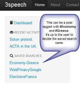
Topics were dropped as a UI element (Topics that the user follows) but not as a concept. We decided to allow users to post and let them choose a topic to insert the post in, not by asking them to provide a hashtag as the generic category the post falls under, but instead allowing them to insert as many hastags as they feel are needed to provide the exact scope of the post.Nevertheless, removing the Topics UI element from the navigation bar on the left hand side presented a huge gap on the way people could easily retrieve topics they follow.
Saved searches was a feature introduced by the popular note application “Evernote”, which although not a social network, the ability to categorize content by the use of tags creates a simple path for the users to save and navigate easily to a note, in our case post, that has more than two tags(as the designated topic). Moving this concept to our social network, the resulting usability test presented a way to simplify even more the navigation scheme. The topics section (that the user is following) was no longer needed, and in fact increased the navigation complexity as a topic could be saved both as a followed one and also as a saved search. By removing the topics section in the user’s navigation bar, and implementing Saved Searches instead, people could follow not just generic hashtags representing topics but topics of any specificity.
In the end, the chosen classification levels are:
Posts (May contain any number of hashtags to specify context e.g. #Economy #EU)
Hashtags used imply category and user can search for posts using these hashtags through the search bar
Comment
Nested Comment
The figure below displays the implemented feature.

Mockups – Visualizing 3speech
Posted by epan in Front-end Design on April 11, 2012
Based on design principles presented in the User Interface Considerations post, we created mockup screenshots of how 3speech will look and feel to users. Mockups are simple way to visualize core webpage elements and can have a great impact on resolving navigation issues. The figures below present what we came up and constitute a starting iteration point on our user interface design path. Figure 1 presents the login page for 3speech, while Figure 2 displays the user’s projected timeline.
3speech - Login Page
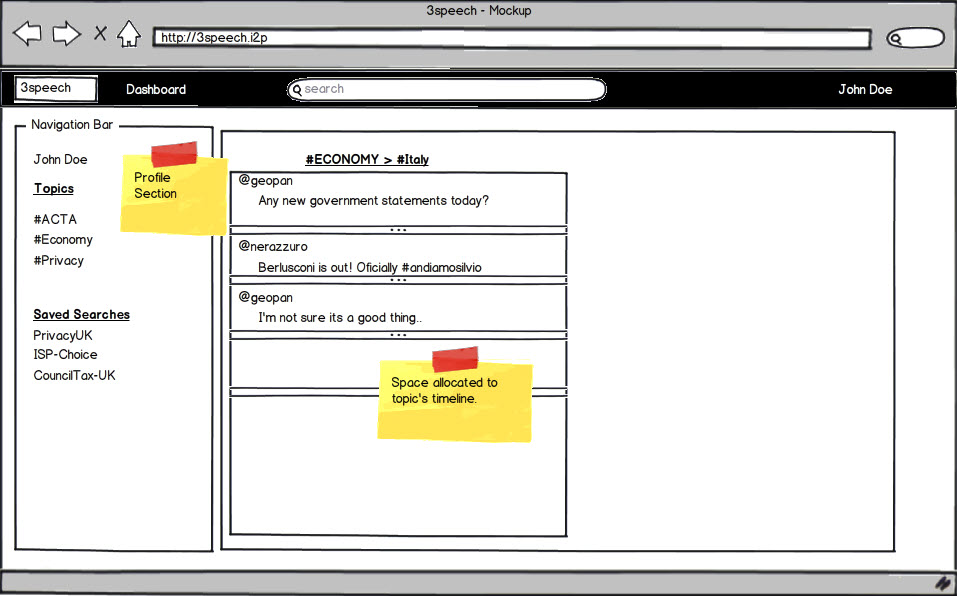
Figure 2: 3speech - Dashboard of user's activity
User Interface(UI) Research
Posted by epan in Front-end Design on April 2, 2012
User Interface design is a research area that has drawn the attention of the academic community even before the Web came into life. When talking about front end design, people misunderstand the concept as CSS / JavaScript coding to some extent. However, these technologies are just the means to reach the desired result, to create an intuitive user experience.
Users should be able to understand the scope of the application and become familiar with the structure of information presentation and navigation scheme. These principles were presented as a result of research early on [1], and have been adopted as part of user interface principles ever since.
In particular for web applications, Nielsen [2] pointed out the need to train people on web design best practices otherwise the web would become dysfunctional from a poor design point of view. Marcus and Gould [3] broaden the research agenda on user interfaces introducing culture as another potential consideration when designing for the web. Moreover, Zhang et al[4] proposed a theoretical framework on web user interface design and evaluation, adding the notion of user satisfaction as one the key point on whether users revisit websites. User interface design evaluation seems a hard issue to tackle and Neurkar [5] suggested that web UI researchers should learn from previous Graphical User Interface approaches used in desktop applications. One of the important findings comparing the above design methods was that response time on the Web was a fact that contributed to worse user experience on the web compared to desktop applications. What created a “buzz” and became along the way a standard technology tool was AJAX, short for Asynchronous Javascript and XML. Webpages built with AJAX simulate the desktop application experience [6], as sections of the webpage can be reloaded without the need to refresh the page, leading to a more consistent user experience.
Recently, research on mobile web user interface design has presented concepts such as responsive web design, the need to design different webpage layouts based on the screen size of the user’s agent. This is mainly due to the fact that smartphone market share is expected to overcome desktop computers in 2012[7].
Nevertheless, the ultimate design goal is to create an intuitive user experience. The targeted platform typically endorses restraints as to how elements will behave on the webpage. Our social network runs on i2p, therefore mobile considerations are not in order for now. A typical user case involves navigation through a desktop web browser, with a mouse and a keyboard.
As a result, we need not to target any mobile platform, but instead create the best possible user experience on a desktop web browser.
References:
[1] Nievergelt, J., and Weydert, J. Sites, modes and trails: Telling the user of an interactive system where he is, what he can do, and how to get to places. Methodology of Interaction. R.A. Guedj, P.J.W. ten Hagen, F.R.A. Hopgood, H.A. Tucker, and D.A. Duce, (Eds.). North Holland, (1980), 327–338.
[2] Jakob Nielsen. 1999. User interface directions for the Web. Commun. ACM 42, 1 (January 1999), 65-72.
[3] Aaron Marcus and Emilie West Gould. 2000. Crosscurrents: cultural dimensions and global Web user-interface design. interactions 7, 4 (July 2000), 32-46.
[4] Ping Zhang; Small, R.V.; von Dran, G.M.; Barcellos, S.; , “Websites that satisfy users: a theoretical framework for Web user interface design and evaluation,” System Sciences, 1999. HICSS-32. Proceedings of the 32nd Annual Hawaii International Conference on , vol.Track2, no., pp.8 pp., 1999
[5] Nerurkar, U.; , “Web user interface design, forgotten lessons,” Software, IEEE , vol.18, no.6, pp.69-71, Nov.-Dec. 2001
[6] Paulson, L.D.; , “Building rich web applications with Ajax,” Computer , vol.38, no.10, pp. 14- 17, Oct. 2005
[7] IDC: Press Release 2011. Smartphone market share. [Online] Available at: http://www.idc.com/getdoc.jsp?containerId=prUS22871611 [Last accessed 06/05/2012]