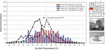
Fig. 3 – Binned distribution of temperatures in a west facing office inside a tower block at the University of Southampton, comparing July 2006 measured data (red bars) with simulation results using measured weather data (blue bars), a CIBSE design summer year (solid line) and a climate change adapted CIBSE design summer year (dashed line).