After reviewing our prototype yesterday, we have decided to make some changes to the design. This post will show the revisions we have made to the original design mockups.
Our biggest criticism was how posts were displayed. Posts are displayed in a “feed”, which is simply a vertical list of posts in chronological order, with most recent first. This is very similar to how Facebook, Twitter and Buzzfeed display posts – simply lists of posts. The problem that we had was that posts are not always useful in chronological order. What if a user wanted to see posts that were most pertinent to their interests? Or posts that they’re involved with (e.g., ones which they have discussed)? Simply displaying posts in chronological order does not allow this sort of discovery.

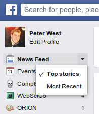
Facebook offers one solution to this problem – it sorts posts by what it considers to be most interesting to the user (“Top stories”). However, it is not entirely clear how this sorting is accomplished, and Facebook still offers users a choice to switch to most recent first. We do not want to burden users with this choice.

Our second problem is that, with our vertical list feed, we could only display at most two posts on a smartphone display. A user must scroll in order to see more. We want the feed to offer the user lots of choice, such that they have better opportunity for serendipitous discovery.
We have therefore designed an alternative interface, which displayed posts in a hexagon grid. We call this the Honeycomb, and it allows posts to be positioned according to when it was posted, and how it interests the user.
New mockups
Below are the revised mockups, demonstrating how the Honeycomb will be used.
[portfolio_slideshow size=large]


Please comment with your real name using good manners.