Real-time Twitter Visualisations for the US 2016 Presidential Elections
Authored by Dominic DiFranzo, and originally published on the Web Science Trust Blog
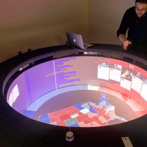
For the 2016 US Presidential election, researchers at the University of Southampton with support from the EPSRC funded project SOCIAM, built a real-time data visualisation that combined traditional polling data with social media posts. The application was built and designed for the Rensselaer Polytechnic Institute EMPAC Campfire, a novel multi-user, collaborative, immersive, computing interface that consist of a desk height panoramic screen and floor projection that users gather around and look into. The application is also a part of the Web Macroscope (a visualisation platform developed at the University of Southampton) and uses data from the Southampton Web Observatory.
Data collection for the polling data was taking from the Huffington Post Pollster API, which collects all the popular polls and their results. The social media data was collected on Twitter, using both their Streaming and Search API. The Streaming API was used to create a stream of data that included 1% of all tweets that had any of the popular and official hashtags and words used by each campaign to show support for their candidate. This hashtag list included tags like ‘TeamTrump’, ‘maga’ and ’draintheswamp’ in support for Donald Trump, and ‘LoveTrumpsHate’, ‘ImWithHer’, ‘StrongerTogether’, and ‘WhyIWantHillary’ in support for Hillary Clinton. Any tweets that mixed hashtags and words from both candidates were removed as this was normally done in a way to not show support for a candidate, but to react to supporters on the other side.
Results from the visualisations showed different levels of support on Twitter for each candidate over time. In the days leading to the election on November 8th, tweets in support for Trump were 1.5 times greater than those in support for Clinton. Interestingly, on the day of the election, this ratio switched and levelled off. Around the 2pm EST on November 8th, tweets in support for Clinton were almost equal to the number of tweets supporting Trump. Later in the night of the election, the ratio of support changed again, with tweets in support of Trump being 1.14 times larger than those in support for Clinton.
Another interesting result from the data was how many tweets that had geographic information tagged to them were overwhelmingly in support for Clinton throughout the day leading and on the election. Most tweets streamed through the visualisation had no GPS lat/long data embedded in them (these tweets often come from mobile phones using the Twitter App, with the optional GSP location data option enabled). As a whole, these geographic tweets are a small minority of the data collected from the Twitter Stream (about 1%). Interestingly, these geographic tweets supported Clinton 15 times more than Trump. Why this is the case is hard to say. It looks like Clinton supporters use mobile apps with location data more than Trump supporters.
Two other studies – one from researchers at USC, and another from Oxford University, the University of Washington and Corvinus University of Budapest, both showed that AI controlled bots were spreading pro-Trump content in overwhelming numbers. This created the illusion of more support for Trump on Twitter than there may have naturally been. Our results of geotagged tweets in support for Clinton, despite overall support from Trump on Twitter might be due to this issue of bots.
Save