Follwing on from the last blog about design theory, below are the prototype designs for TravelSafe. The group wanted to go with a simple, minimalist look so that the application is more intuitive to use for the user. These prototypes were developed using Balsamiq Mockups (https://balsamiq.com/).
Site Map
The diagram above shows the site map for the application, with each page extended in the wireframes below.
Our Designs
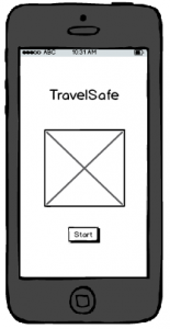
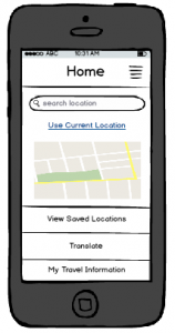
Here are the first two screens that the user will see when they enter TravelSafe.
The screen in Figure 1 has been kept as simple as possible so that it is as self-explanatory as possible for the user.
Figure 2 has been kept as simple as possible, and used to divide the rest of the content that is shown below.
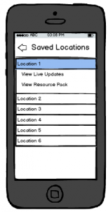
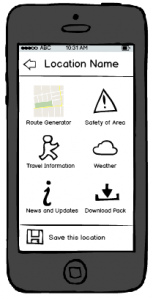
If a user selects ‘View Saved Locations’, Figure 3 is the screen that the user will be taken to. When the users searches a location from the Home screen, the bottom of the page will give them the option to save the location – a shortcut for places you visit all the time so that they don’t have to search for it every time (see Figure 4). If they search a location, or click ‘View Live Updates’ on a saved location, they will be taken to the screen in Figure 4 where they can choose what action they want to take, or go back to the previous screen.
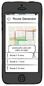
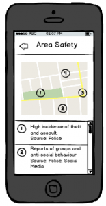
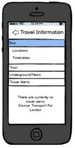
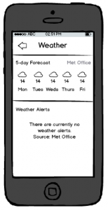
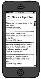
The next five screens show examples of the kind of information the user would see, updated for each location. If they were to download a resource pack, the information would be taken from each of these and saved into a folder on their phone, accessible from ‘View Saved Locations’ and giving them access to:
- bus and train timetables
- ungerground/metro map
- area map
- 7-day forecast
- list of areas to avoid
- travel, health and safety tips from Government organisations such as embassises, World Health Organisation and Police.
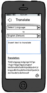
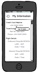
The last set of functionality included in the application is the ‘Translate’ functionality and the ability to access and edit a user’s own information, as shown below. The translate functionality would make use of Google’s API to incorporate Google Translate, giving access to a large number of languages as well as the ability for the phone to “speak” the translation – this would allow travellers to show locals what they were trying to say to aid understanding. The idea of ‘My Information’ is to give the user a place to store important information that they might need, such as Travel Insurance information, flight details and passport number so that they have a quick and easy way to access it, straight from the menu on the home screen.
As these designs show, the group has tried to keep a consistent design throughout all the screens, as well as minimising the amount of searching a user has to do and a limited number of steps between all screens. In terms of maintaining standards, the mobile phone application would work alongside all usual touch screen functionality, such as swiping and touch input.
Written by Emily.
This post represents that the group has chosen appropriate economic and social Contextual Factors that directly link to the marking criteria, and are vital to understanding what requirements app design has. This is based on market analysis, evaluation, and platform decisions. There is evidence that research has been chosen intelligently (by reference to literature and analysis) to produce a conclusion of professional quality, leading to a successful product.
This post additionally represents Engineering and Design decisions. These are based on the Contextual Factors and literature review which the group have tailored the product to incorporate. This means that the app design has considerable research, fluent design and well planned steps to achieve this. This post illustrates how and why the product has been influenced in its design, and shows how engineering this app feature will solve problems, and how the product will further incorporate design decisions.
In addition, this post illustrates considerable use of media, innovation and creativity. This is apparent through applying Contextual Research, Design steps and engineering guidelines to produce wireframe designs which contribute to the product solution, summarise what the product does, and provides visualisations that align with the target market.

