 Last advances in mobile technologies and rapid spread of 3G networks engaged handsets with the Web bringing an instance access to online resources from any place and at any time. However, facilities of mobile devices are not equal to PC (lower screen resolution, performance issues, diversity in geometry of the display and buttons arrangement, etc.) what significantly spoils the user experience. Thus, building a web-based app we need to keep in mind this specific and follow usability rules. In this post we will examine MovieIt in terms of its usability comparing core system characteristics with mobile usability check lists.
* For usability evaluation of our system we used “A Usability Checklist for the Usability Evaluation of Mobile Phone User Interface” proposed by Yong Gu Ji, Jun Ho Park, Cheol Lee and Myung Hwan Yun.
Additional testing
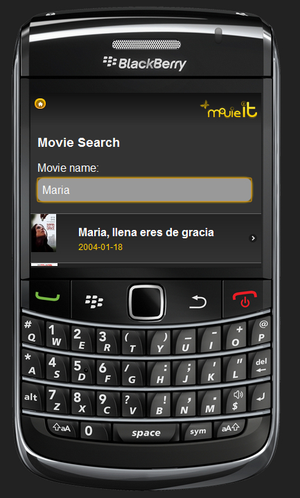
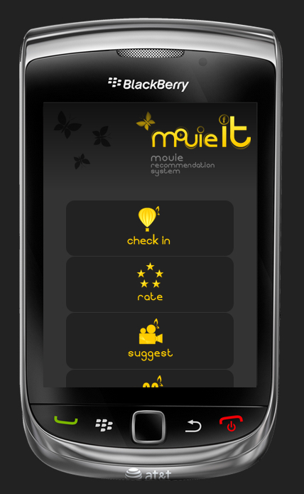
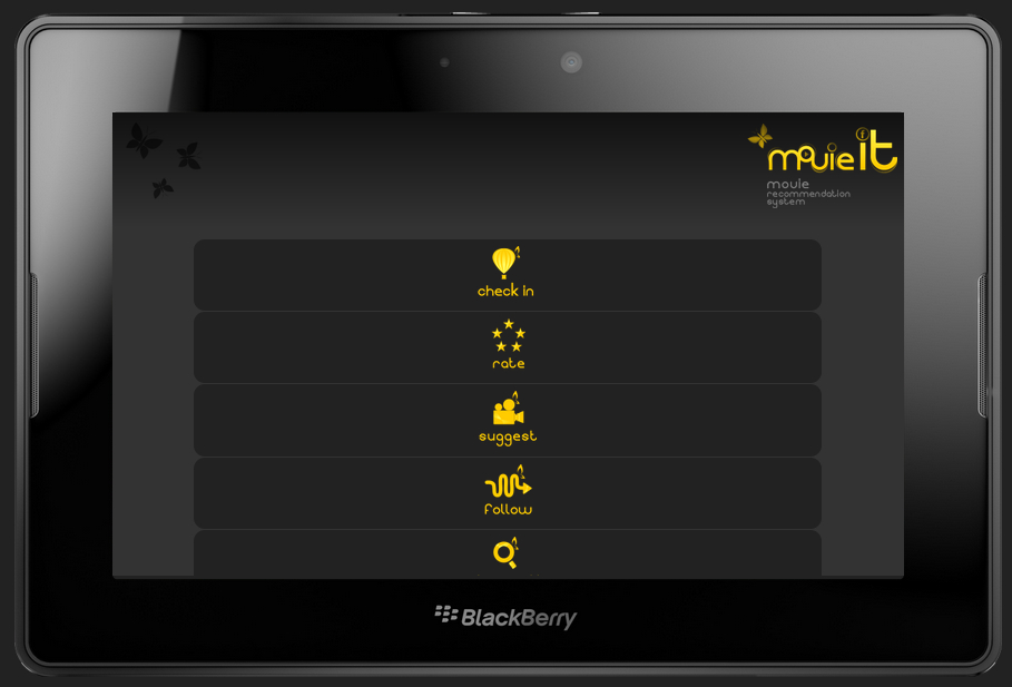
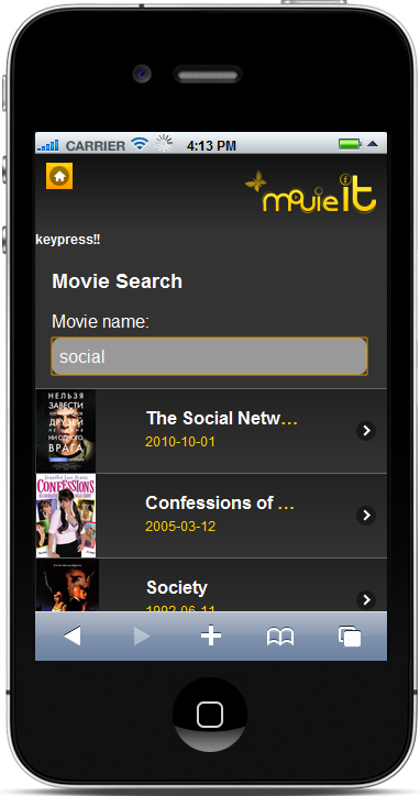
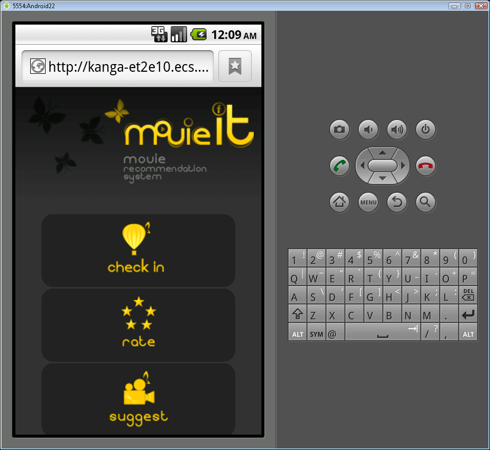
One of the major problems of User Interface for mobile phones is a diversity of screen resolutions and display geometry. Another serious issue is incompatibility of web technologies with mobile platforms and browsers (for example, not all mobile browsers support cookies). In order to ensure that MovieIT system works properly on the most common handsets we ran a set of tests using simulators for following devices: iPhone 3G, iPhone 4, iPad, Blackberry Playbook, Blackberry Tourch, Blackberry Bold 97200, Samsung H1 (touch), HTC Android, Nokia N8 and Nokia 97/5800 (touch). Some screenshots of tested simulators provided below.
Testing results
Simulations revealed that MovieIt system is compatible with all major mobile platforms. Moreover, user interface is displayed properly on all tested devices.
Conclusion
Overall, system has shown itself successfully in the majority of usability evaluation activities. However, there are some drawback as a lack of customization, insufficient feedback in the case of the wrong input and performance issues.


