Posts Tagged navigation
Navigation – Issues and Solution
Posted by epan in Front-end Design on May 3, 2012
Creating an intuitive navigation scheme is one of the hardest parts on designing user interfaces for web applications. Social networks such as Facebook and Twitter were researched as to what navigation schemes they have implemented. The common navigation structure they share is the central role of the user entity.
Users of Facebook can create relationships with other users as “friends”. Recently Facebook introduced the notion of subscriber as well, by which you can follow a user without being friends with him but still have access on their posts. Users can also be member of Groups, created by other users. Groups resemble our concept of topics, in the way that both are designated to discussion on a specific concept.
Twitter on the other hand chose a more just-in-time approach to information share between users by limiting each post to 140 characters and introducing the concept of hashtag(#), which has been adopted by the web community since then. Posts are usually more of a comment on some topic, with the extended use of hashtags. Hashtags are used to identify a topic (e.g. #elections ) and users can search for posts containing any specific hashtag. Any post may contain any number of hashtags, allowing for users to create posts of a more specific nature. There is no notion of hierarchy between hashtags but the more hashtags are used, the more specific the topic of the post becomes.
In terms of navigation, 3speech differentiates itself from other social networks by focusing on topics of interest rather than on users. So the first consideration was about making the information be centered around topics. Users should be able to search, follow, post and of course create topics. We needed the notion of categorization to classify relevant topics together and make it easier for users to find them by searching.
We decided to include hashtags as our main type of topic classification because it allowed us to create a hierarchy on topics. However, after looking into several use cases we identified a serious conflict that can be presented by the following example.
#Economy #Greece
Is different from #Greece #Economy
This can create a conflict in database storage of the posts, as duplicate posts will be saved in the database under different categories.
The solution
Having several thoughts shared at group meetings regarding navigation, we ended up with a hybrid navigation scheme based on the most useful features of both Twitter and Facebook.
Starting from Facebook we decided to implement the concept of posts and comments on each post. Extended by nested comments, which allows users to answer to a comment specifically and not to the post, it presents a really powerful platform for discussions and not just comments on posts.
However, there was still a need of a higher level classification for topics. Hashtags provided a way to provide classification, and hierarchical structure was disregarded in favor of a more flexible navigation scheme.
Overall, the current classification levels we chose are:
Topics (Hashtag e.g. #Economy)
Posts (May contain Hashtags to specify context e.g. #EU)
Comment
Nested Comment
Having this structure and presenting it to a focus group in order to get feedback, we came to realize that the navigation scheme was still regarded as complex and the hierarchy was not comprehended as expected. Based on feedback important navigational decisions were taken:
Topics were dropped as a UI element (Topics that the user follows) but not as a concept. We decided to allow users to post and let them choose a topic to insert the post in, not by asking them to provide a hashtag as the generic category the post falls under, but instead allowing them to insert as many hastags as they feel are needed to provide the exact scope of the post.Nevertheless, removing the Topics UI element from the navigation bar on the left hand side presented a huge gap on the way people could easily retrieve topics they follow.
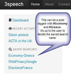
Saved searches was a feature introduced by the popular note application “Evernote”, which although not a social network, the ability to categorize content by the use of tags creates a simple path for the users to save and navigate easily to a note, in our case post, that has more than two tags(as the designated topic). Moving this concept to our social network, the resulting usability test presented a way to simplify even more the navigation scheme. The topics section (that the user is following) was no longer needed, and in fact increased the navigation complexity as a topic could be saved both as a followed one and also as a saved search. By removing the topics section in the user’s navigation bar, and implementing Saved Searches instead, people could follow not just generic hashtags representing topics but topics of any specificity.
In the end, the chosen classification levels are:
Posts (May contain any number of hashtags to specify context e.g. #Economy #EU)
Hashtags used imply category and user can search for posts using these hashtags through the search bar
Comment
Nested Comment
The figure below displays the implemented feature.
-
-
Archives
- May 2012 (11)
- April 2012 (15)
- March 2012 (3)
-
Meta


