Posts Tagged design
Scenarios and Personas 2
Posted by steiakakis in Scenarios and Personas on May 8, 2012
Scenarios and Personas 2:
Robert Nesta
Employer: Bank employee
Computer skills: Normal
Background Story
Robert Nesta is employed in a bank. He lives in Berlin and spends most of his free time on internet reading articles and news from around the world. He also is interested in discussing that news with other people. However, he is skeptical about the fact that he cannot risk revealing his identity. The majority of news websites require an account in order to allow the user to post a comment. Also he cannot express his thoughts on facebook, twitter or other social networks because he might be criticized by his company.
Scenario
He has heard about 3speech. He needs to download the i2p network and install it on his computer. After he is done with the configurations and settings he is ready to browse 3speech. He logs in to his account and starts following discussions that are already held in 3speech. Also he is able to fetch an article or a media file from another website and start a discussion around it. Inside 3speech he has no identity; he is absolutely untraceable and free to express his ideas without any concern. Finally he is able to start building a discussion society around his interests and interact with other users.
Scenarios and Personas 1
Posted by steiakakis in Scenarios and Personas on May 4, 2012
Alaa Abdel-Fattah : “Arrested by Egyptian Junta ”
Employer: Blogger
Background: Famous blogger
Computer skills: Advanced
Background Story
Alaa Abdel-Fattah , one of Egypt’s most famous bloggers and activists , was arrested in 2006 during a peaceful protest. Someone can state that this was a random arrest of a protestor. Six years later, it is common known that he had been arrested because of his blog’s significant reputation. It was another example of the systematic targeting of journalists, bloggers, and activists by Supreme Council of the Armed Forces (SCAF). This is a real example of internet free speech criminalization. Abdel-Fattah was not the only person that had been arrested for expressing freely his ideas. Many people around the globe had been banned from social networks and other websites for expressing their thoughts.
Scenario
Abdel-Fattah wants to continue blogging and posting his ideas and thoughts. But he is concerned about his own safety and freedom. With 3speech available he is now able to spread his thoughts without any hesitation.
He has heard about 3speech. He needs to download the i2p network and install it on his computer. After he is done with the configurations and settings he is ready to browse 3speech. He logs in to his account and starts following discussions that are already held in 3speech. Now he is able to view any topic of his interest, comment it or start his own new topic about the subject of his interest.
Mockups – Visualizing 3speech
Posted by epan in Front-end Design on April 11, 2012
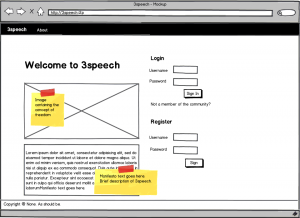
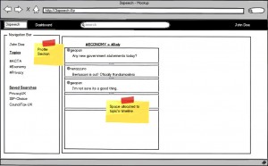
Based on design principles presented in the User Interface Considerations post, we created mockup screenshots of how 3speech will look and feel to users. Mockups are simple way to visualize core webpage elements and can have a great impact on resolving navigation issues. The figures below present what we came up and constitute a starting iteration point on our user interface design path. Figure 1 presents the login page for 3speech, while Figure 2 displays the user’s projected timeline.
User Interface(UI) Research
Posted by epan in Front-end Design on April 2, 2012
User Interface design is a research area that has drawn the attention of the academic community even before the Web came into life. When talking about front end design, people misunderstand the concept as CSS / JavaScript coding to some extent. However, these technologies are just the means to reach the desired result, to create an intuitive user experience.
Users should be able to understand the scope of the application and become familiar with the structure of information presentation and navigation scheme. These principles were presented as a result of research early on [1], and have been adopted as part of user interface principles ever since.
In particular for web applications, Nielsen [2] pointed out the need to train people on web design best practices otherwise the web would become dysfunctional from a poor design point of view. Marcus and Gould [3] broaden the research agenda on user interfaces introducing culture as another potential consideration when designing for the web. Moreover, Zhang et al[4] proposed a theoretical framework on web user interface design and evaluation, adding the notion of user satisfaction as one the key point on whether users revisit websites. User interface design evaluation seems a hard issue to tackle and Neurkar [5] suggested that web UI researchers should learn from previous Graphical User Interface approaches used in desktop applications. One of the important findings comparing the above design methods was that response time on the Web was a fact that contributed to worse user experience on the web compared to desktop applications. What created a “buzz” and became along the way a standard technology tool was AJAX, short for Asynchronous Javascript and XML. Webpages built with AJAX simulate the desktop application experience [6], as sections of the webpage can be reloaded without the need to refresh the page, leading to a more consistent user experience.
Recently, research on mobile web user interface design has presented concepts such as responsive web design, the need to design different webpage layouts based on the screen size of the user’s agent. This is mainly due to the fact that smartphone market share is expected to overcome desktop computers in 2012[7].
Nevertheless, the ultimate design goal is to create an intuitive user experience. The targeted platform typically endorses restraints as to how elements will behave on the webpage. Our social network runs on i2p, therefore mobile considerations are not in order for now. A typical user case involves navigation through a desktop web browser, with a mouse and a keyboard.
As a result, we need not to target any mobile platform, but instead create the best possible user experience on a desktop web browser.
References:
[1] Nievergelt, J., and Weydert, J. Sites, modes and trails: Telling the user of an interactive system where he is, what he can do, and how to get to places. Methodology of Interaction. R.A. Guedj, P.J.W. ten Hagen, F.R.A. Hopgood, H.A. Tucker, and D.A. Duce, (Eds.). North Holland, (1980), 327–338.
[2] Jakob Nielsen. 1999. User interface directions for the Web. Commun. ACM 42, 1 (January 1999), 65-72.
[3] Aaron Marcus and Emilie West Gould. 2000. Crosscurrents: cultural dimensions and global Web user-interface design. interactions 7, 4 (July 2000), 32-46.
[4] Ping Zhang; Small, R.V.; von Dran, G.M.; Barcellos, S.; , “Websites that satisfy users: a theoretical framework for Web user interface design and evaluation,” System Sciences, 1999. HICSS-32. Proceedings of the 32nd Annual Hawaii International Conference on , vol.Track2, no., pp.8 pp., 1999
[5] Nerurkar, U.; , “Web user interface design, forgotten lessons,” Software, IEEE , vol.18, no.6, pp.69-71, Nov.-Dec. 2001
[6] Paulson, L.D.; , “Building rich web applications with Ajax,” Computer , vol.38, no.10, pp. 14- 17, Oct. 2005
[7] IDC: Press Release 2011. Smartphone market share. [Online] Available at: http://www.idc.com/getdoc.jsp?containerId=prUS22871611 [Last accessed 06/05/2012]


