Archive for April, 2015
Use Case Diagram
Posted by Ayoub Elgassier in Design, Engineering, Media Use on 13/04/2015
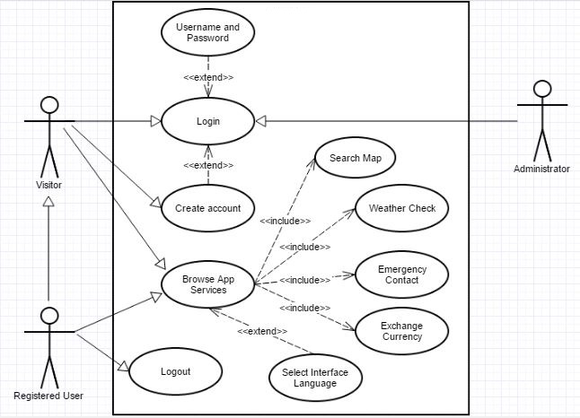
The below use case diagrams demonstrates interaction between user and the application. There are three use cases are designed for our application, which are as follows:
The first use case shows interaction with the main functions of the application. The application offers services, such as login and multi-lingual interface. The user can select interface language (Default English) and then application services can be browsed.
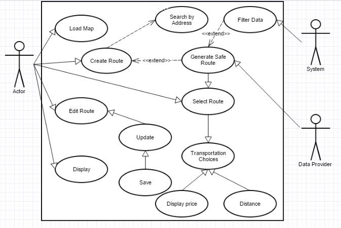
The second diagram represents the interaction between user and search map. A user can specify a route and the system will evaluate the safest routes in order to reach the target place.
The user can load a stored route or edit existing route in addition to create a route by searched by address.A safe route would be generated by filtering the data, which is based on rating of areas provided by Data Provider, by the system. Afterwards, the user can choose the appropriate route and the select type of transportation.
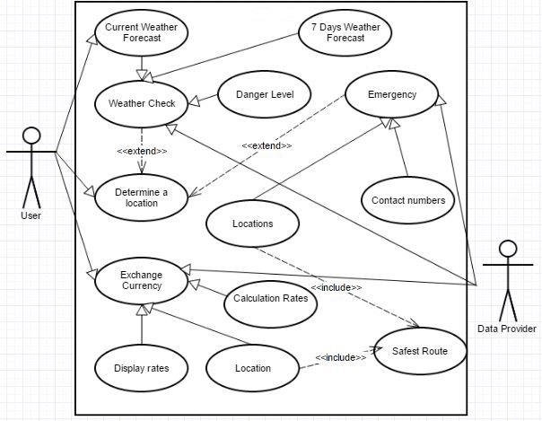
The final diagram shows the functions which are described in Information Travel Update blog.
The user can select a certain location in order to display weather forecast for that place. Additionally, the application provides a feature which is ‘Danger’. For example, it might be some beaches unfit for swimming. Another service, the application allows users to specify their current locations in order to reach the nearest post office and exchange currency rates can be displayed. Finally, the application offers Emergency contacts and locations.
Written by Ayoub.
This post represents that the group has chosen appropriate economic and social Contextual Factors that directly link to the marking criteria, and are vital to understanding what requirements app design has. This is based on market analysis, evaluation, and previous engineering decisions. There is evidence that research has been chosen intelligently (by reference to literature and analysis) to produce a conclusion of professional quality, leading to a successful product.
This post additionally represents Engineering and Design decisions. These are based on the Contextual Factors and literature review which the group have tailored the product to incorporate. This means that the activity diagram has considerable research, fluent design and well planned engineering steps to achieve this. This post illustrates how the product has been influenced in its design and engineering, and shows how the engineering of the app will solve problems through use case diagrams.
In addition, this post illustrates considerable use of media, innovation and creativity. This is apparent through applying Contextual Research, Design steps and engineering guidelines to produce use case diagrams which contribute to the product, summarises what the product does, and provides visualisations that align with the target market.
Furthermore this post features the use of different types of media evident in the use case diagrams.
Activity Process for Safest Route Generation
Posted by Ashiru Ali in Design, Engineering, Media Use on 07/04/2015
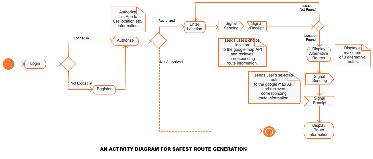
TravelSafe leverages the google maps API to generate a safest possible route to a destination based on individual reviews, crime statistics, embassy twitter feeds, disease control agencies of the specific country. It also calculates the distance on each generated optional route.
The activity process is as follows;
- The user logs in or register if they haven’t registered.
- The user gives authorisation to the app to use its resources, such as the location, network, sms, optionally Facebook etc.
- If the user does not grant required permissions, TravelSafe exits to the default screen
- otherwise, it prompts for destination location to be enter.
- calls the google maps API with the filled-in location and get all alternative routes to the destination rated by “safety”
- The user then selects a desired alternative route.
- TravelSafe requests the detail information for the selected route and displays it to the user.
This post represents that the group has chosen appropriate economic and social Contextual Factors that directly link to the marking criteria, and are vital to understanding what requirements app design has. This is based on market analysis, evaluation, and previous engineering decisions. There is evidence that research has been chosen intelligently (by reference to literature and analysis) to produce a conclusion of professional quality, leading to a successful product.
This post additionally represents Engineering and Design decisions. These are based on the Contextual Factors and literature review which the group have tailored the product to incorporate. This means that the activity diagram has considerable research, fluent design and well planned engineering steps to achieve this. This post illustrates how and why the product has been influenced in its design and engineering, and shows how the engineering of this safest route generator app feature will solve problems through a UML diagram.
In addition, this post illustrates considerable use of media, innovation and creativity. This is apparent through applying Contextual Research, Design steps and engineering guidelines to produce an activity diagram which contributes to the product, summarises what the product does, and provides visualisations that align with the target market.
Furthermore this post features the use of different types of media evident in the UML diagram.
References
UML Activity diagram drawn with Creately Online Diagramming tool.
Wireframe Designs
Posted by Emily Pearce in Design, Engineering, Media Use on 06/04/2015
Follwing on from the last blog about design theory, below are the prototype designs for TravelSafe. The group wanted to go with a simple, minimalist look so that the application is more intuitive to use for the user. These prototypes were developed using Balsamiq Mockups (https://balsamiq.com/).
Site Map
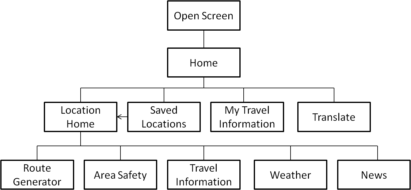
The diagram above shows the site map for the application, with each page extended in the wireframes below.
Our Designs
Here are the first two screens that the user will see when they enter TravelSafe.
The screen in Figure 1 has been kept as simple as possible so that it is as self-explanatory as possible for the user.
Figure 2 has been kept as simple as possible, and used to divide the rest of the content that is shown below.
If a user selects ‘View Saved Locations’, Figure 3 is the screen that the user will be taken to. When the users searches a location from the Home screen, the bottom of the page will give them the option to save the location – a shortcut for places you visit all the time so that they don’t have to search for it every time (see Figure 4). If they search a location, or click ‘View Live Updates’ on a saved location, they will be taken to the screen in Figure 4 where they can choose what action they want to take, or go back to the previous screen.
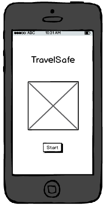
Figure 1
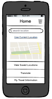
Figure 2
Figure 3
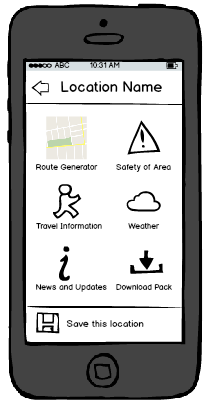
Figure 4
The next five screens show examples of the kind of information the user would see, updated for each location. If they were to download a resource pack, the information would be taken from each of these and saved into a folder on their phone, accessible from ‘View Saved Locations’ and giving them access to:
- bus and train timetables
- ungerground/metro map
- area map
- 7-day forecast
- list of areas to avoid
- travel, health and safety tips from Government organisations such as embassises, World Health Organisation and Police.
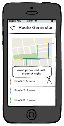
Figure 5
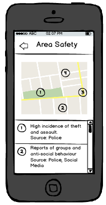
Figure 6
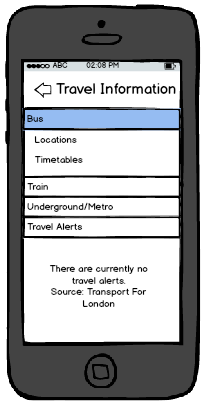
Figure 7
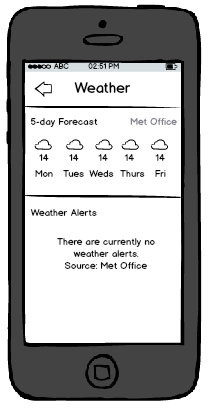
Figure 8
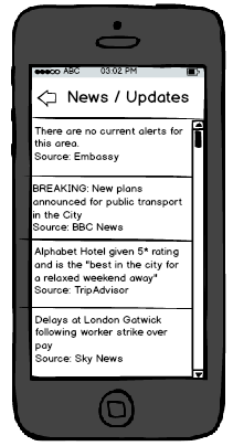
Figure 9
The last set of functionality included in the application is the ‘Translate’ functionality and the ability to access and edit a user’s own information, as shown below. The translate functionality would make use of Google’s API to incorporate Google Translate, giving access to a large number of languages as well as the ability for the phone to “speak” the translation – this would allow travellers to show locals what they were trying to say to aid understanding. The idea of ‘My Information’ is to give the user a place to store important information that they might need, such as Travel Insurance information, flight details and passport number so that they have a quick and easy way to access it, straight from the menu on the home screen.
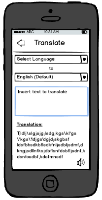
Figure 10
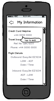
Figure 11
As these designs show, the group has tried to keep a consistent design throughout all the screens, as well as minimising the amount of searching a user has to do and a limited number of steps between all screens. In terms of maintaining standards, the mobile phone application would work alongside all usual touch screen functionality, such as swiping and touch input.
Written by Emily.
This post represents that the group has chosen appropriate economic and social Contextual Factors that directly link to the marking criteria, and are vital to understanding what requirements app design has. This is based on market analysis, evaluation, and platform decisions. There is evidence that research has been chosen intelligently (by reference to literature and analysis) to produce a conclusion of professional quality, leading to a successful product.
This post additionally represents Engineering and Design decisions. These are based on the Contextual Factors and literature review which the group have tailored the product to incorporate. This means that the app design has considerable research, fluent design and well planned steps to achieve this. This post illustrates how and why the product has been influenced in its design, and shows how engineering this app feature will solve problems, and how the product will further incorporate design decisions.
In addition, this post illustrates considerable use of media, innovation and creativity. This is apparent through applying Contextual Research, Design steps and engineering guidelines to produce wireframe designs which contribute to the product solution, summarise what the product does, and provides visualisations that align with the target market.
TravelSafe Logo Designs
Posted by Briony Gray in Design, Innovation and Creativity (Idea), Media Use on 05/04/2015
An important consideration for the usability and desirability of Apps is the visual aesthetics (Airey, 2009). These may potentially convince new users to use the app based on their interests coinciding with the image presented with (Pittard et al., 2007). Literature and market research was conducted, and certain resources were deemed useful in the creation of designs for web apps, this can be found in the Design Theory post. The literature is listed in the references below. The media resource on web design for mobile applications can be found here https://www.youtube.com/watch?v=r3sDuuWC6-Y, and designing tips for cross-platform apps here https://www.youtube.com/watch?v=0oS-tvCUbBs
Based on these we have decided to make a range of designs for the app logo that summarise the features of the app while presenting a ‘travel friendly’ vibe. They also take into consideration design decisions that literature suggests is important for apps: this includes having a clear message, using neutral colours, having easy to read text, having a well laid out image, and having a logo that an individual will remember easily(Adams et al., 2006; Airey, 2009). The final designs are listed below:

Design number 1.
Design number 1 corresponds with the success criteria of good market design stipulated by Airey (2009) and Pittard et al., (2007) as it features neutral colours that apply to both genders, it projects an image of travel which reflects one of the primary uses of the app, it presents a friendly image which users may trust and feel safe using, the image also uses neutral colours which presents a colour theme, the image is surrounded by negative space which draws the eye to the simple image, and finally it is clearly laid out with a spaced title and no other text.
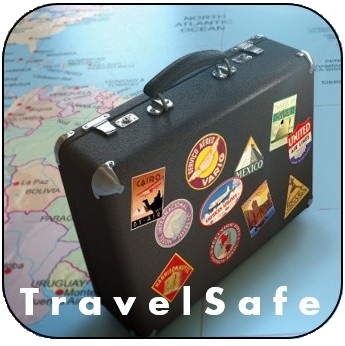
Design number 2.
Following on from design number 1 above, design number 2 (right) is a slight variation of the design success criteria previously stated. This design features a number of colours which lend the user to think that travelling is exciting and diverse (Airey, 2009), the image shows a suitcase which strongly represents the notion of travel which is a primary use for the app, the suitcase has surrounding objects such as a map that further illustrate travel, the bold white title draws the eye as the image has may different colours, the title is clearly laid out with no other text.

Design number 3. (image rights stock photo www.dreamstime.com)
Following on from design number 1 above, design number 3 (left) is a slight variation of the design success criteria previously stated. This design is very simplistic and minimalist which allows the image to represent that app rather than allowing colour or image to takeaway from its message. In this design the image highlights the presence of safety while using the app, that it can be trusted easily, and that the design is no-fuss and so the app should be no-fuss. In addition it has a clear and laid out title which indicates the app name, featuring no other text.

Design number 4. (image rights stock photo to www.dreamstime.com)
Following on from design number 1 above, design number 4 (right) is a slight variation of the design success criteria previously stated. The design is extremely clear and simplistic and only features a title, which ensures that the user knows exactly which app they are using. The design features no images, and minimal colour to highlight the title which keeps user attention of the name of the app. This is effectively cutting out image association with an object or service, and instead encourages the user to learn the app name directly (Adams et al., 2006).

Design number 5.
Following on from design number 1 above, design number 5 (left) is a slight variation of the design success criteria previously stated. In this an image of the world in shown held in a pair of hands, indicating that travel it within the users own hands. Although the colours are fairly vibrant, they are limited which creates a colour theme. The title is clear and spaced which draws the eye as it is framed by the image behind it. No other text is featured making it easy to read. However despite the global imagery there is no other indication that the app can be used for other travel purposes such as transportation services or route generation.
To decide which design to pick we have held a vote with all group members in which each may choose a favourite. The result of this was that design number 1 embodied all design choices stipulated by literature, and was liked the best by the group. In addition to this these five logos have been presented to the experts interviewed regarding the app features. The expert opinions will serve to better guide our decision as to which design to choose as our final app logo. The expert guidance and opinion post will follow shortly.
Written by Briony.
This post represents that the group has chosen appropriate economic and social Contextual Factors that directly link to the marking criteria, and are vital to understanding what requirements app design has. This is based on market analysis, evaluation, and expert opinions. There is evidence that research has been chosen intelligently (by reference to literature and analysis) to produce a conclusion of professional quality, leading to a successful product.
This post additionally represents Engineering and Design decisions. These are based on the Contextual Factors and literature review which the group have tailored the product to incorporate. This means that the app design has considerable research, fluent design and well planned steps to achieve this. This post illustrates how and why the product has been influenced in its design, and shows how engineering this app feature will solve problems, and how the product will further incorporate design decisions.
In addition, this post illustrates considerable use of media, innovation and creativity. This is apparent through applying Contextual Research, Design steps and engineering guidelines to produce logo designs which contribute to the product, summarise what the product does, and provides visualisations that align with the target market.
References
Adams, S., Morioka, N., & Stone, T. L. (2006). Logo design workbook: a hands-on guide to creating logos. Rockport Publishers.
Airey, D. (2009). Logo design love: A guide to creating iconic brand identities. New Riders.
Pittard, N., Ewing, M., & Jevons, C. (2007). Aesthetic theory and logo design: Examining consumer response to proportion across cultures. International Marketing Review, 24(4), 457-473.