Add Event to the List of Events The diagram below describes the actions that can be taken by the administrator of the system in order to add a new event to the existing list. They must log into the system before they are allowed to modify the events list. If the user is not an …
Category Archive: Design
Apr 23
Activity Diagram: Review a Seat
Review A Seat The following diagram shows the procedure that must be followed in order for a user to review a seat. Firstly, the user must be logged into the system to access this feature of the website. In case the user is not already registered then they must sign-up which can be done either …
Apr 23
Activity Diagram: Attend Events
Attend Events The activity diagram below specifies the steps that must be taken for a user to add an event to his personal events list. In order for a user to have access to this feature of the website they must register first otherwise the user is not authorised. Registration must be done to be …
Apr 23
Activity Diagram: Search
Search The following activity diagram shows the actions that must be taken by the user in order to search for a venue in our web application. The first page displayed to the user is the ‘Home Page’ where the user can view three different sets of criteria that must be specified in order to complete …
Apr 22
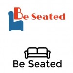
How we designed the Be Seated logo.
In the process of creating logos. I personally found the website Squarespace rather useful. It provides a free platform to make clean, simple designs which is quite useful. I designed the logo using this simple website. In practice our service may want to invest in a company to make a flashier logo in the future …
Apr 21
Be Seated Logos
Any company or service can be enhanced with a memorable and striking logo. In the process of deciding which logo was best we created some examples logos to take forward and assess. Based on Lindsay Rothfeld and Joshua Johnson criteria, we evaluated the possible logos. Different desgins and versions of the ‘Be Seated’ logo can …
Apr 21
Tips for Logo Designs
A logo is the first impression of a company, their impact weapon. Be unique and clever The image must stand by itself. Originality. Avoid clichés. Designing something out-of-the-box. Understand the brand. Reach a specific audience. Aesthetics vs deeper meaning. Use a visual double entendre. Two pictures wrapped into one. Colour is key. Grab attention vs …


