In this post we perform a technical analysis of websites that are similar to “Be Seated”. We have selected Seatplan.com, SeatGuru.com and Yelp.com to review. These websites share similar visions of providing users with reviews and information about the services and rating them, so that the users can make smart and good decisions.
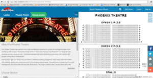
The website is about seat plans in the theatres in London. The site has detailed reviews of the seats with pictures from the theatre-going public. The reviews tells users about the seats that are more comfortable and have best views. It is incredibly similar to our idea but without the scope. The website is extremely new and not yet popular.
Analysis:
Login System:
Registration is free and users can add/search reviews of the seats in particular theatre by signing up or using their Facebook id.
Navigation:
Navigation is fairly easy with helpful hints and the site has a search engine for seat reviews. The site has a brief introduction on theatres with lists of reviews from theatre-goers. The detailed map of the seating arrangements is displayed alongside the theatre description.
Review System and Rating:
The review system is based on user experience. The seats are rated with star points from 1 to 5 on the basis of Comfort, Leg Room and View.
Tools and Apps:
It has a toolbar for online sharing platforms like Facebook, Twitter etc.
Accessibility and Usability:
The website is functioning well in both MAC OSX 10.5 and Windows OS. It also has cross-browser compatibility in desktop and mobile platform.
Discussion and Conclusion:
Since, the website is relatively similar to the concept of our project “Be Seated”, a seat map for more than just theatres can be used within our project.


