Student Dashboard v0.1 responsive design
About a year ago I started a blog post on here about taking a completely unresponsive, non-mobile-friendly set of style sheets and making them responsive. I got a fair way in, and wrote about 1500 words describing my methodology. However, then the project ended, reports were due and there was no real time to carry on working on this.
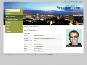
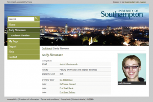
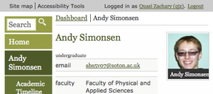
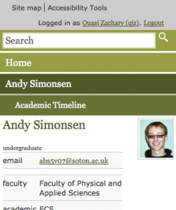
Over the past couple of months I’ve found a few spare moments to work on this again, and I am now happy that I have a suitable prototype stylesheet that does the University branded template from the full screen version (well the fixed 940px wide default), all the way through a fluid version in slightly smaller screens, to a responsive version that fits iPhone-sized screens.
I just wanted to post these screenshots somewhere 🙂 The “student” being viewed is a persona developed for testing purposes. Andy is not real!
1024×768
iPad landscape
iPad portrait
iPhone landscape
iPhone portrait
What next?
Well there’s obviously more to do. This needs usability testing. It will be integrated with the real live system, and the whole service tested. I can even see a few issues with it already, which I’ll go away and fix soon 🙂
Feel free to post comments on what it looks like.


Leave a Reply