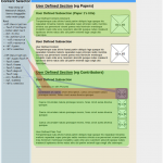
Erevnametrics: Research Object Builder UI
While I’ve mainly been talking about the back-end of the RO Builder, another thing that I have been doing is creating an easy to use, browser based, front end. This I am doing with html & javascript, and it links together the various shims and the RO builder itself. Eventually I’d like to expand it to include several methods of visualizing and sorting on the data beyond plaintext. Before properly building the UI, I’ve come up with several concepts, some simple and resembling a simple HTML form that could be easily added to another page, others a bit more complex.
This is the most simple of the lot, and is just a front end for the builder; it consists of one line for adding new resources, one for deciding where you want to create the RO (and possibly the format of it – n3, RDF/XML, turtle, etc.), and then a table of all the elements added so far.
A little bit more complicated here, but still the same format as before: The picture would be either something from the RDF representing the main subject, or a generic placeholder picture for it’s type. The uri to the picture would have to be passed to the web page from the shim, which would increase their complexity, but for simple shims, a default picture / type should be able to always be relied on.
This is a concept for visualizing the RO as a web page – the RDF is displayed in a tree structure, to the left, and all of the elements would be draggable onto a preview pane, which would result in a method of displaying that resource dependant on the type of the resource. Ideally it would let you change the way each object is displayed simply, and allow the end user to customise the page as they wished, in addition to providing a number of default templates. Due to the fact that it would be generated from the RO, the content would be dynamic – with a standard template for displaying a page, changes to the RO would be automatically reflected in the page, and something similar, albeit a bit more complex, could easily work for custom layouts too. This concept, however, is very likely beyond the scope of this internship – it would likely be too complex to create during my time here.
This is another concept, and is probably the best out of the ones I’ve talked about today, it would be a relatively simple page, with collapsible boxes for adding resources, and then some simple sorting of the resources based on searching on either the content of their triples, or reasoning about their resources; then links to different forms of display for the results obtained. The main advantages of this over the other main display layout are it’s simplicity and modularity. The top pane for adding and then creating your RO is essentially concept #2, and the bottom panes could be modules that you could extend or modify with relative ease.


Leave a Reply