Archive for category Academic Article

User Interface Design: How to get human visual attention by Gemma Fitzsimmons

Introduction

This post will describe a number of basic effects in relation to human vision and attention, focusing on how those effects can be relevant to the design of web site displays.

Saliency

Saliency is all about how much something stands out. If an object is salient, then it is more likely to attract your attention.

However, if everything is salient, it is difficult to figure out what is important and the display could be confusing. You may have already noticed this with web pages that have too much clutter, making it hard to find what you are looking for [1].

Therefore, when designing the interface to a web-based application, the items which are the most salient need to be those that are the most important to the users (e.g., buttons which are used regularly or have useful information, such as notifications).

Grouping

When a number of similar objects are close to one another, they can be visually ā€˜groupedā€™ by the user. This is particularly easy when the objects are the same colour. When ā€˜groupedā€™, they are treated as a single unit, rather than lots of single units. This makes it easier to either ignore them, or pay attention to them when necessary [2].

In the case of our project we may wish to allow the user to group feeds from different social networks together. One way to achieve this would be to colour the items according to their source (e.g., colour the backgrounds to Facebook items one colour, Twitter items a different colour and so on). This will enable the users to easily distinguish the origin of the information.

Preattentive Processing

Attention has various components. Some of these are under conscious control; others are automatic. One automatic component of attentional processing is preattentive processing. This was first described in Treismanā€™s Feature Integration Theory [3]. Objects will ā€˜pop outā€™ when an item in the display is salient compared to the rest of the items in the display. Examples of the many different ways an item can pop out and be detected preattentively are listed below in the image. These features can attract the users attention just because they pop out compared to the rest of the display.
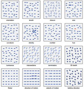
Image from Healey and Enns

A example about features that catch user's attention

Attentional Capture

Attentional capture occurs when a salient visual event occurs. Our attention is immediately drawn to the salient event [5]. Banner advertisements often try to take advantage of this phenomenon by having bright-coloured images and motion within them, which can capture the attention of the users.
However, attentional capture can also be distracting, so for our design, it may be best to avoid having too many sudden, salient events. Any salient events (such as notifications) should be kept to a minimum and should not be obtrusive to the users.
Inattentional/Change Blindness

Sometimes users can completely fail to perceive visually salient objects. This is because we cannot take in all the information on the screen at once. Though this is not obvious to us, as we believe that we can take in everything around us, in fact that is not the case.
A famous example of this can be seen in the Simons and Chabrisā€™ video where something unexpected happens during the video and a majority of participants fail to notice this happening [6].
[INSERT YOUTUBE VIDEO (http://www.youtube.com/watch?v=vJG698U2Mvo)]

In relation to our current project we may want to fight against or encourage inattentional/change blindness. We may want the users to notice when new items are added to their stream, or we may wish for the users to not get their attention captured by the new items if they are reading older items. Regardless of which route we go down, we want to be careful to make sure that we donā€™t have a display where many changes are occurring all the time, or else users will be unlikely to notice those changes, or become overwhelmed and frustrated by the flood of information.
References

[1] L. Itti, C. Koch and E. Niebur. “A model of saliency-based visual attention for rapid scene analysis ,” Pattern Analysis and Machine Intelligence, IEEE Transactions on , vol.20, no.11, pp.1254-1259, 1998.
URL: http://ieeexplore.ieee.org/stamp/stamp.jsp?tp=&arnumber=730558&isnumber=15773
[2] E.Goldstein, Sensation and Perception, 8th Edition. CA, USA: Wadsworth, 2009.
[3] A. Treisman and G. Gelade, ā€œA feature-integration theory of attention,ā€ Cognitive Psychology, vol. 12, pp. 97ā€“136, 1980.
URL: http://www.distancelearningcentre.com/access/materials/cog_psych/Treisman_Gelade_1980_Feature_Integration_Theory.pdf
[4] C. G. Healey and J. T. Enns, ā€œAttention and Visual Memory in Visualization and Computer Graphics,ā€ IEEE Transactions on Visualization and Computer Graphics, 2011.
URL – http://www2.psych.ubc.ca/~ennslab/Vision_Lab/Publications_files/140_Healey%26Enns_TCVGinpress.pdf
[5] J. Jonides and S. Yantis, ā€œUniqueness of abrupt onset in capturing attention,ā€ Perception Psychophysics, vol. 43, pp.346ā€“354, 1988.
URL – http://step.psy.cmu.edu/articles/Jonides.pdf
[6] D. J. Simons and C. F. Chabris, ā€œGorillas in our midst: Sustained inattentional blindness for dynamic events,ā€ Perception, vol. 28, no. 9, pp. 1059ā€“1074, 1999.
URL – http://www.cnbc.cmu.edu/~behrmann/dlpapers/Simons_Chabris.pdf

,

1 Comment