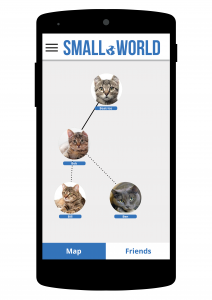
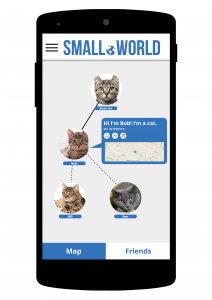
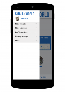
The idea and name of Small.World were agreed upon early in the project, but the branding took a bit longer to decide. The logo went through several different stages shown below:
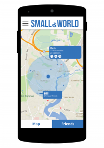
In the end we decided to go for a blue and white logo:
This was partly to distinguish it from the logo used in https://www.asmallworld.com/, but also based on other apps and basic colour theory. Colour theory suggests that blue is associated with trust and security, which is why it is the most used colour for companies (Morton, 2015). Therefore we used blue and white to create a clear and simple design that doesn’t appeal to one gender more than another and doesn’t have any common accessibility issues associated with the combination.
References:
Morton, J. (2015). Blue. [online] Colormatters.com. Available at: http://www.colormatters.com/the-meanings-of-colors/blue [Accessed 27 Apr. 2015].
BufferSocial, (2013). Why Facebook Is Blue: The Science of Colors in Marketing. [online] Available at: https://blog.bufferapp.com/the-science-of-colors-in-marketing-why-is-facebook-blue [Accessed 27 Apr. 2015].


