Preview of the Application – Mockups Part 2
The second part that we could divide our application’s functionalities is the one that covers the main activity of the users when using it, that includes the video browsing, watching and uploading.
1) Browse Videos by category screen
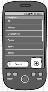
When users complete the registration process they are encouraged to start watching videos. The following sample screen could be used, where users can browse through the different categories to select the one that interests them and watch related videos to it. There should also be some functionality that would allow users to search all the videos by inputting some keywords which would match the titles or even the tags that videos have and show the relevant ones. And of course there should be some “Add” button in case users decide to upload one of their own.
2) Browse Related videos screen
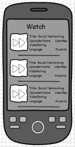
After selecting a category, a list would appear with all the relevant videos. The following mockup provides an overview of that screen, where a thumbnail is provided for each video, along with the title and some additional info about it including who uploaded it, his reputation, the overall rating of the video, the language in which it is made and -if applicable- the accent of the users on it. The user reputation system that has already been mentioned as a good way to provide users with some kind of feedback for the uploaders of the video, should be part of the preview of the video, so that users can take into consideration if a video has been uploaded by an experienced user who has contributed a lot. The rating for the videos as we’ll see in one of the next few screens is actually divided in more than one categories, but here it is presented only with the average rating of them all for users to be aware of the quality of the video overall. The use of accents here is a feature, that as already discussed will allow users to choose videos by people with accents that are more familiar to them, or even the opposite with accents that they want to familiarise themselves to.
3) Uploading Videos screen
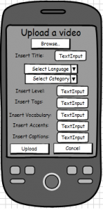
Probably the most important screen of the application, as through its use is ensured the sustainability of the app. The necessary information for uploading a video is at first to browse through the user’s videos to select what to upload / here that could be replaced by pointing the user to the camera function of the phone in order to make a video at that time. After having a video one way or another users should provide a title for it, then select the language in which the video is made as well as the category it represents as a subject, then insert the level of the language spoken, some tags to provide its relevance to some topics, some key vocabulary words or phrases that are of importance in the video and finally add the accents on it if there are some particular ones. An extra feature provided here which can be of high importance here is the “insert captions”. Users can add captions for their dialogues so the users can see written what is being said. The captions could be added in the language spoken or additionally their translation could be put there instead. Additional translations for the video could be provided in the comments section of the video or maybe in some extra part provided for the description of it. Not all of them can be represented here but there are many different ways to implement this. The mockup shows the basic concept.
4) Playing Video screen
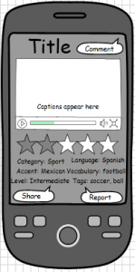
When someone selects a video to be played he could get a representation looking like the following one. On the top we could display the title of the video and the tooltip right next to it could lead to a comments section related to the video shown now. A big part of the screen should be dedicated to the video shown with all the appropriate features for controlling the progress, the sound and the proportion of the screen used. Something extra that could be added here is something like the feature that YouTube provides, where the user can select to go to a specific moment on the video in order to watch something particular mentioned. In the description part the uploader could provide some instructions on the parts of the video, where he could say perhaps where a conversation about a specific topic is taking place so users interested in it can go directly in that part and skip the rest of the content. After the video some information about it should be mentioned, like the rating, the category in which it is included, the language spoken, some tags with keywords about its topic, the level of the language spoken as an indication for the users it addresses, the accents heard on the video and some basic or important vocabulary used on the video related to the topic. By encouraging people to rate this video, users when clicking on it would be redirected to another screen where they should rate the video in different categories (see next screen), as the one shown here is the overall rating of it. Another feature that is essential in the video screen is a report option, from which users will be able to report videos with inappropriate content. Many reports could result in a video being deleted. If this feature gets combined with the reputation of the users maybe we could give some highly reputable users the ability to control the content by deleting it at once as well. The last and highly important feature provided is the Share button which is supposed to give to users the ability to share the videos they make on sites like YouTube or other social networking sites. This particular feature could serve two goals, at first to give users the option to share their videos with friends in order to show them what they have learned or perhaps something that they found interesting and it also serves our purposes for indirectly advertising our app through their posts.
5) Rating categories
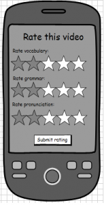
When someone selects the rate this video option he would be redirected in a screen looking like the following one. There he could rate the video in a few different categories, more specifically he could rate how useful/rich is the vocabulary presented in the video, if there is a proper use of grammar in the spoken sentences and how good is the pronunciation of the participants in the video in terms of how close the speaking is to a real native conversation. By submitting the rating an overall average score is calculated to produce the general rating presented in the previous screen.
6) Comments screen
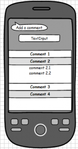
By pressing the comments bubble on the “watch videos” screen, users could be redirected to a separate screen where all the comments about a particular video are concentrated. People could view the comments other users have made, as well as adding one of their own. Another option could be to reply on some of the existing comments in order to answer in a potential question of a user for instance.
The mockups provided here cover pretty much most of the content of the application that involves the main functionalities of it. Naturally it is not easy to include everything in these drawings, but having them completes visually our vision for the application and the things that we would like it to cover and provide to its users. At some later point we will try to make some of them a little bit more “alive” in order to give a real sense of what the app could be like!
