Category Archives: Uncategorized

Do not use, you should categorize each and every post.

WEEK 8 : Documentary photography

Documentary photography is a tool to capture a moment and communicate with the people who is looking at it. A successful documentary photo can always tell the story behind even it is just a freeze moment, bringing the viewers travel back to the scenes where the photos were taken.

Don McCullin is a British Photojournalist and is known for his war documentary photography(1). During the Vietnam War which is also known as the Second Indochina War(2), Don was one of the war photographers and he has capture a range of photograph which reveal the ruthless side of wars. I choosed three works out of it. Both of them recounted how war damage the life of the civilian, they have no control of their important things and people and even their life. The photograph of the death young Vietnamese soldier with his possessions is the most shocking photo out of the three of them. The small photo of a girl in his wallet make a big contrast of the situation. It can easily tell that the girl is a very important person of the soldier, however they were being separate forever because of the war. This photo has not only told the story of this young soldier, but also represent a lot of civilians and soldiers which have similar story at that time. The next two photos are related to the ordinary Vietnamese during the war, the one that an American marine inside a civilian house with the couple photo ,and the one that an old Vietnamese civilian was tormenting by the US Marines are also another examples that shown the violence of war.

This series of photograph really brought me to a meditation because of the reality that they showed to me. These photos are way more powerful than any words because they were captured from the real moment of that period. They communicate with the real experience and that’s why they are so influential.
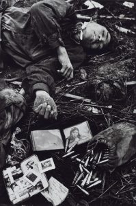
A Young Dead North Vietnamese Soldier with His Possessions 1968, printed 2013 Don McCullin born 1935 ARTIST ROOMS Tate and National Galleries of Scotland. Purchased with the assistance of the ARTIST ROOMS Endowment, supported by the Henry Moore Foundation and Tate Members 2014 http://www.tate.org.uk/art/work/AR01195
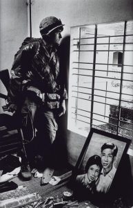
The Battle for the City of Hue, South Vietnam, US Marine Inside Civilian House 1968, printed 2013 Don McCullin born 1935 ARTIST ROOMS Tate and National Galleries of Scotland. Purchased with the assistance of the ARTIST ROOMS Endowment, supported by the Henry Moore Foundation and Tate Members 2014 http://www.tate.org.uk/art/work/AR01196
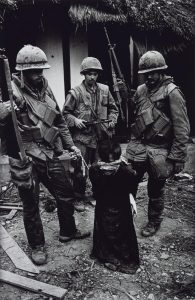
US Marines Tormenting an Old Vietnamese Civilian, The Battle for the City of Hue 1968, printed 2013 Don McCullin born 1935 ARTIST ROOMS Tate and National Galleries of Scotland. Purchased with the assistance of the ARTIST ROOMS Endowment, supported by the Henry Moore Foundation and Tate Members 2014 http://www.tate.org.uk/art/work/AR01199

Reference:
(1) Online: available from https://en.wikipedia.org/wiki/Don_McCullin
(2) Online: available from https://en.wikipedia.org/wiki/Don_McCullin

Photo: (Don McCullin, 1986)

WEEK 6 : Postmodernism

Following the development of art, it was interpreted as different forms in different moment in the history. Modernism was a style that is rejecting the style of at from the art, which is a big change in the definition of art. However, after the term of postmodernism appear in the history, the pointer of the evolution of art had changed again.

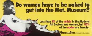
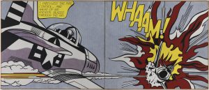
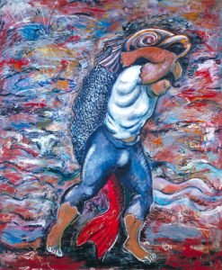
Since postmodernism is aiming to question the notion of how art should be and having a freedom to express different ideas. The works usually reflecting the problems from the society and having a deep personality in it. Because of this, postmodernism art has an ability to reveal the diversification of any groups of people in the society. For example, the poster ‘Do women have to be naked to get into the Met. Museum’ is a sample of feminist art, it said even though very few of woman can go into the modern art section but 85% of them are naked, it sharply pointed out the problem of the value of women in the current society. Since women are always used as a sexual element in tradition art, it deconstructed the rigid impression of the way how women appear on art. Moreover, ‘Whaam!’ is an example of comic art in postmodernism, it was created based on an image from All American Men of War, the work leaving an open meaning to the viewer which increase the interaction between them and the painting. To add more, Sandro Chia who is the artist of the work ‘Water Bearer’ having a unique style which his works were mostly about a boy or men with fish. The figures are always searching for something and I think the artist is also trying to reveal some social phenomenon.

In conclusion, following with the development of postmodernism art, the trend of art is requiring more and more personal thought and personality which is not only about making things look pretty and suiting everyone’s taste. Personal think this is a positive change since it can let artist to express their points of view for freely through their work.

Do Women Have To Be Naked To Get Into the Met. Museum? 1989 Guerrilla Girls null Purchased 2003 http://www.tate.org.uk/art/work/P78793

Whaam! 1963 Roy Lichtenstein 1923-1997 Purchased 1966 http://www.tate.org.uk/art/work/T00897

Water Bearer 1981 Sandro Chia born 1946 Purchased 1982 http://www.tate.org.uk/art/work/T03469

Reference:
Tate Modern– Postmodernism

http://www.tate.org.uk/art/art-terms/p/postmodernism

WEEK 4 : Is it possible to be truly authentic?

In the society nowadays, people always pursuing the authenticity and really clinging about it. While in the art world, a similar situation exsit and sometimes hinder artist’s creative thought.

It may be tricky when people talking about authenticity in art. Since copying and referencing can be arguable in an art work, but beside artists, we are all living in the world full of designed work. Poster on the street, videos on YouTube and even decorations at home are always influencing our mind of what designs look like. Also, there are a lot of successful artist’s style are influence by the artists before. So, I think to avoid single reference to other’s work is impossible in this technology society. However, it doesn’t mean that artist and designer can copy other’s work without thinking anything, I think we should always reference by the way other thinks and how they search for ideas. Moreover, it is also important to be honest and show reference if you really used other’s idea or work.

To add more, I think that the meaning of Modernism is to always challenge the grid of something obvious and try to get new ideas. Since the contemporary practice always require something exciting and improvement, so I think the principles of Modernism hold the value in the practice nowadays.

Task 8 // Appropriation

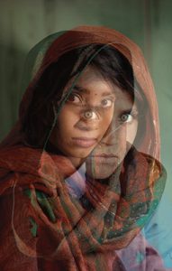
I have appropriated a famous photograph called the Afghan girl, taken by Stephen Curry. It is one of my favourite photographs published from the National Geographic Magazine. I took a self-portrait using a tripod and trying convey the girl’s similar emotions although my piece was taken in a different composition and angle. I then used Photoshop and merged both images together using the opacity tool creating both works looking transparent and enhancing the illusion. In my photograph, I tried replicating the image wearing a scarf over my head. Using a similar lighting with the dark background. I wanted to show my identity in the image and convey two different perspectives to the audience.


WEEK 5 : Wes Wilson

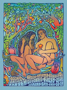
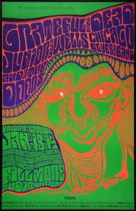
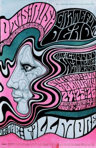
Wes Wilson is a famous American artist in 1970s, he was a poster designer for rock concert in the 1960s and was known for his psychedelic poster and type (Classic Posters, 2013), the wavy and melting look type style was inspired by the Art Nouveau masters (1). and his work influenced the next generation of designer until now.

The typeface is no doubt the most iconic elements in Wes’s posers, the waving strand of type and cryptic looking made them really suit with the meaning of rock music concert, making them a huge successful at that time. Also, the letters are filled with almost all the gap in the posters, which somehow looks like patterns and shapes and endue the spirit in the picture, I was really impressed by the way he make the type looks like shapes which break the grid of how front usually look like and made them more sensibility. Besides the typeface, the bright colors that he used was also another influential thing in his design. Inside of using harmonious colors, he had choosed to work with very contrast and clashing colors. This made the posters very eye-catching, since contrast colors are much more attractive compare to other colors combination and graphic designers are still using this theory nowadays. Moreover, I think he is a decisive designer, from the way he put colors and shapes courageously, you can tell he is unwilling to be ordinary and a thoughtful person. His work wasn’t just about how things will look good on a surface but also having their own story in each of them. Even though some artist disagree him at that time, but because of his persistence, he created his own style and standing as exemplar for modernism.

In a nutshell, I really like the way Wes Wilson design the front and making them collaborate with the color scheme. He is a designer who design with thoughtful idea and making his work impressibility which encourage me to think out of the grid more often.

Hardly Strictly Bluegrass Festival, Golden Gate Park, San Francisco, CA poster by Carolyn Ferris & Wes Wilson


Wes Wilson, 1965

Wes Wilson, 1965


Reference:

“Wes Wilson”, Classic Posters, Jan 2013

WEEK 3 : “Technology is the mortal enemy of art.”

It is no doubt that technology is a turning point of art development in the art history. It made the form of art became more diversification and popularize which make every stratum can have a chance to find out more about art. However, there is problems happening after technology influenced art.

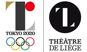
Because of the convenience of communicate on the internet, art work can be spread out very wide and fast which is great for artist but also lead copying problems at the same time. Copyright has been protected by the law but the problem still existed. Example of it would be the first logo design for the Tokyo Olympic 2020 was accusations of plagiarism (2015). The logo that was blamed as plagiarism was replaced very soon after that. The second down side would be the electronic of art, it is nothing wrong about developing art into a digital way as I have said in the beginning of this article, digital art such as digital drawing can make editing become more easily and faster yet this may cause a risk that forcing artist not to use traditional art supplies. I think it is always very important to work with materials in a manual way which can build up a foundation knowledge of creativity.

Overall, I agree that technology is an important developmental milestone but at the same time, knowing how important is respecting others’ work and paying attention to tradition way of making art is an issue for all the contemporary practitioner.

(Logos compare side by side, BBC News, 2015)

Post_M0dernism


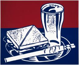
Lichtenstein, R. (1964). Sandwich and Soda. [screenprint on polystyrene] Liverpool: Tate

It’s Roy Lichtenstein’s lesser known works that still appeal to me on a deeper level these days. It’s his simpler illustrations that tackle mundanity and everyday irony more tactfully in my opinion. Pieces like ‘Sandwich and Soda’ are relevant to me and others existing in an era of increasing levels of playfulness and sarcasm being accepted in the art world. What’s also inspiring is what was occurring outside of the single image. By choosing to screen-print this image he could manufacture hundreds of copies thus reaching a wider audience, blazing a trail for artists to come.


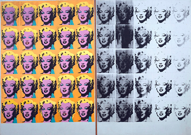
Warhol, A. (1962). Marilyn Diptych. [acrylic on   canvas] London: Tate Modern.

The meaning Andy Warhol’s most famous works, in my opinion are still as pertinent as ever in my opinion. Among those works is the Marilyn Diptych. It was a bold response to the 60s zeitgeist of celebrity culture, a public spirit that never really went away. By deconstructing the image through repetition in two different ways he reveals the meaning it has in the world. “The color contrasted against the monochrome that fades out to the right is suggestive of life and death, while the repetition of images echoes her ubiquitous presence in the media”. His firm grasp on the world around him is something that any designer should aim to replicate in way that’s appropriate for them.


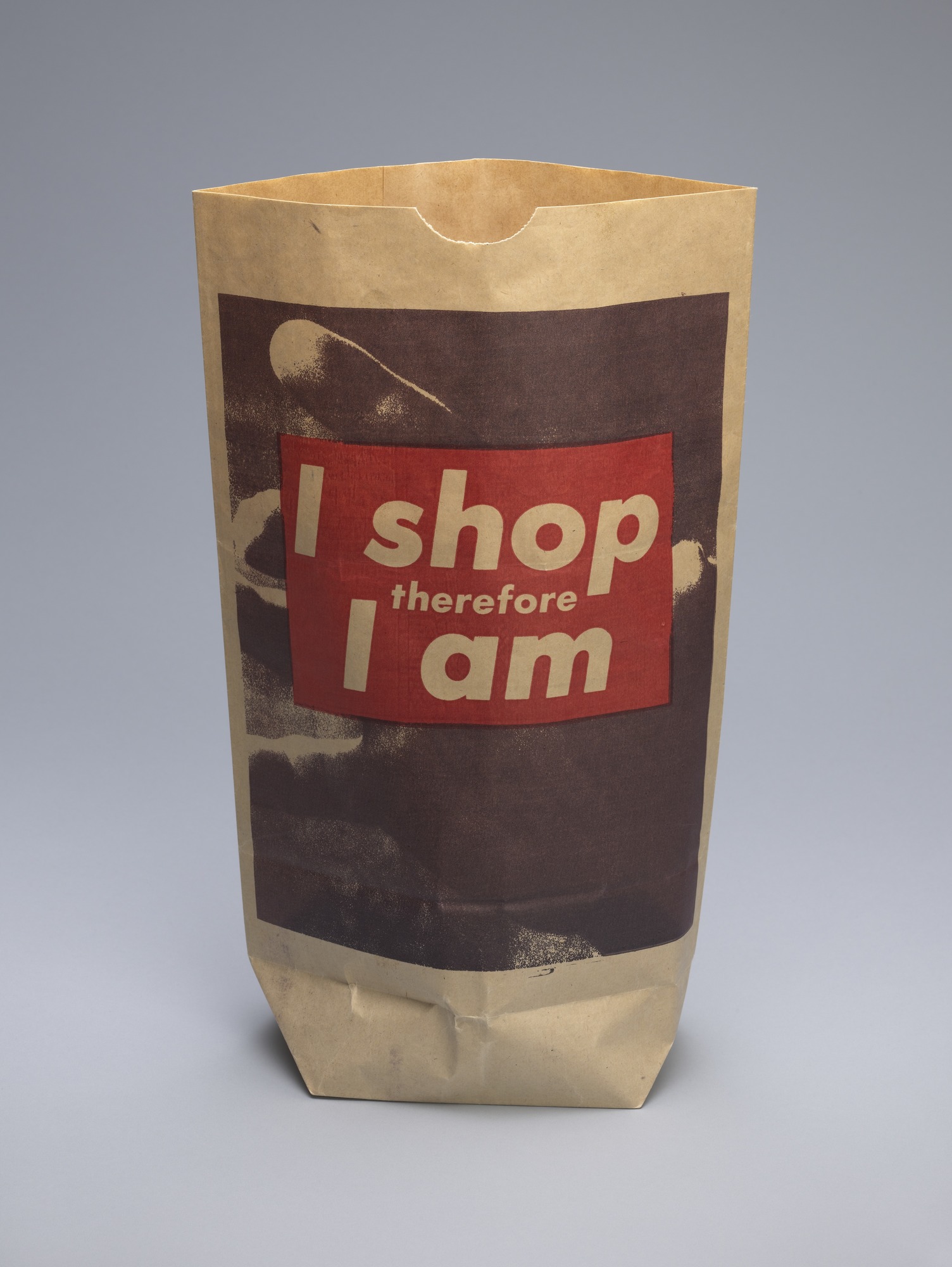
Kruger, B. (1990). I shop therefore I am. [photolithograph on paper shopping bag] New York City: MoMA.

As a work of art from the 90’s I feel that it ‘I shop therefore I am’ by barbara inherently retains more relevance to me as a designer in the 2010’s. Her punchy type and simple graphics combined with found imagery is something that I feel a strong connection with. Because of where she chose to show the design it reveals more about the design itself and what she meant.


Abstract: The Art of Design, S01E03 – Es Devlin: Stage Design. (2017).

Directed by B. Oakes. England: Netflix.

Tate. (2017). ‘Sandwich and Soda’, Roy Lichtenstein, 1964 | Tate. [online] Available at: http://www.tate.org.uk/art/artworks/lichtenstein-sandwich-and-soda-p77811

The Art Story. (2017). Postmodern Art – Modern Art Terms and Concepts. [online] Available at: http://www.theartstory.org/definition-postmodernism-artworks.htm#pnt_1

The Museum of Modern Art. (2017). Barbara Kruger. I shop therefore I am. 1990 | MoMA. [online] Available at: https://www.moma.org/collection/works/64897

Summary

This module was both incredibly challenging and utterly inspirational. While my time management and research skills definitely have room for improvement, I enjoyed pushing myself to deliberate on subjects I hadn’t thought much about previously. It was the first time I felt the transition between college level and univeristy level of fashion. Things I once just created are now considered, challenged and deliberated upon. This creates a new plane of inspiration which I’m sure will have a massive impact on my designs, with deeper meanings comes more original work.

I think the most beneficial part of this module was beginning to humour my curiosity. i have always been majorly fascinated by art and design, yet seemed never to follow the trail. I would admire peoples work and move on, my contextual studies simply taught me to think and care. Learning the importance of primary visual research for inspiration showed the importance of the library; it’s far too easy to rely solely on the internet. Although useful for deeper more thorough research, books provide ideas you had never previously thought of. We then were shown how to take full advantage of online resources and how to pursue the origin of a source. There is nothing more satisfying than discovering the thought behind artwork you love, such as Yves Klein’s Zone de SensibilitĂ© Picturale ImmatĂ©rielle where he sold invisible pieces of art. I discovered his immaterial pictorial zones accidentally, as I was researching the stem of his Anthropometry of the Blue Period. Something I would have never known without my newfound curiosity for history and meaning.

During the projects I’ve been completing throughout the term I’ve noticed how different my approach to research is. My ideas become more intricate and interesting because I now prefer to think of them as initial research that I then further explore, which results in more complex, deeper topic. The thing I struggled with most is finding specific references for allocated topics, while browsing for research is straight forward and stimulating, actually searching for a particular quote is a lot more challenging. Time allocation also played a large part in this module; while one task a week isn’t much to ask, fitting research and writing around studio time and extracurricular activities is something I definitely need to work on.

This module has been a massive milestone in my development as a designer, I approach problems and topics in an entirely different matter. Listening to a tutor who spoke about subjects with such passion was infectious and so enjoyable, a personal favourite being the visual research talk.

Task 5 and 6

John Galliano

https://www.vogue.com/fashion-shows/fall-2009-ready-to-wear/john-galliano

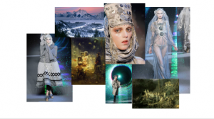
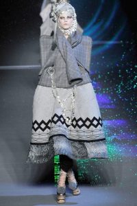
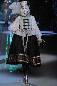
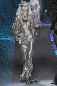
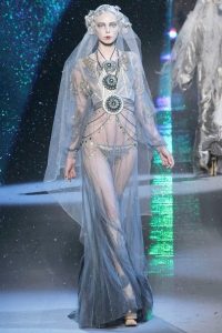
I have chosen to look at John Galliano’s Fall 2009 collection, where he was inspired by Russian Balkan folklore and the frozen lands of Russia. The models are styled to look almost fairy tale like and the runway show created a fantasy world using glitter snow and light effects. The garments are beautifully embroidered and he uses traditional shapes and patterns from Russia, you can see this in his knitwear and choice of sheer materials ranging in colours. The image I have been particularly drawn to is the furthest one to the right, and the final garment shown in the runway. The model wears what seems to be an organza dress which flows gracefully over her legs cascading the floor. The heavy embroidery on sleeves and bodice of the dress create a sense of grandeur which is only enhanced by the silver, gold and blue coins draping over her front and waist. The sheer head piece pulls together the mystery ice princess look, creating an almost innocent demur whilst still having an air of sexuality. I also love how the photographer captured beautiful sections of green iridescent light created by the light effects and the reflection of the glitter snow. Much like McQueen, Galliano always make sure his runway shows are also a spectacle and he shows through the collection that he can adopt traditional expertise’s but still keep his flare. The detail of every models accessories’ makes you believe that you are watching another world with the dramatic makeup, faces nearly white, lips frosted and eyes popping completing each and every look. Only Galliano would conjurer up a collection inspired by folklore and turn it into a parade of glittering theatre.

Publish or Perish!

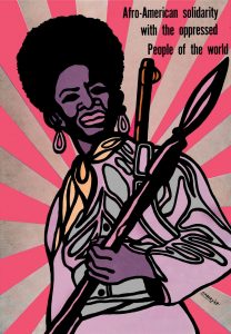
Within the Abstract series made for Netflix, Planton, a photographer opens the film with ‘what’s important is the story, the message, the feeling, the connection, how do you make this reach people? It’s a combination of graphic simplicity and the power of spirit and soul.’ The soul purpose of Graphic Design is to portray a message to an audience through typography and image. A well executed piece of graphic design has the power to change the fait of history as demonstrated with Emory Douglas’ work.

‘Emory Douglas was an integral part of the Black Panther Party, joining as minister of culture in 1967 and designing artwork that became potent symbols of the movement.'(The Guardian) The Black Panthers stood for human rights for everyone, they promoted gender equality and many women were members of the movement. Gender roles were often swapped with a woman in the poster shown holding a spear and a gun strapped to her shoulder and men would often cook free breakfast for children. Douglas certainly made an impact upon the western world at the time as well as in the present. receiving an AIGA Medal for his work ‘recognised for his fearless and powerful use of graphic design in the Black Panther Party’s struggle for civil rights and against racism, oppression and social injustice’ (K.Wolgamott). The black panther party were so influential and seen as a threat to the FBI, consequently the movement was destroyed.

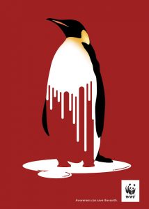
Another organisation that use the power of graphic design in their favour to convey their messages are WWF

This poster convoys the effects of global warming on a few levels. The melting of land ice and the loss of biodiversity across alpine and tundra regions. This piece of graphic design is very clever in how it shows its message. The red background contrasts with the white melting ice/penguin resulting in what looks like dripping blood, symbolising the death of fauna due to the loss of habitat. The organisation also uses an animal that is not necessarily a keystone species but creates a connection with the audience. A cute and cuddly animal in danger will create that bad feeling towards the audience and in turn will create more of an impact.


The Adbusters Media Foundation is a Canadian non profit organisation founded in 1989 in Vancouver. Their manifesto follows ‘We are a global network of artists, writers, musicians, designers, poets, philosophers and punks trying to pull off a radical transformation of the current world order.’ (Adbusters) Taking the idea of the Mcdonalds ‘happy meal’ and asking the question ‘Are we happy yet?’ next to a massively oversized burger, they are addressing the idea of consumerism and asking us, are trans national corporations really making our lives any better in quite a powerful way.

Adbusters | Journal of the mental environment. (2017). About – Adbusters | Journal of the mental environment. [online] Available at: https://www.adbusters.org/about/ [Accessed 7 Dec. 2017].

Adbusters ‘Are we happy yet?’. (2013). [image] Available at: https://dshiellsedwards.wordpress.com/2013/10/20/adbuster/ [Accessed 7 Dec. 2017].

Anon, (2017). [image] Available at: http://mindblowingresources.blogspot.co.uk/2012/09/30-mind-blowing-posters-against-climate.html [Accessed 7 Dec. 2017].

Douglas, E. (2015). Afro-American solidarity with the oppressed People of the world. [image] Available at: http://journalstar.com/entertainment/visual-art/black-panther-minister-of-culture-emory-douglas-on-graphic-art/article_5e37c607-88bc-553a-824e-a4cd8af1f8c9.html [Accessed 7 Dec. 2017].

Wolgamott, K. (2015). Black Panther Minister of Culture Emory Douglas on graphic art and social change. [online] JournalStar.com. Available at: http://journalstar.com/entertainment/visual-art/black-panther-minister-of-culture-emory-douglas-on-graphic-art/article_5e37c607-88bc-553a-824e-a4cd8af1f8c9.html [Accessed 7 Dec. 2017].