
As discussed by Jack in a recent post, the highly thematic nature of EventHive leaves much to play with when designing a basic Graphical User Interface, particularly given the name’s strong connotations with hexagonal-patterned hives, large swathes of activity and a sleek and shiny feel. A number of sketches were therefore made and discussed by the group, before the best were formalised into the following wireframes.
As it was envisaged the majority of traffic for the network would be via the mobile phone application, attention was paid particularly to its wireframe design as below, with the principles easily convertible to a desktop browser application which would be developed in parallel with the mobile application.
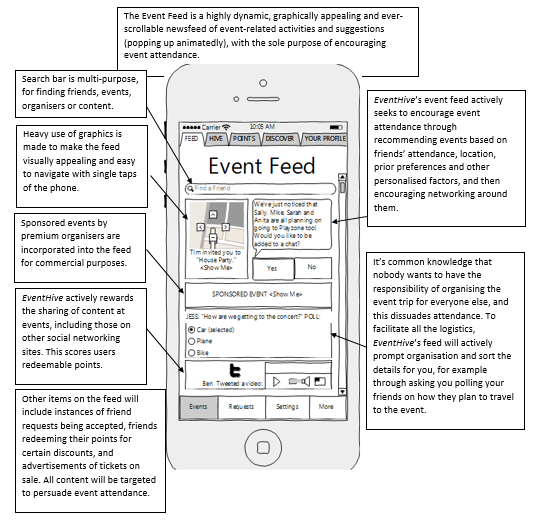
The Event Feed Interface
One of the critical features of the EventHive network due to its crucial role in driving event attendance, the Feed’s interface was designed to appear highly, active and dynamic to incur a “spur-of-the-moment” feeling which played on users’ “Fear of Missing Out”, while striking a fine balance between maximising content and being overstuffed.
The Event Hive Interface
The event directory element of the EventHive network, the theme of a hive is exploited to demonstrate the interconnections between events.
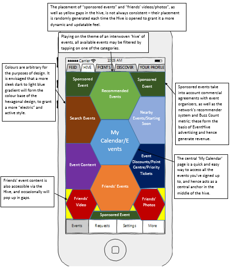
Tapping on one of the event filters will zoom in on (shading the rest of the screen) the following sub-hive, playing on the almost fractal honeycomb nature of hive design.
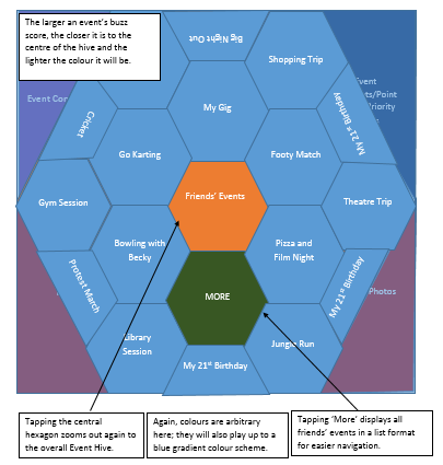
It is in the event sub-hive where the effect of buzz count and recommender systems really comes into play, with more central locations in the hive making them more likely to be selected.
The Event Page
Tapping on an event brings up its event page:
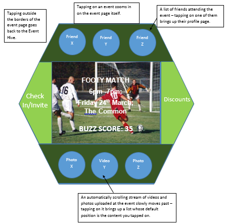 Loosely based off the design of Google Circles, it is a way of accessing all the information, multimedia content uploaded, attendees list and discounts of events. It may be also be used to check into an event via GPS, and thus gain redeemable points.
More Traditional Interfaces
The profile page is similar to that of the event page, with profile picture and information at the centre (and tappable to discover more), and surrounding segments containing friends lists, events attended, multimedia content uploaded, and contact details/integration with other social networks.
The points screen resembles a simple scrollable list-style shopping centre, similar to those of mobile applications like Amazon (see below):
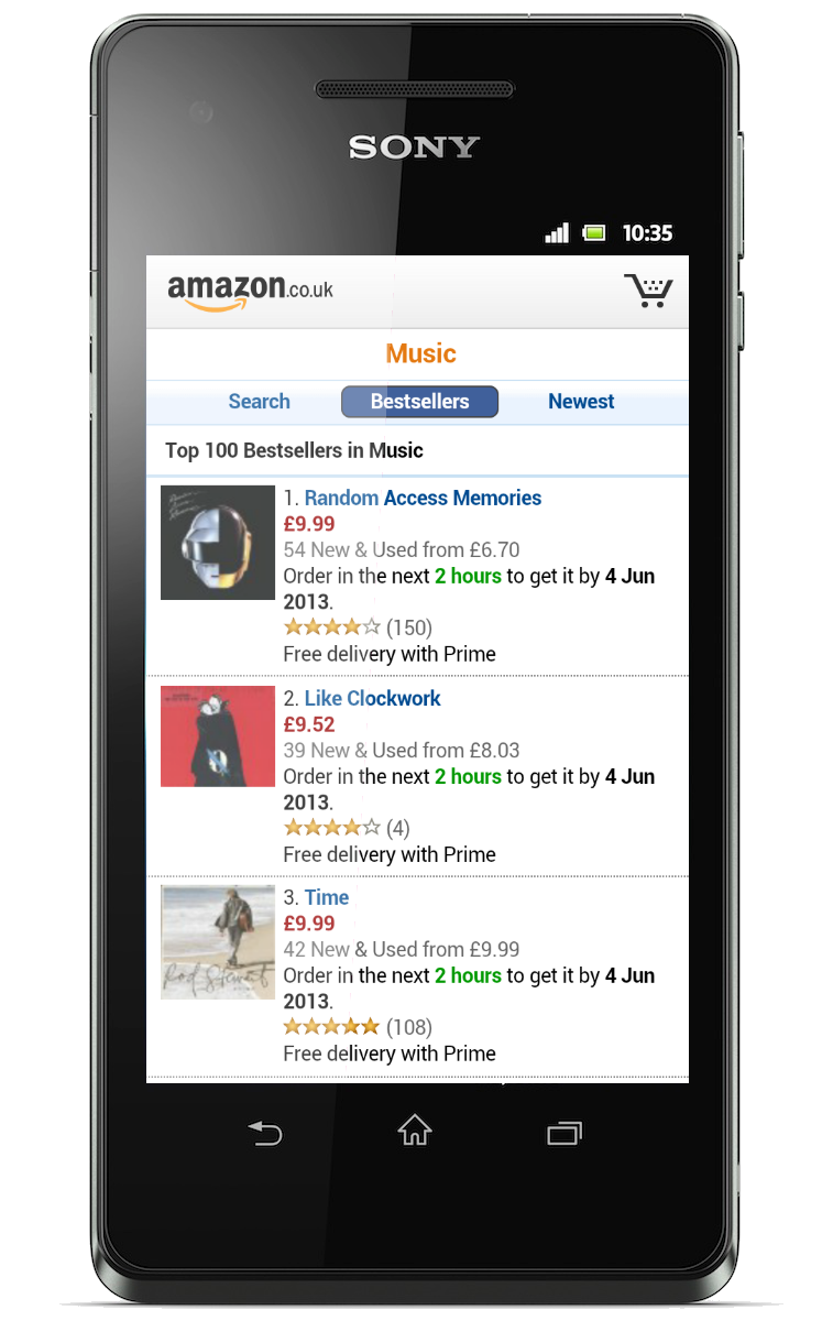 From http://mobilemarketingmagazine.com/wp-content/uploads/2014/07/Amazon-Mobile-Site.png
In accordance with its gameification purpose, graphical features such as leaderboards (for example, ‘most points accrued in last week’ across your friends list) and graphical features are likely to be implemented. Likewise, organisers’ analytics features are assumed to be relatively standard in-keeping with modern expectations.
Browser-based implementations of these interfaces are intended to be simple conversions of the themes, perhaps offering greater amounts of content on-screen as opposed to the rather minimal mobile application’s affordances.
Given the conceptual nature of the designs, it is highly likely that, as content and features are added and removed from Event Hive, these will only form the very basis of the final product. Nevertheless, we believe that by sticking closely to the Hive branding thematically, we have provided a cohesive, sleek, intuitive and interesting Graphical User Interface which forms a solid foundation in accordance with the Hive branding, in turn providing a formidable basis of a networking community.
No comments yet.