Posts Tagged kohtume
Mockups – Sami
Posted by Samantha Kanza in Mockups and Ideas on April 14, 2014
This post shows some mockups of what Koh.Tu.Me would look like on a smartphone.
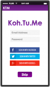
1. This is the login screen of Koh.Tu.Me. This allows users to login if they have created an account, or to login with their Facebook, Twitter or Google+ account. Whilst people may receive event invitations without an account, it is necessary to have an account to create an event. Alternatively, if you do not wish to login to the application if you don’t have an account you can skip this stage.
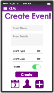
2. This is the create event page, it is pretty simple, and requires a name, details, type of event (business or pleasure), the date (including start and end time) and whether it is private or not.
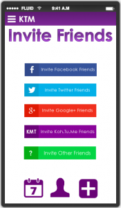
3. This is the first stage of the invite friends part of the event. This page allows users to invite friends from their different social networking accounts, their Koh.Tu.Me account, and additionally other friends who don’t have a social networking account.
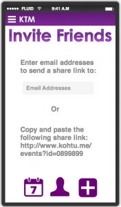
4. This is the invite friends stage for if a user has opted to invite friends who aren’t on a social network. This allows them to either list email addresses to send share links to the event to, or provides a share link directly to copy and paste to their friends however they see fit.
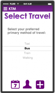
5. This is the select travel page, it allows users to choose their primary method of travel to the event.
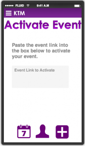
6. This is the activate event page. It is for people who are invited to an event but do not wish to create an account. They can use Koh.Tu.Me to ‘activate’ their events within the app, as an easy way to see that specific event information and interact with the other people who have been invited to this event.
Created by: https://www.fluidui.com/
Survey Design – Sami
Posted by Samantha Kanza in Interviews with Users or Focus Groups on March 27, 2014
In order to assess the viability of our application, we have created a survey.
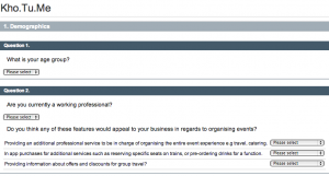
The first part of the survey creates basic demographic information, including their age group and whether they are a working professional or not. If they answer yes to working professional, then the section underneath is shown which asks them how appealing they find potential business specific features of our application. The answers in those dropdowns are “Very Appealing”, “Moderately Appealing” and “Not Appealing”.
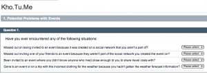
The second part is focused on looking at the problems kohtume is attempting to solve. So this section asks if any of our participants have encountered these problems when organising or going to events. These just require straight yes/no responses.
The third part is focused on seeing what features of our app are appealing to the participants. The answers in those dropdowns are “Very Appealing”, “Moderately Appealing” and “Not Appealing”.
Using a Qualitative Method to get Feedback on our Social Networking Application Idea – Sami & Someah
Posted by Samantha Kanza in Interviews with Users or Focus Groups on March 26, 2014
In order to see which elements of our social networking application are most appealing we decided to use a qualitative method to investigate this. We considered interviews, focus groups, and surveys as potential ways we could get this feedback and analysed the strengths and weaknesses of each method in relation to the time frame, and the information we wish to collect.
Focus Groups [1,2]
Strengths
- Exploring what different people have to say.
- Providing insights into the roots of complex behaviour and people’s motivations.
Weaknesses
- The moderator of the focus group can actually prove more disruptive than helpful when it comes to trying to draw opinions out of the participants.
- “polarization effect” – attitudes can become heightened and more extreme as the group discussion continues.
- Discussions can get sidelined if participants disagree strongly.
Surveys [3]
Strengths
- They are anonymous and neutral, potentially leading to more honesty.
- All of the data is collected automatically and can be analysed at a later date.
- Takes less time (in terms of direct time put towards the study).
- Can address lots of different demographics easily.
Weaknesses
- There’s a lack of engagement with the person answering the questions.
- There’s less scope to get more personalised information out of a survey, as whilst you can show different questions based on user answers, you can’t make subtle adaptions to the questions depending on how the answers are going.
- Takes more time (in terms of indirect time, of waiting for people to answer the questions).
Interviews [3, 4]
Strengths
- Qualitative interviews produce credible evidence
- It can be used to explore multiple different possibilities to answering a specific question, in addition to allowing for elaboration on certain points.
Weaknesses
- Interviews are neither as neutral or anonymous as surveys, meaning that people won’t necessarily answer as fully or honestly as they would in a more neutral surrounding where their answers could not be attributed back to them.
- There’s also a huge pressure to collect all the data needed during that interview period as otherwise that information could get lost or misrepresented when it comes to writing up the results.
- Can risk being interviewer led.
Conclusion
We wish to ask some very simple yes/no questions to find out if the problems that our social networking application attempts to address, are actually commonly occurring problems. We also wish to find out whether people find different elements of our social networking application appealing, and if so, how appealing. These characteristics seem to lend themselves best for a survey as we can ask direct yes/no questions and we aren’t looking for different interpretations or different ways to explore questions, we just want simple yes/no answers.
In addition we could run a survey cost free, and after the initial overhead of setting up the survey, it would take a lot less time to collect the data. It also allows us to target a wider demographic as we can share a survey with all of our Facebook friends, thus addressing people of different ages and professions.A survey also seems more likely to elicit participation as participants can fill in the survey at a time convenient to them, and we wouldn’t be asking for any personal information. Additionally, if we were to use the isurvey tool offered by soton, then that offers easy data analysis of results after the survey is completed.
Having taken all of these factors into consideration it seems like a survey is the most suitable for the questions we wish to ask, and the resources/time we have available.
References
[1]Sussman, S,. Burton, D., Dent, C.W., Stacy, A.W and Flay, B.R. Use of focus groups in developing an adolescent tobacco use cessation program: collective norm effects. J. Appl. Soc. Psychol. 1991.
[2] Morgan, D.L and Krueger, R.A. When to use Focus Groups and Why. 1993.
[3] Kvale, S. Interviews. An Introduction to Qualitative Research Interviewing. Sage Publications, Thousand Oaks, 1996.
[4] Rubin, H.J and Rubin, I.S. Qualitative Interviewing: The Art of Hearing Data. Sage Publications, 2012.
Storyboard 3 – Jokha
Posted by Jokha Al Adi in Uncategorized on March 25, 2014
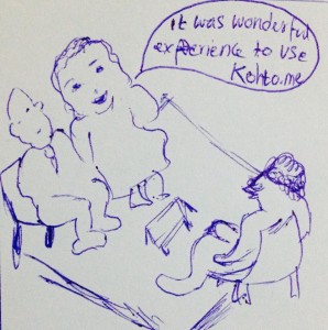
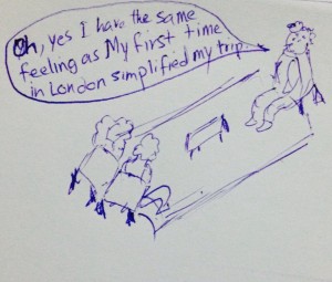
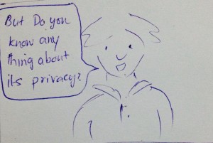
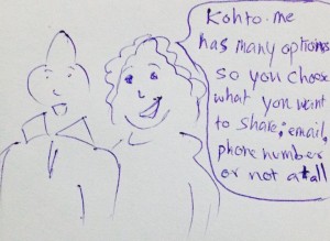
This storyboard illustrates how Koh.Tu.Me is pleasant to use, and doesn’t share your personal data against your will.
Storyboard 2 – Jokha
Posted by Jokha Al Adi in Web maps and Storyboards on March 25, 2014
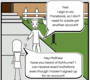
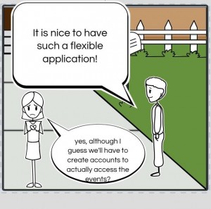
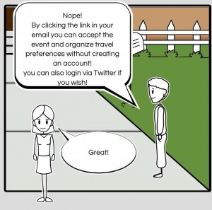
This storyboard illustrates how you don’t need to create an account with Koh.Tu.Me in order to receive event invitations.
Created using: StoryBoardThat.com.
StoryBoard – Jokha
Posted by Jokha Al Adi in Web maps and Storyboards on March 24, 2014
Branding – Sami
Posted by Samantha Kanza in Mockups and Ideas on March 21, 2014
This post will detail the name and branding for our application.
We wanted to go for a simple catchy name, that wasn’t too difficult to say and that ideally had a meaning behind it. Thus we decided that our social networking application would be called Kohtume, which is estonian for “meet me at the” [1]. It also sounds a bit like “go to me”.
The main logo will look like this:
The logo icon will look like this:
These were chosen because we wanted the logo to be simple and illustrate our name, and based on Facebook and twitters branding, simple text based logos seem to be the fashion for social networks. We chose a bright purple to reflect “fun” [2] as that is a main purpose of our application.
This branding and colour scheme will be used in our mockups to illustrate how our application will look.
Additionally the domain kohtu.me is available [3], as we wanted to pick a name that had an available domain so our application would be easily searchable on the Web, and wouldn’t be confused with any other applications under the same name.
[1] http://mymemory.translated.net/t/Estonian/English/kohtume
[2] http://www.colorcombos.com/color-purple-article.html
[3] https://www.123-reg.co.uk/order/domain?X-CSRF-Token=a49f26b5c99f63ef2a1c9efca76486b2dd692f8e&domain=kohtu.me




Recent Comments